
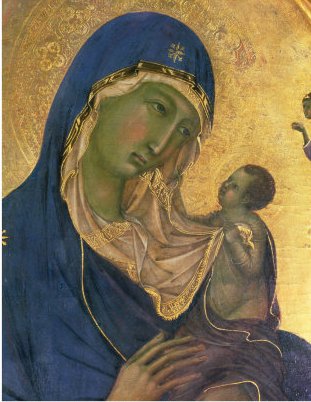
 I always used to wonder why some faces painted in tempera had a green tinge to them. I had been told at some point, that this was the underpainting showing through and that the colour of the skin had somehow faded. This is possible: in the 15th century Cennino Cennini described a method in which monochrome underpainting is undertaken in terre verte, an earth green, before a thin transparent layer of skin tone, a pale orange, is applied. Cennino Cennini's method is described in a book called The Method of Tempera Painting). But even so, why put the green there in the first place? It was obviously intended originally to give a greenish tinge to the skin (even before the colour changed over time).When painting icons I was encouraged to use red and green washes in shadows but it was an intuitive process and I wasn't sure what principles were guiding me or why they were used (I probably hadn''t been paying attention in class!).
It wasn't until I went to study portrait painting in Florence that I felt I understood what was going on here. I was taught that we see the deepest shadows are red or red brown and the half-tones are a green grey. The colour is obtained by mixing ivory black, yellow ochre and white. Ivory black has a touch of blue in it and so creates a grey-green when mixed with the yellow and white. The colour produced matches almost exactly the colour of the veins that you see, under the surface of the skin. So if you look at your wrists you will see this colour in the visible veins under your skin there.
What the icon painters and gothic artists are doing is just what the portrait painters were trying to do: match the colour scheme of their paintings with what they see in nature. It shows that even in the highly stylised forms so much is based upon observation of nature.
I always used to wonder why some faces painted in tempera had a green tinge to them. I had been told at some point, that this was the underpainting showing through and that the colour of the skin had somehow faded. This is possible: in the 15th century Cennino Cennini described a method in which monochrome underpainting is undertaken in terre verte, an earth green, before a thin transparent layer of skin tone, a pale orange, is applied. Cennino Cennini's method is described in a book called The Method of Tempera Painting). But even so, why put the green there in the first place? It was obviously intended originally to give a greenish tinge to the skin (even before the colour changed over time).When painting icons I was encouraged to use red and green washes in shadows but it was an intuitive process and I wasn't sure what principles were guiding me or why they were used (I probably hadn''t been paying attention in class!).
It wasn't until I went to study portrait painting in Florence that I felt I understood what was going on here. I was taught that we see the deepest shadows are red or red brown and the half-tones are a green grey. The colour is obtained by mixing ivory black, yellow ochre and white. Ivory black has a touch of blue in it and so creates a grey-green when mixed with the yellow and white. The colour produced matches almost exactly the colour of the veins that you see, under the surface of the skin. So if you look at your wrists you will see this colour in the visible veins under your skin there.
What the icon painters and gothic artists are doing is just what the portrait painters were trying to do: match the colour scheme of their paintings with what they see in nature. It shows that even in the highly stylised forms so much is based upon observation of nature.

Above: a study I made under direction in which the deep shadow lines are red (see the line above the upper eyelid and defining the nose for example); below: a mosaic by a master from Istanbul in which the artist has defined the deep shadow lines in a red brown colour, and the half tones are in earth green. This is handled superbly and has a natural appearance.


Above: a pastel portrait completed while I was in Florence the deep shades are red-brown while the half-tone skin colour is grey green; below: a portrait of 18th century society beauty Lady Hamilton by master George Romney in which he is very skilfully handling the transition from green to red as the shadow gets deeper. And below that is a self-portrait by another the 18th century English master, Sir Joshua Reynolds. Romney and Reynolds are part of the British school that can be traced back to Sir Anthony Van Dyck who was, in turn the star student of Rubens.


