


An Illustration of How Sacred Art Can Inform the Profane
The Baroque period of the 17th century saw the flourishing of a whole new Christian culture. Beginning in Italy and closely associated with the liturgy as part of the Catholic Counter-Reformation, it gave rise to a flourishing of art, architecture, and music, both religious and secular, across much of Europe, in Catholic and Protestant countries alike. I contend that beauty drove this cultural spread. These works of art spoke powerfully and irresistibly to the people of their age, and patrons and buyers decided they wanted art like this in their homes and churches. We can look at one part of this cultural movement, painting, as an example of what happened more broadly. The portraiture, still lifes, and landscapes of the period reflected the stylistic elements of Baroque sacred art described in the previous chapter, adapted and developed for each genre.
Portraiture
Here is a portrait painted by Anthony Van Dyck when he was just 21 years old, around 1620, and still working in the studio of his master, Rubens.
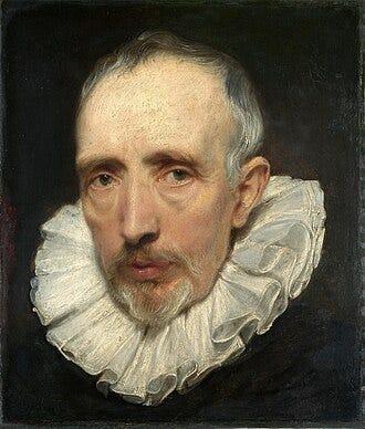
Anthony Van Dyck, Portrait, c. 1620.
In this painting, the contrast of light and dark is present, as is the variation of focus and the muted color palette. However, there is one key difference from the sacred art described in the previous chapter, arising from the nature of the subject. This is a portrait, not a painting of a saint. A portrait, unlike sacred art, seeks to represent a likeness of the person, strongly emphasizing his uniqueness. Sacred art, as we have discussed, seeks instead to emphasize what is common to all humanity, so that we can emulate it. We discern what is unique about a person primarily from the facial features and especially the eyes. It is through the eyes that we most readily perceive an inner life; we notice the dampness of the eyeballs, the tensions in the muscles that control the eyebrows, the angle of the lids, and so on. There is truth in the traditional proverb that the eyes are the windows to the soul. After the eyes, we look to the mouth, and then to gesture, especially the gesture of the hands.
The sacred artist working in a naturalistic mode will rely more on gesture to communicate mood. The portrait artist, by contrast, seeks to illuminate the mood and unique qualities of the person’s soul through a strong focus on the face, and particularly the eyes.
Still Life
Still lifes, like portraits, were painted by both Catholic and Protestant artists during this period. The example shown here is by the French artist Jean-Baptiste-Siméon Chardin, who worked in the 18th century. His Still Life with Peaches, a Silver Goblet, Grapes, and Walnuts exemplifies the characteristic Baroque approach. We see the variation in focus, coloration, and tone in accordance with the principles described in the previous chapter.
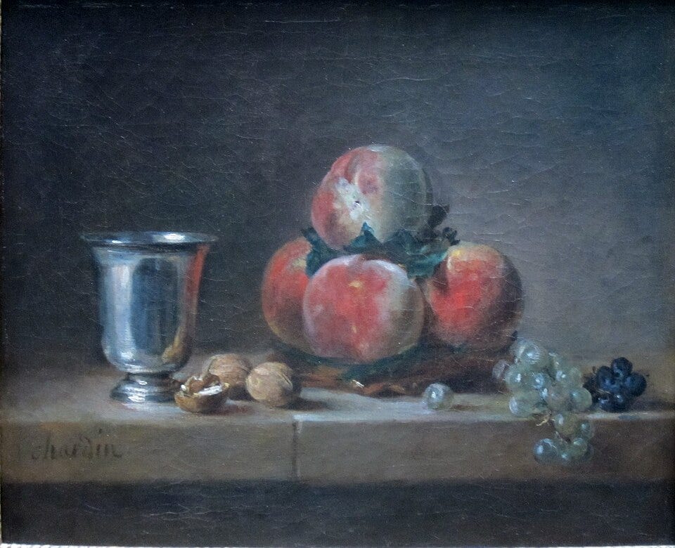
Jean-Baptiste-Siméon Chardin, Still Life with Peaches, a Silver Goblet, Grapes, and Walnuts.
Landscape
Landscapes are more difficult to paint in the Baroque style than portraits or still lifes, for several reasons. First, a landscape is a more complex composition. There will very likely be trees, animals, people, and buildings all working together in harmony to create a unified impression. At the very least, there will be several principal foci rather than one.
The foci, in this context, are those elements that draw our attention most strongly when we look at a scene. Unless we have reason to do otherwise, we tend to look at people first and to linger on them longest, then at the works of human hands such as a farmhouse or a cart, and then at animals and plants. In this respect, our natural interest tends to follow the hierarchy of being.
The best landscapes respect this hierarchy and tend to present all aspects of creation in harmonious relation with one another, typically placing the human figure in the principal focus. The artist’s goal in a landscape is to present the whole as beautiful while emphasizing the properly ordered relationships between things. Sometimes the artist will wish to make something other than a human being the center of interest, as when a herd of cows in a meadow becomes the principal subject. Even then, a cowherd who watches from the sidelines ought to be placed in the composition in a way that acknowledges the superiority of the human being in relation to the animals, even while the animals command the primary interest. This is not an easy balance to strike.
This attention to hierarchy matters in all genres of painting, not only in landscape. When the proper ordering of relationships is represented in visible things, it develops in us the capacity to look beyond the visible and to seek the ultimate being to whom all things point by their very existence, which is God. When everything in a painting is treated with equal interest, or worse, equal disinterest, it not only misrepresents reality but makes that leap of faith toward heavenly things, which should be the goal of every Christian artist, harder for the viewer to take. A successful landscape therefore requires the artist to portray a complex web of relationships between many creatures, presenting each so that it plays its part in the whole without overloading the eye with equal detail throughout.
When Rubens painted his landscapes, he adopted the standard Baroque template, rendering large portions of them in deep shadow or in sepia tones drained of color. It is apparent that what worked so powerfully in sacred art did not transfer to landscape in quite the same way. To me, his landscapes always look as though they are observed from a vantage point deep inside a dark forest.
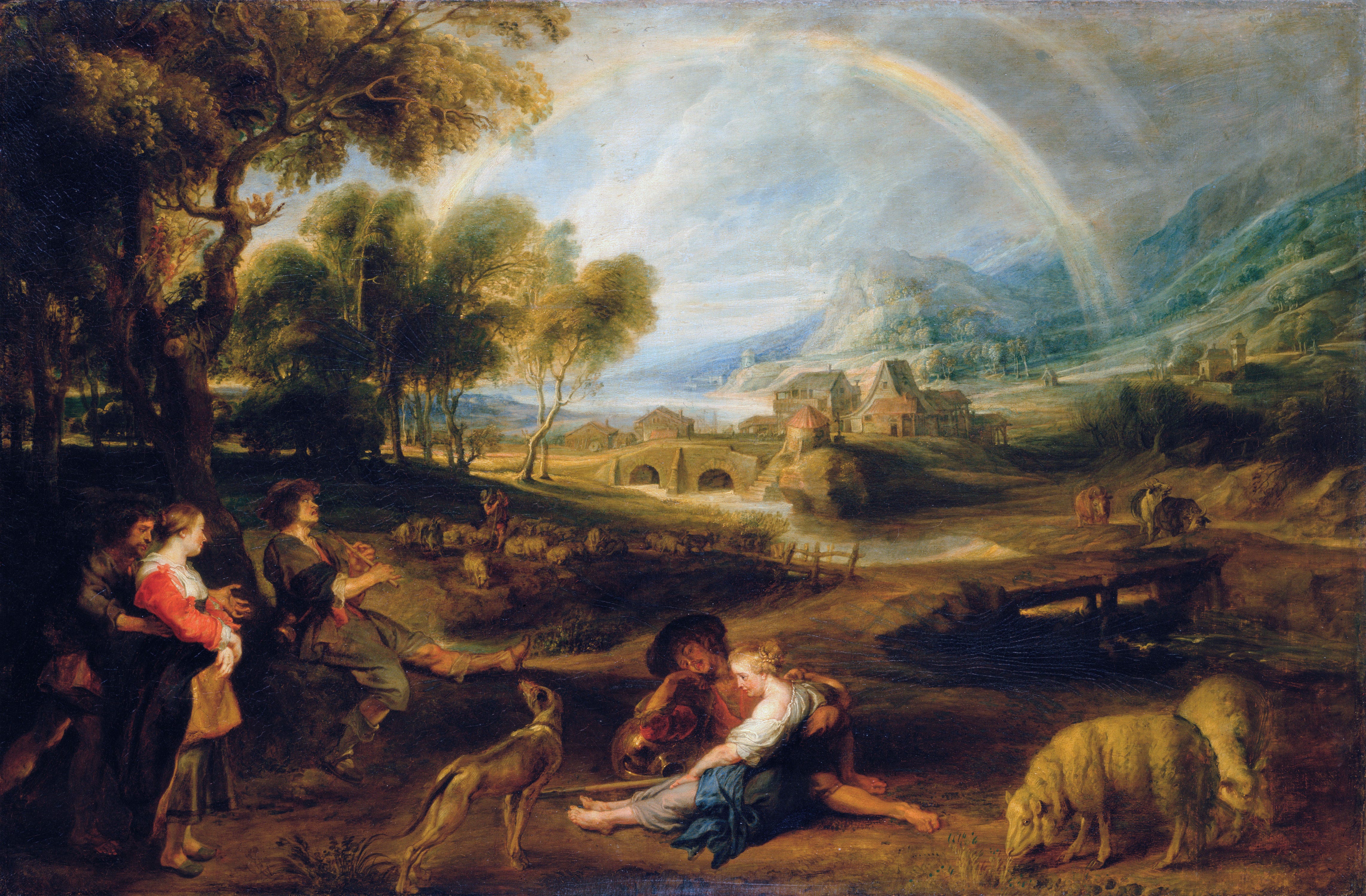
Peter Paul Rubens, Landscape with a Rainbow.
There is also the extraordinary technical difficulty of painting trees and foliage. To represent even a single tree, an artist must summarize form; he cannot possibly render every leaf and every detail. At the same time, he must indicate sufficient detail, otherwise the result will look like a smooth green sponge on a pole. If, on the other hand, he supplies too much detail by attempting to represent many individual leaves, he risks producing the effect of a green feather duster. The Rubens above also displays this fault, which might be called feather-duster syndrome.
Clouds and open sea are more tractable by comparison. Consequently, some of the most successful landscapes of the 17th century are in fact seascapes. This one was painted by Willem van de Velde the Younger, who lived from 1633 to 1707.
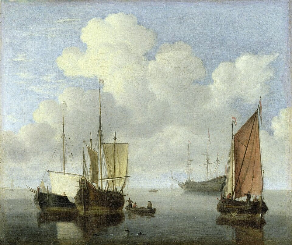
Willem van de Velde the Younger, Seascape, 17th century.
How the Technical Difficulties Were Overcome
While the sacred art of the Academy, the name given to the state-sponsored art school in Paris that came to dominate the style of art across Western Europe, declined during the 17th century, the quality of secular painting continued to develop. Artists steadily worked out how to overcome the technical difficulties of representing natural subjects in oil.
One development was to move beyond gray and sepia as the sole basis for tonal work. While still using selective tonal rendering, artists began incorporating colors closer to those of nature, such as gray-green for foliage. This allowed compositions to escape from the deep shadow that characterized the Rubens landscapes.
In tackling the foliage problem, artists worked out how to select certain areas for detailed rendering, knowing that the observer’s eye would read the whole as uniformly detailed. The approach was to identify where the eye naturally falls in a given composition, then to offer more color and detail in those areas while leaving adjacent areas more summary. A similar technique was applied to the representation of cloth in portraiture. To distinguish velvet from satin, for example, one would select one area, typically where light and shadow meet, for a detailed rendering of texture and color. The rest of the same fabric would be handled with less color and less detail, but in such a way that the balance prompts the eye to perceive the whole as fully realized. Vermeer, working in the 17th century, provides a striking example of this method in the rendering of the carpet in the following painting.
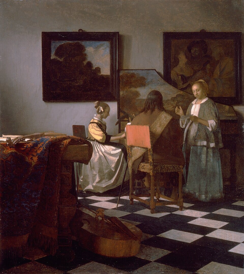
Johannes Vermeer, The Concert, c. 1663–66.
Notice how the coloration and detail vary markedly across the carpet. Some areas in the light are predominantly orange ochre; some areas in shadow are predominantly dark blue; a third portion is painted in a combination of royal blue and brick red with a detailed rendering of the carpet’s design and texture. Until we deliberately examine each section in isolation, the overall impression is not of a patchy surface but of an integrated, fully realized carpet.
Jean-Baptiste-Camille Corot (1796–1875) was perhaps the first painter to master this approach fully in the context of outdoor landscape. The painting below, Ville d’Avray, was painted around 1867.
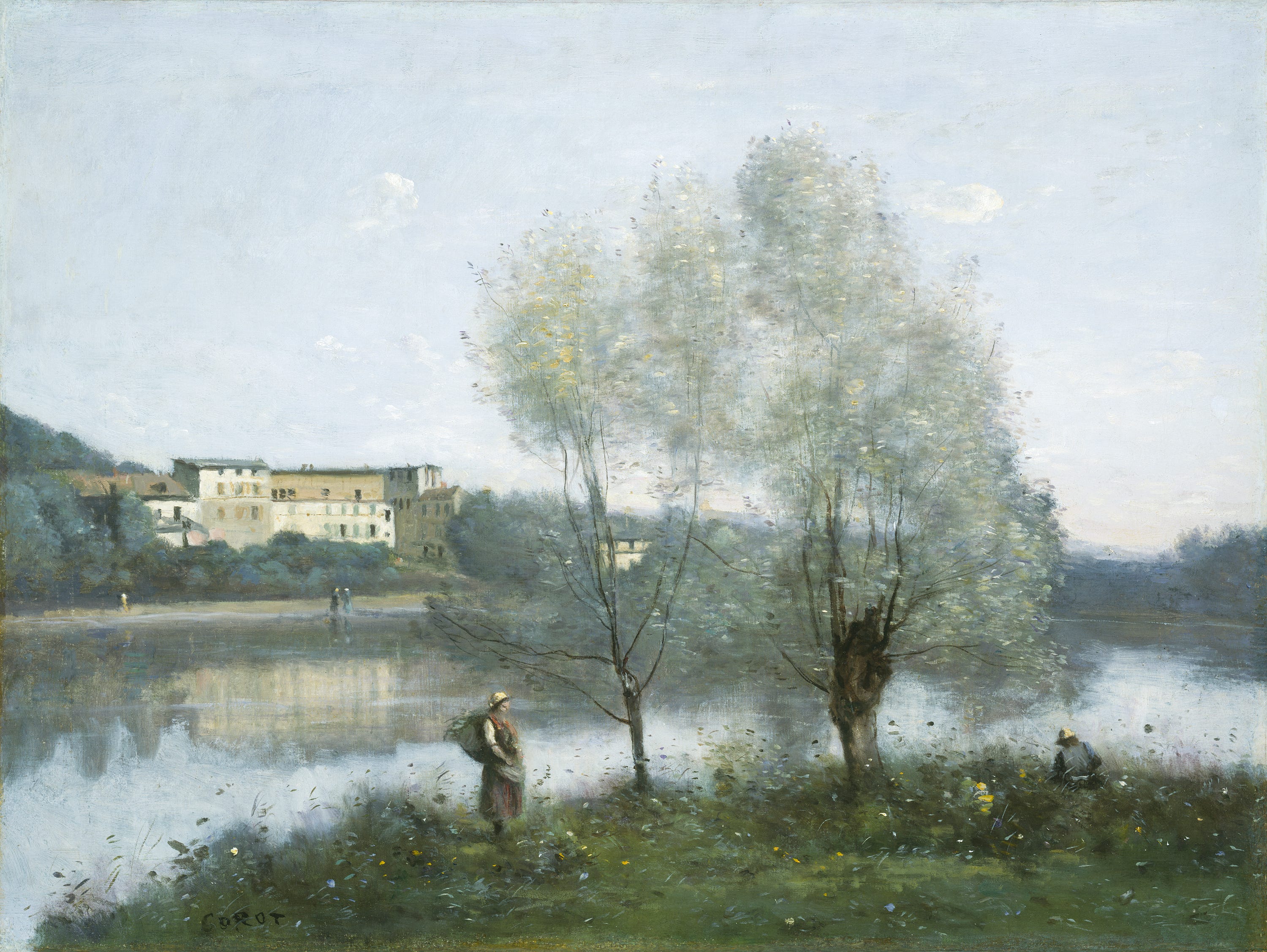
Jean-Baptiste-Camille Corot, Ville d’Avray, c. 1867.
Notice how Corot establishes an underlying form, a broad shape for each element, so that we read the whole: a silver-green haze for the willow trees, blue-green foliage in the distance, richer green for the grasses in the foreground. Over this foundation, he has selectively placed light, brightly colored strokes of leaves and flowers catching the light. The closer the elements are to the viewer, the more detail they receive.
Why Secular Art Survived While Sacred Art Declined
It is worth asking why secular painting continued to develop and improve during a period when sacred art was in decline. One reason, I suggest, is that regardless of an artist’s worldview or religion, if his intention in painting a landscape is to capture its beauty, that intention is consistent with a Christian understanding of the natural world. This is why even landscapes painted by artists with no Christian commitment, such as Chinese Daoist painters, may be considered compatible with the Christian understanding of how a landscape ought to be painted.
There are also practical pressures at work. People will not buy landscapes unless they find them beautiful, so the artist who wants to sell his work had better make them beautiful. Similarly, those who commission portraits want a likeness that shows the subject in the best light, as those who love them might see them. These commercial incentives have kept a tradition of representational skill alive in portraiture and landscape even through periods when institutional taste moved in other directions.
This is why, even in the last 100 years, painters working in representational traditions have continued to find patrons. The Italian portrait painter Pietro Annigoni, who famously painted Elizabeth II as a young woman, is one example. Andrew Wyeth in America and William Heaton Cooper in the British watercolor landscape tradition are others. It is worth noting that Wyeth and Heaton Cooper both came from artistic families and had their fathers’ example to guide their formation.
The Lesson for Today
The lesson we can draw from the story of the Baroque tradition is this: when we have an authentic liturgical renewal accompanied by art forms genuinely connected to it, we can hope to see a transformation of the wider culture, just as the Baroque transformed the culture of its own day. We cannot know in advance what the next such renewal will look like, if it comes. But if it does succeed, it will be its beauty, and not the approval of art critics or university lecturers (this one included), that wins the world over.