

How Every Painting Is Built, Part 2 of 2: Line, Tone, Colour

Last week, we looked at the choice of medium - why it matters, what the main options are, and how the properties of each shape the kind of image an artist can make. This week, we turn to the three elements that lie at the heart of the painted image: line, tone, and color. Together with the handling of detail and distance, these form the complete visual vocabulary that every artist draws on, whatever his tradition or period.
Using Line and Tone to Represent Form
When we look out of a window and take in a view, we distinguish one object from another through visual contrast in their shapes. A person standing in a beam of light against a dark background is clearly visible; the three-dimensional form of his face is legible because of the variations in light and shadow across its surface - a bulbous nose, sunken cheeks, the curve of the jaw, and so on.
An artist can represent this contrast in two ways. The first is to represent the boundary between a light shape and a dark shape as a line.
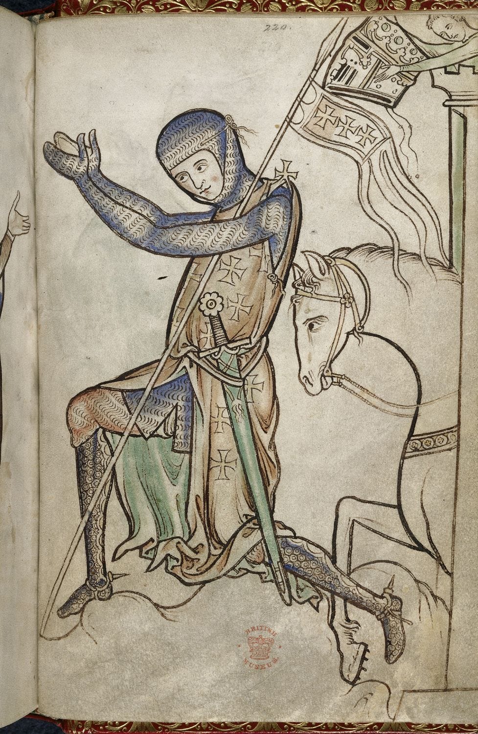
In this portrayal of a knight by the English monk Matthew Paris, from the 13th-century Westminster Psalter, we see a skilled use of line to depict form. Paris controls his line with enough assurance to give it a graceful, flowing quality - a beauty comparable to fine calligraphy. Notice also how he varies the width and darkness of his lines. He does this for two purposes: first, to direct the viewer’s eye toward the parts of the composition he considers most important, since a thicker, darker line draws attention more strongly; and second, to indicate the degree of contrast between an object and its background. Where a light shape sits against a much darker one, the contrast is high, and a bold line is appropriate; where a pale shape sits against a slightly darker background, the contrast is low, and only a thin, pale line is used. Where there is effectively no contrast at all, the skilled artist will allow the line to disappear entirely, even though he knows the edge of an object is there. The less skilled artist tends to put the line in anyway, because he knows intellectually that the edge exists, and this will overrule what his eyes are actually telling him. Line drawing is easy to do poorly - it is how most children begin - but demands genuine subtlety to handle well.
Where line represents contrast by marking a boundary, the second approach represents it by painting tonal values directly, as the eye sees them. This is harder than it sounds. Most people must be trained to observe what the eye actually sees rather than what the mind constructs after processing visual information - and what the mind constructs is always conditioned by memory and prior knowledge of the object. Consider this self-portrait by Rembrandt:
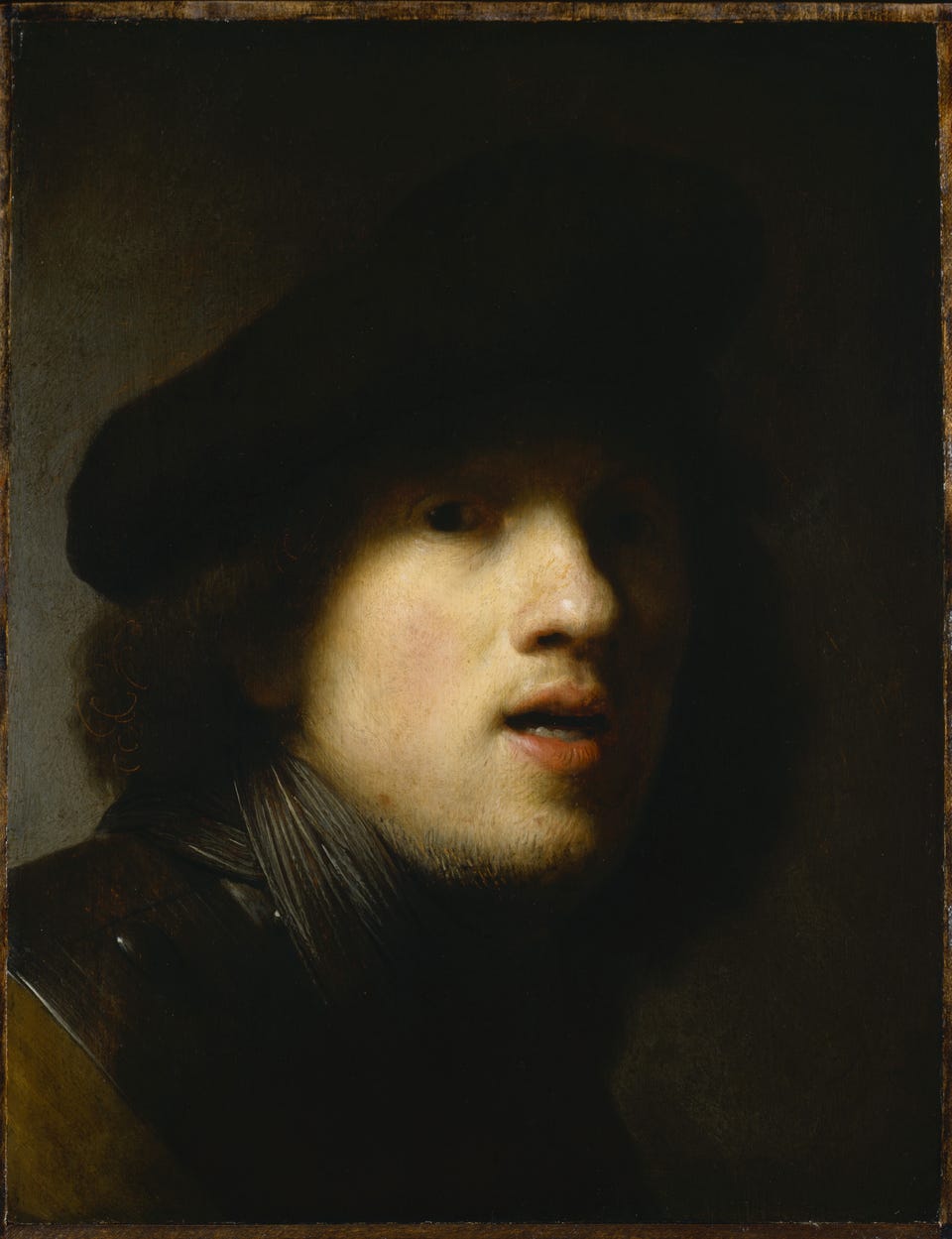
Here, there are no lines at all. Everything is a tonal value, and any apparent edge is simply the junction of a lighter and a darker area. This allows Rembrandt to convey the shape of the face without an outline. He is also willing to let edges dissolve where the tonal contrast is low - the right side of the figure here is barely distinguishable from the background. This points to a deeper distinction between the two approaches. Line tends to show edges and discontinuities; tonal painting can express the gradually changing internal variations of a three-dimensional surface, which is why it lends itself more to high naturalism.
In practice, most artists combine the two approaches, with one playing a supporting role to the other. Matthew Paris is a good example: predominantly linear, but with enough internal tonal variation to suggest the three-dimensional character of the forms. Having considered line and tone, we can turn to the third element - color - which brings its own particular difficulties.
Color
Color can also be used to describe form, but it is the most difficult of the three elements to handle well, for reasons that are easy to overlook.
Consider a grayscale image of something colored in nature. Red and yellow can generally be distinguished, since red tends toward a darker tonal value in monochrome, but red and blue are much harder to tell apart. I can remember watching Liverpool and Everton soccer matches on a black-and-white television in the 1960s: Liverpool in deep red, Everton in deep blue - indistinguishable from the waist up. Fortunately, Everton wore white shorts and Liverpool red, which settled the question. (I am a Liverpool supporter, incidentally.)
The reason this matters to the painter lies in how the eye works. The human eye reads both monochrome and color simultaneously, using different receptor cells - rods and cones - in the retina, and the brain can assess three-dimensional form from tonal and color variation in combination. But while the mind processes this information with ease, it is extremely difficult for the artist to represent it faithfully. Colors do not simply become darker or lighter in shadow - they may shift toward blue in shade, or toward yellow and green in bright sunlight, even though the actual color of the object has not changed. This means that to paint color accurately, the artist must observe what his eye receives rather than what his intellect tells him the color ought to be.
There is a further complication: colors shift not only with light and shadow but also with distance, through what is called color perspective. The green of leaves becomes progressively bluer the further away they are, which is why mountain ranges always appear blue on the horizon - hence the song about the Blue Ridge Mountains of Virginia. Tonal contrast also decreases with distance, so that those blue mountains become not only bluer but lighter the further away they are. The skilled naturalistic artist must hold all of these variables in balance simultaneously, and few manage to do so well.
Here is one who did:
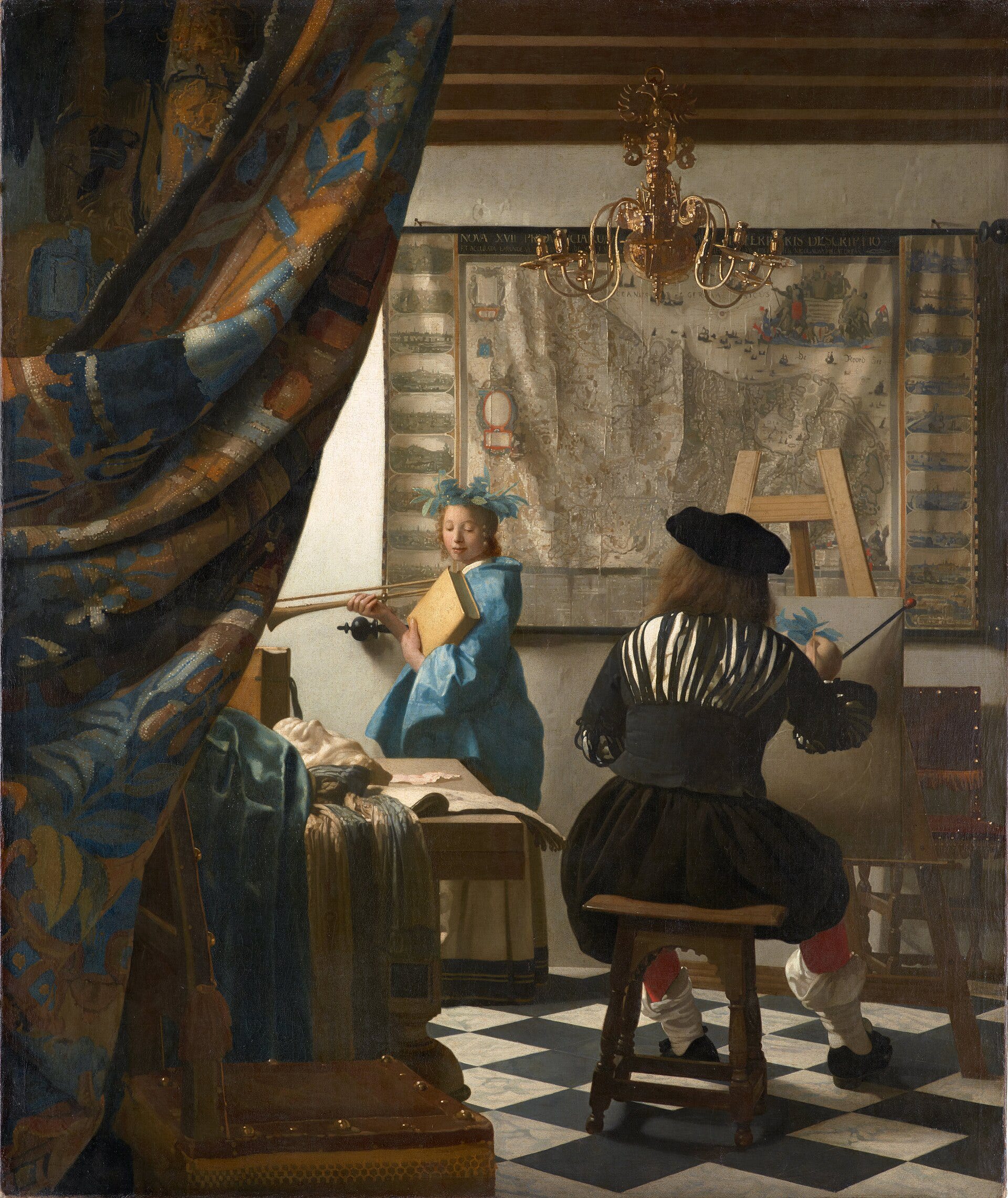
In Vermeer’s The Art of Painting (c. 1666), notice the large draped curtain pulled to one side. We judge the actual color of its pattern by looking at the mid-tones - the areas neither bleached by direct light nor lost in deep shadow. Vermeer has shifted the colors so that what is blue in full light becomes reddish in the shadow, and vice versa; yet the eye reads the fabric as a consistently colored pattern, because the brain instinctively compensates for exactly this kind of variation. To do this in paint, Vermeer had to observe the colors as his eye received them rather than as his intellect classified them - suppressing the very interpretive process by which we normally make sense of what we see. This capacity is rare. Most Baroque masters simplified the problem by concentrating on tonal variation and applying Vermeer’s kind of color sensitivity only at the main focal points.
Closely related to the handling of color and tone is the question of how the artist represents distance itself - not just the color shift of distant objects, but the whole problem of conveying size and space on a flat surface.
Judging Distance and Size
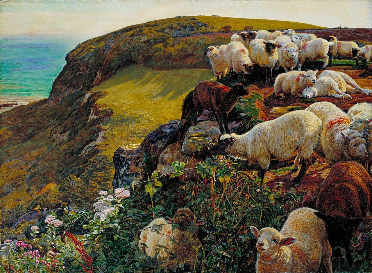
If we see a figure in a painting, we may estimate his height by comparing him to familiar objects nearby - a door, a table, another figure. But we also judge distance by the resolution of detail: when something is far away, we cannot distinguish its finer features as clearly as when it is close. A good artist knows this and uses it. One of the most common errors of beginners is to paint distant objects with as much detail as near ones - every leaf on a distant tree painstakingly rendered. This creates an image that is somehow mentally exhausting, overloaded with information the eye would never actually receive at that distance. Both the Pre-Raphaelites and the modern photorealists can be guilty of this, and in different ways the results share a quality of incongruity: the painting is the product of technical accomplishment, but somehow we sense, even if we do not know why, that something is visually wrong.
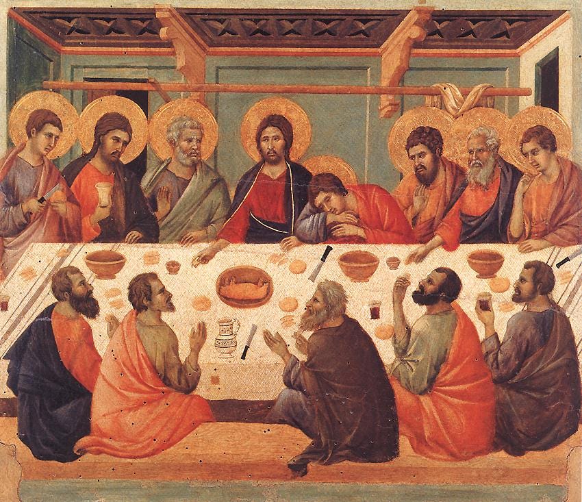
Yet this same principle, once understood, can be turned to deliberate and powerful effect. Artists who consciously heighten detail at apparent distances and, in doing so, deliberately override natural perception can imbue their images with a symbolic or heavenly quality. In heaven, to behold something fully is to know it fully; heightened detail across an entire picture plane suggests a mode of seeing that is not bound by natural distance. Gothic painters such as Duccio and iconographic painters such as Andrei Rublev understood this and used it consistently. Their images carry a sense of participation in a different order of reality - one where the ordinary limits of perception do not apply. There is a skill in using this as a visual tool: for the break from naturalism to work, everything else present in the painting must support the idea that we are looking at heaven, so that the heightened level of detail no longer strikes the viewer as incongruous.
Putting It All Together
The artist composes his picture as a whole by weighing and combining these elements - line, tone, color, detail - in different proportions and with different emphases. The resulting balance between naturalism and abstraction, between depicting the visible world as it appears and representing realities that transcend it, characterizes the style of a given work and the tradition to which it belongs.
It is commonly said that a good artist knows the rules, and a great artist knows when to break them. I do not think this is quite right. These are not arbitrary rules but principles grounded in how images actually work, and the genuinely skilled artist does not break them - he applies them differently depending on what he is trying to represent. The same principle of detail and distance is applied one way when painting the natural world, where detail diminishes with distance, and another way when painting heavenly subjects, where it does not. What looks like rule-breaking is usually the consistent application of a different set of governing assumptions about the nature of the subject. The failure of the Pre-Raphaelites and photorealists is not that they broke the rules but that they applied naturalistic conventions to subject matter and compositions that would have been better served by something else, producing an incongruity they did not recognize and could not resolve.
Perhaps a distinction in motivation should be made here between the Pre-Raphaelites and the Photorealists. The Pre-Raphaelites were generally Christian in motivation and sought to reestablish the late-Gothic style of artists such as Van Eyck, who preceded the Italian Renaissance exemplified by Raphael. This is was part of the broad Victorian neo-Gothic movement that was connected with Anglican and Catholic Christianity in England in the 19th century. What was a very successful movement architecturally was, in my opinion, less successful artistically for the reason I gave above. However, even with this handicap, many examples of their art can still be striking and beautiful and are redeemed in my eyes because the symbolism and choice of subject are handled well and are otherwise in harmony with a Christian worldview. Certainly, it is preferable to much contemporary art!
The Photorealists, however, are materialists who deliberately pack their images with detail in order to reflect their false assertion, from a Christian point of view, that what they represent has no meaning or significance, and they reject the idea that a man is anything more significant than a collection of atoms that we happen to call a man. For them, the collection of atoms we call a man has no more significance than the collection of atoms we recognize as a cigarette butt on the floor.
This framework - line, tone, color, medium, and the handling of detail and distance - is the vocabulary that all visual artists share. The three great traditions I will be exploring in subsequent posts, the iconographic, the Gothic, and the Baroque, each represent a coherent and internally consistent way of deploying that vocabulary. An artist working within one of those traditions handles the elements in broadly the ways characteristic of that tradition, and this is what makes the tradition recognizable. At the same time, the greatest artists within a tradition are recognizable as individuals: Velázquez, for instance, is unmistakably a Baroque painter, yet equally unmistakably himself. Some elements of his handling - his way with tone, his restraint with line, his management of color perspective - are shared with other Baroque painters; others are distinctively his own. Understanding the vocabulary makes it possible to see both things at once.
