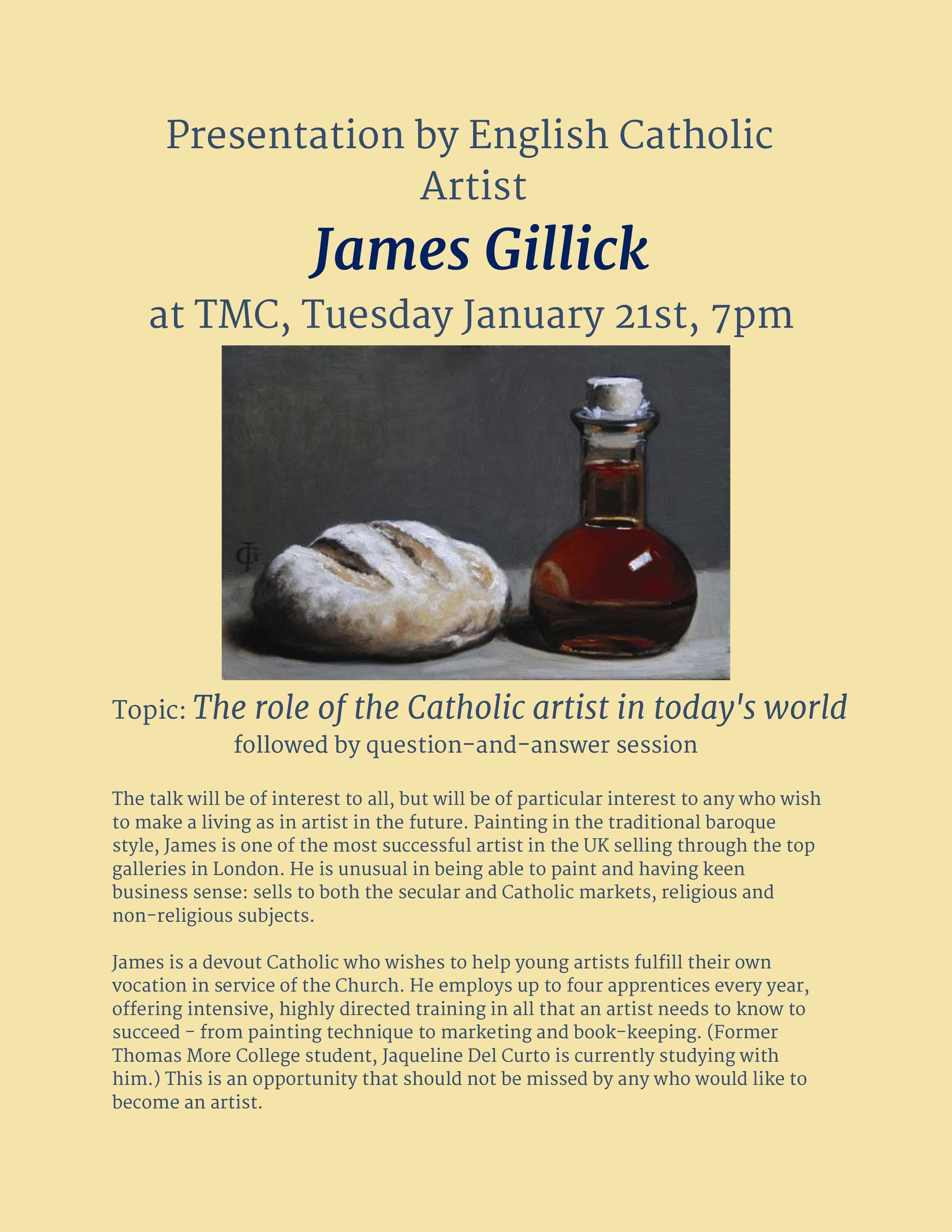
 James Gillick one of the UK's most successful artists, will be speaking at Thomas More College in the library building at the campus in Merrimack, NH this coming Tuesday at 7pm. Jim, who is a good friend of mine and a devout Catholic, paints both mundane and sacred subjects. He is devoted to the re-establishment of a culture of beauty, not only through his own work, but by teaching. He offers up to four working apprenticeships a year. This is an intensive course in which apprentices are expected to work very hard. He teaches not only technique, but also the business skills of being an artist such as marketing and book-keeping.
His talk is open to the public and will be of interest to any who are interested in the arts, but will be of particular value to those who really want to make it as and artist. James is not precious about what he does - he has a refreshing, down-to-earth practicality about his work and the way he discusses it. He is based in Lincolnshire in England and sells through the top galleries in London.
James Gillick one of the UK's most successful artists, will be speaking at Thomas More College in the library building at the campus in Merrimack, NH this coming Tuesday at 7pm. Jim, who is a good friend of mine and a devout Catholic, paints both mundane and sacred subjects. He is devoted to the re-establishment of a culture of beauty, not only through his own work, but by teaching. He offers up to four working apprenticeships a year. This is an intensive course in which apprentices are expected to work very hard. He teaches not only technique, but also the business skills of being an artist such as marketing and book-keeping.
His talk is open to the public and will be of interest to any who are interested in the arts, but will be of particular value to those who really want to make it as and artist. James is not precious about what he does - he has a refreshing, down-to-earth practicality about his work and the way he discusses it. He is based in Lincolnshire in England and sells through the top galleries in London.
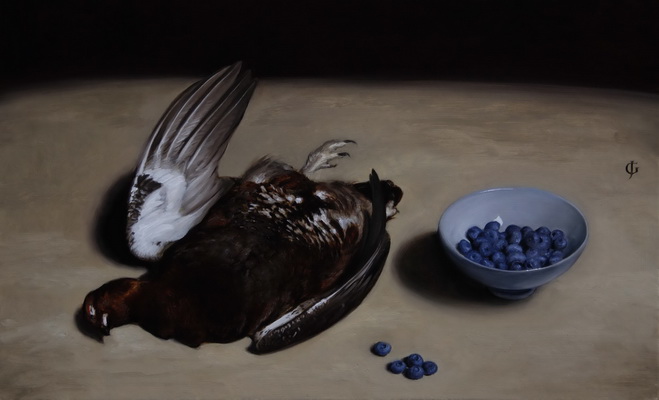
He is largely self taught (although he has the advantage of coming from a family of working artists) and his Catholicism informs his work - he consciously paints in the baroque style . I am particularly fond of his still lives.
When we look at any scene, we do not take it all in, in a single glance. Rather the eye, which has an angle of focus of only about 15 degrees roves around the scene, gathering information that is stored in the memory. We tend naturally to spend more time on those aspects of what is in front of us that we are most interested in and so we have most information about those areas. Those areas that are of less interest we pass over quickly. At any moment, the image on the retina of the eye has a central region that is in sharp focus, and has the greater colour. Peripheral vision is, in contrast, blurred and depleted of colour (the cells in that part of the retina can only transmit tonal information). The reason that we are not conscious of this is that the picture we see in our mind’s eye is supplemented by information given to it by the brain and which is supplied by the memory. If the memory does not have information about this particular scene, then the brain will supplement the picture, so to speak, with what it feels ought to be there based upon what has been seen in elsewhere. This is usually pretty reliable, but not always. (Illusionists manipulate this, for example, by tricking the mind to supply a picture of something that isn’t there.)
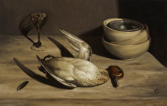
The naturalistic painting of the baroque period (the 17th century), developed a balance of focus and colour that mimicked this natural way of looking at things. The assumption behind it was that mankind is hardwired to appreciate the hand of the Creator in his creation and if the artist works in harmony with the way we see, then the well painted artwork will similarly, through its beauty, point us to the ultimate source of inspiration of the artist. Those areas that are of primary interest in the composition are rendered in sharper focus and contain more detailed information. Similarly, most of the painting, which the artist intends for us to see in peripheral vision is depleted of colour and rendered in monochrome (usually sepia). When this is handled skillfully the artist controls the passage of the eye over the canvas using the interplay of sharp contrast in tone and sharp edges, and supplies greatest detail and colour in those areas that are naturally of greatest interest. They are also the areas that contain most colour.
The academic method of drawing and painting, which was the basis of the baroque style, is gaining ground again, but this baroque balance of focus and tone is not always understood, and even more rarely properly applied. (I am likely to be making this point many times in this blog.) However, James Gillick (who interestingly did not learn his craft one of today’s ateliers of Florence or the US) is certainly someone who is pointing the way to something good for the future: his muted palette and sharp contrast of light and dark is sensitive to the methods of the Old Masters. You can see more of his work at www.gillick-artist.com .