
 After the 17th century, the sacred art of the academies, the baroque, declined. Landscape however, is an aspect of baroque art that not only did not decline, but actually developed in a way that was true to the original principles right through to the end of the 19th century. I will outline the basic form of landscape that established in the 17th century.
The form of the baroque landscape is based upon an assumption that mankind is the greatest of God’s creatures and has a uniquely privileged position within it. The rest of creation is made by God, so that we might know him through it. Creation’s beauty calls us to itself and then beyond, to the Creator. Man is made to apprehend the beauty of creation.
After the 17th century, the sacred art of the academies, the baroque, declined. Landscape however, is an aspect of baroque art that not only did not decline, but actually developed in a way that was true to the original principles right through to the end of the 19th century. I will outline the basic form of landscape that established in the 17th century.
The form of the baroque landscape is based upon an assumption that mankind is the greatest of God’s creatures and has a uniquely privileged position within it. The rest of creation is made by God, so that we might know him through it. Creation’s beauty calls us to itself and then beyond, to the Creator. Man is made to apprehend the beauty of creation.
To illustrate, I quote from a section of Psalm 148: ‘Praise the Lord from the earth, sea creatures and all oceans, fire and hail, snow and mist, stormy winds that obey his word; all mountains and hills, all fruit trees and cedars…’
 None of these aspects of God’s creation is capable of responding to call of the psalm literally. The ‘praise’ is not theirs, but ours. Their beauty inspires and directs our praise. This is one purpose for it. The natural world is not just a collection of atoms conforming to the laws of physics and chemistry. All that it does, through grace, is in conformity to its divine purpose. Having said that, we live in a fallen world. Creation is beautiful yet, amazingly, because of the Fall, it is not as beautiful as it ought to be.
When man interacts with creation (when farming or gardening, for example) he should remember this part its divine purpose and so his work with it should be beautiful too, serving to restore it more fully to fulfillment of what it was meant to be. This is why farmland is profoundly natural and when we farm well (as with anything done well) the result is beautiful.
Once this is accepted then the Christian artist who is painting the landscape should seek to reveal all these truths about Creation. As with all art this is done by consideration of both the content and the form.
The baroque landscape artist, just as I described in my piece about still lives - here - paints in such as way that it gives us information in the way that we naturally look to receive it. As the eye roves around any scene, we spend more time on those aspects which are of greater interest. Our interest reflects the natural hierarchy of being. So we are more interested in farmland than untouched areas, in animal rather than plant life, and more interested in man than a animals. The composition of the painting ought to reflect this. Even if a person is apparently a minor element in a rural scene, the artist should be aware that it is a detail that will catch the eye of the observer.
 The form reflects this too. The artist varies the focus and the intensity of colour. (Again for more detail on this see the previously mentioned article.) Those areas that give the greatest amount of visual information are in sharpest focus and have the greatest colour and these are made the primary foci of the painting. The areas of least interest are rendered in monochrome and out of focus. The beauty of the painting depends upon a harmonious arrangement of these principle foci of interest (usually no more than three or four).
This is never easy but it can be easier in some situations than others. Consider the painting of Susanna Fourment by Rubens, left. This is set in a landscape, but because it is really just a backdrop of what is intended to be a portrait, he has it in a loose focus, largely tonal description.
The baroque developed firstly as a form of sacred art, with a focus on the human person and quickly mastered how to apply these principles to that subject. The greatest focus is in the area of the face and especially the eyes of the individual. (See this article on portraiture for more detail.)
When faced with a beautiful view in all its complexity – beyond anything a man is capable of reproducing exactly – the artist is forced to summarise. He will select those areas of greater interest and supply more detail and colour in these; visually summarise to a greater degree those areas of secondary interest.
 The big problem is the one that is there for all Christian art – the balance of the particular and the general. While clouds in the sky, for example, can be represented as large forms, the problem is particularly acute with the representation of foliage. Trees, shrubs, grassland have to be represented as a collection of the particular: we are aware that a tree, for example, has many individual leaves and this must be indicated; and the general form: a tree forms a massed, cloud-like shape that must be seen as such as well.
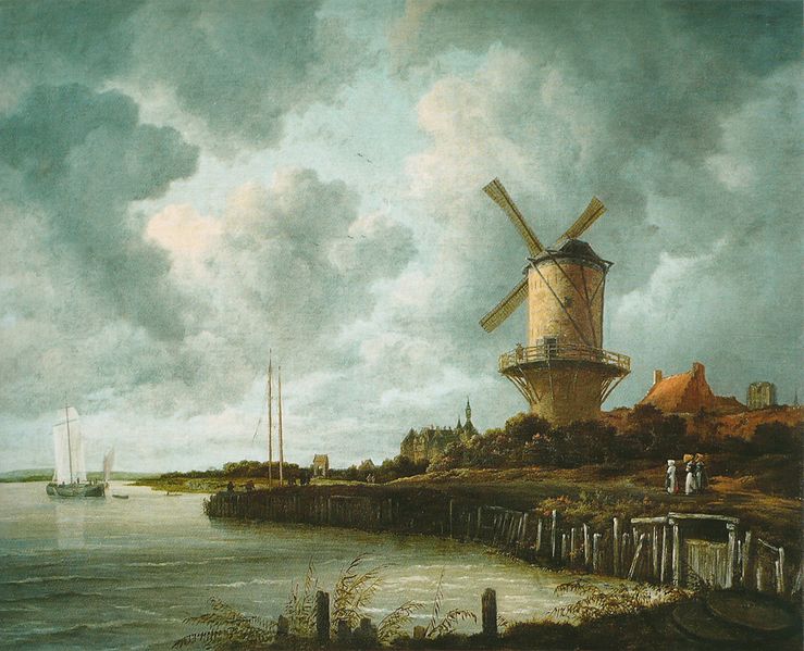
The Dutch artists, who were not Catholic and so had less of a focus on sacred art, applied these principles to landscape with greater energy. Although I love the Dutch landscapes of this period, my personal feeling is that even they never mastered these problems in every respect with regard to foliage. If we look at the landscape by Ruisdael of Bentheim castle, above right, the trees are too feathery. There is too much focus on the particular and not enough of the general. Future articles will describe how later artists overcame this problem.
 Seascapes pose a different problem, somewhat easier to overcome. The sea and clouds in the sky are more easily seen as large forms (though still requiring great skill to portray successfully if one wishes to conform to the baroque ideals). If we place a boats can be the foci, even in the distance, and then the sky and the sea can be made secondary to the composition and toned down and put evenly out of focus.
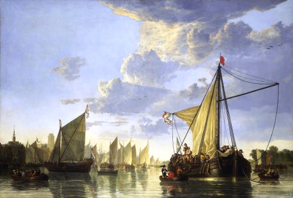
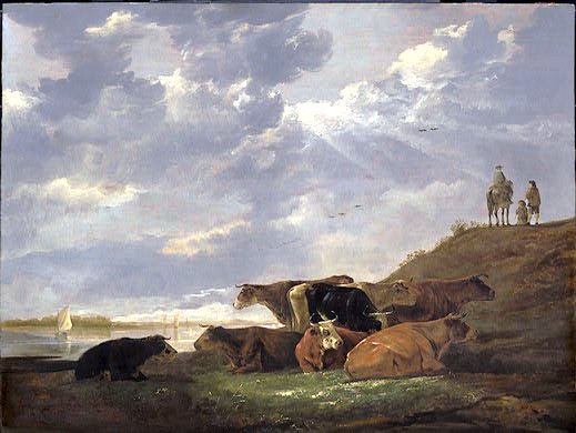
The great Dutch painter Aelbert Cuyp seemed to get around the problems by avoiding trees. He painted wonderful seascapes (see example above left) His pastoral scenes tend to be fields, or even cows standing the water! Nevertheless looking at his painting below, we see the classic baroque variation in focus and colour with even the grass pale brown except in the focal points.
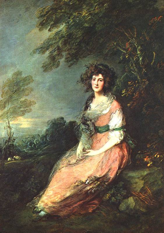
The other problem relates to the variation in colour. As I mentioned, those areas of least interest are rendered tonally. The baroque tradition, with its emphasis coming from the language of light and dark in sacred art, tended to render the tonal areas in sepia, changing to blue for distant areas. The reliance on sepia works well for portraits, but landscapes with large tonal impressions sepia always give the impression of being deep shadow. It makes it difficult to paint a bright sunny day. All these paintings appear to me as though the shadows are in deep shaded woodland. Later artist began to vary the base colour of these tonal areas to blue-greys and green-greys rather than sepia. We will see in later articles how later artists, such as Corot, overcame this. It took some time for them to do so. Looking, below, at the landscape (and portrait) of a later British artist, Thomas Gainsborough, who although working in the 18th century nevertheless continued for the most part to paint in the classic baroque form, we still see this deep sepia shadow and feathery portrayal of tree foliage.
Other paintings shown are top, windmill and seascape by van Ruisdael; and second from top, Landscape with Rainbow by Rubens
