

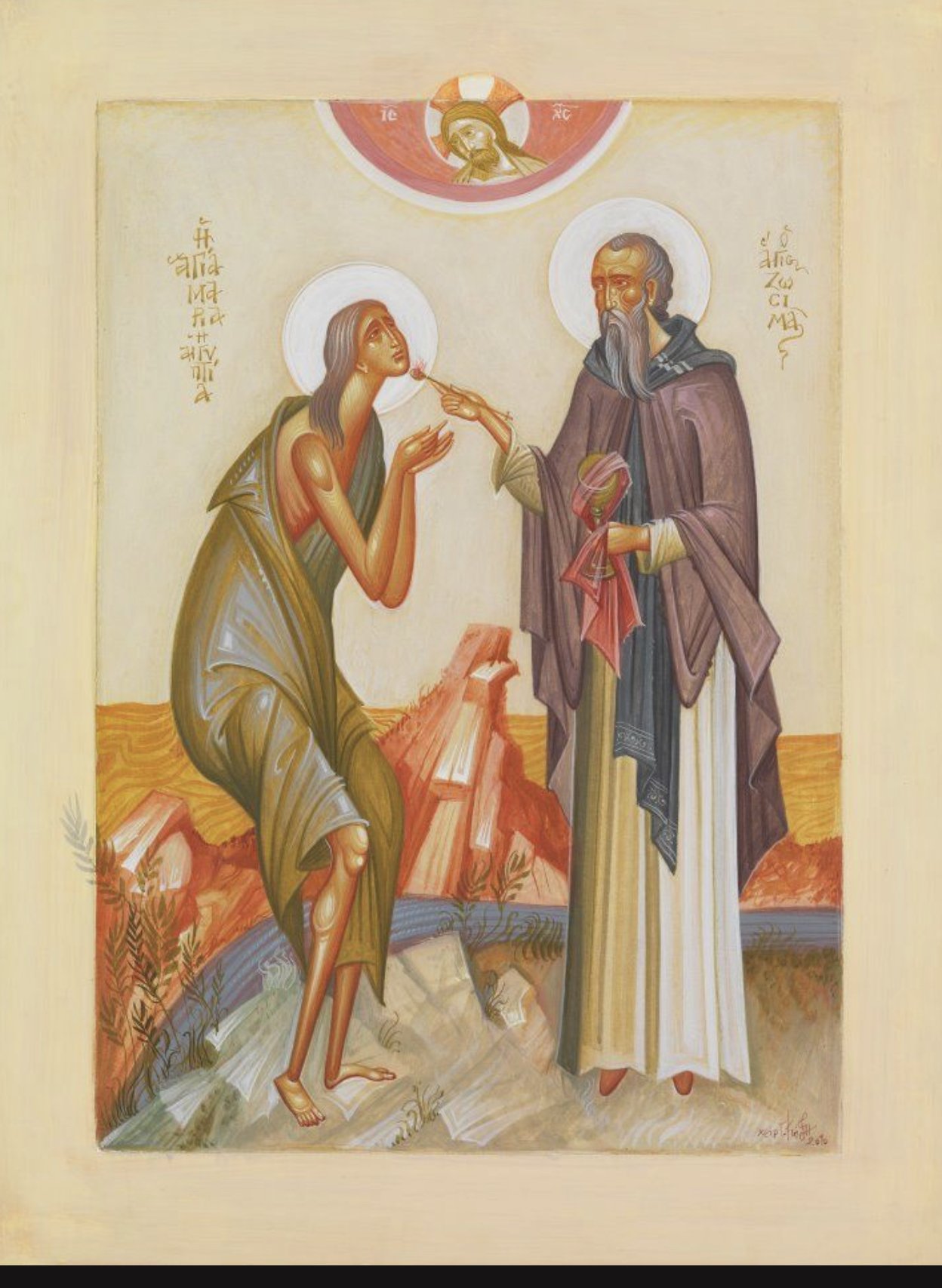
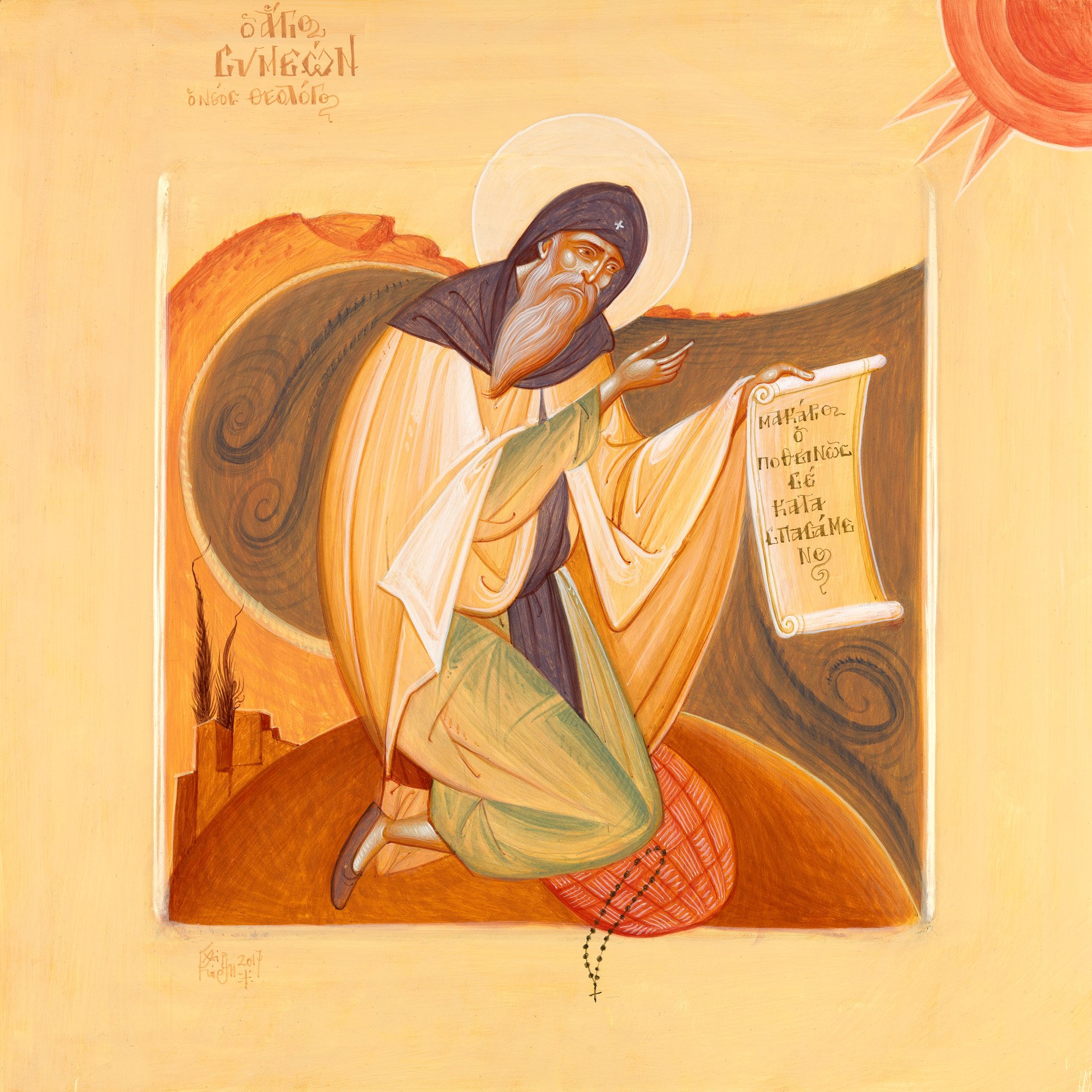
Here are a few more examples of work by the Greek artist, George Kordis, whose work was featured just a couple of weeks ago. I was intrigued by the style of his work and present these examples today with a slightly deeper analysis of his work, but for the most part, simply for your enjoyment. Kordis is always precise in his use of line and it is this precision that allows for some looser, more expressionistic (and I use that term guardedly, it is never slapdash) application of paint.
I don't know with certainty the method that Kordis uses, but that is not the object of the exercise here. As an artist, I am primarily interested in how I might attempt to replicate or incorporate partially the effects and stylistic elements that I like into my own work. Accordingly, what I am going to describe is the method that I would use if I was to try to adopt aspects of his style in my own work, based upon an analysis of the photographs I have seen. I have a reason for doing this: when I was taught iconography my teacher Aidan Hart, would instruct us on how to paint or draw the icon as one might expect, but very often he would also describe how he worked out how to use this method by analyzing past works of art. Through this additional instruction, I was being taught, in effect, to teach myself by looking at the work of any artist that appealed to me. When using past masters as a model for my own painting the motto that I was given was, 'Think twice, paint once.'. In other words, consider carefully what you think the artist did, then decide what you are going to do, and then do it! It couldn't be further from the idea of stream of consciousness expression, which seeks to disengage from rational thought and be guided solely by the emotion of the moment. In the method I was instructed in, even loose and what we might term expressionistic brushwork is premeditated, however spontaneous it might appear.
This ability to teach oneself is important for artists today, I feel.
First, in the field of sacred art and especially iconography, most people will not have access to a fully integrated six-year program of instruction that teaches how to paint, soup to nuts, so to speak. Most will have random and varied access to individual workshops. It is for the student, therefore, to choose a range of workshops that those that are available, perhaps from several different teachers, so that they form an integrated pattern of art education. It is very unlikely that these will combine to give the student everything that is needed. It will be essential, therefore, for the student to be able to fill in the gaps by undertaking focussed, self-directed study. The student who has the capacity to learn from a painting without any other direction will always be at an advantage, therefore.
This capacity for self-directed study by analysis of Old Masters' work can be adapted to any style, So although I learned it in the context of iconography classes, I might then use it to learn to paint in the way of a 13th-century Sienese gothic artist such as Simone Martini.

There is another reason for developing this habit and this is an antidote to what is almost the opposite problem (although much rarer at the moment) that is too much hands-on direction from the teacher. This is a risk of attending one of the few schools teaching the naturalistic method of drawing and painting which is based upon those developed in the High Renaissance. It is called the Academic Method and is so-called because the first schools that taught it, 500 years ago or so, referred to themselves as 'academies' in an attempt to connect themselves in people's minds with Plato's Academy and Greek learning in general.
The 21st-century versions of these academies are steadily establishing themselves there are a few that have permanent studios and are offer a more stable, long-term art education, albeit typically without the advantage of working within mainstream universities (although there a few are offering degrees now, eg The Florence Academy). The form of teaching that is offered is highly prescriptive and systematic. This is appropriate for such a training that aims to give the student a high level of skill, but there is an accompanying danger that goes with this, and that is that students become trapped in the teaching studio because they are so reliant on the teacher's directions that they are not able to work independently apart from the studios of the school. The capacity for self-study can help give students the confidence to break free and start to work independently, at an appropriate stage of course.
You don't need to follow the color palette of Kordis. I am aware that he takes risks here and for me sometimes it works spectacularly and sometimes it misfires a bit, but it is always interesting.
1. Draw the line


2. Describe basic form in monochrome as an underpainting. The goal is to produce, in effect, a grayscale version of the painting in all the detail intended for the finished painting. The color used here is a brown ochre or avana ochre.
3. Then place transparent washes of flat color over the underpainting. This is the stage that application can be loose. Mottled effects, multiple colors, areas left so that only the underpainting can be seen, are options that can be considered. Resist the temptation to use too much opaque color. As you paint this stage it will feel as though more color is needed, but hold your nerve and keep to layers of dilute and therefore transparent paint. Generally, we want the tonal values of the underpainting to be visible. If multiple layers of transparent washes are used then it will introduce a beautiful optical effect when the icon is later illuminated, especially in flickering candlelight. The transmitted light will be partially transmitted and partially reflected at each interface of color. The light that is reflected emerges from the icon and is seen by the observer and is the color of the surface it most recently reflected off. Where there are multiple layers of different colors you will see light of many colors emerging. This creates a jewel-like effect in which the icon appears to be a source of glistening light.

Finally, I would then add highlights. These are graded in transparency so that at the highest point of a rounded surface they are opaque, and graded through to translucent at the edge so that they blend into the colored wash painted in the previous stage.

I call this final stage highlights, but generally, these are lighter in tone. However, counter-intuitively, the artist can apply them in the same form - going from translucent to opaque following the form as above - but using darker tone colors. The famous Russian iconographer from the 14th century used this technique in his famous Trinity/Hospitality of Abraham icon, for example. This creates a sense of iridescence. Kordis uses both light and dark highlights.

There is another stage that could be added, and that is a pure white super highlight, which is usually a well-placed line that sparkles on the very highest point of the surface or on the glistening edge.
You can see this on an icon by another iconographer, The Annunciation by Emmanuel Cusnaider

