High Renaissance

Titian the trailblazer - showing us how to balance naturalism and symbolism

titian.self.portrait
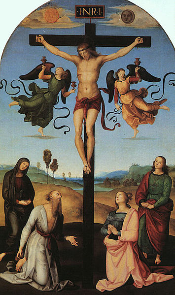
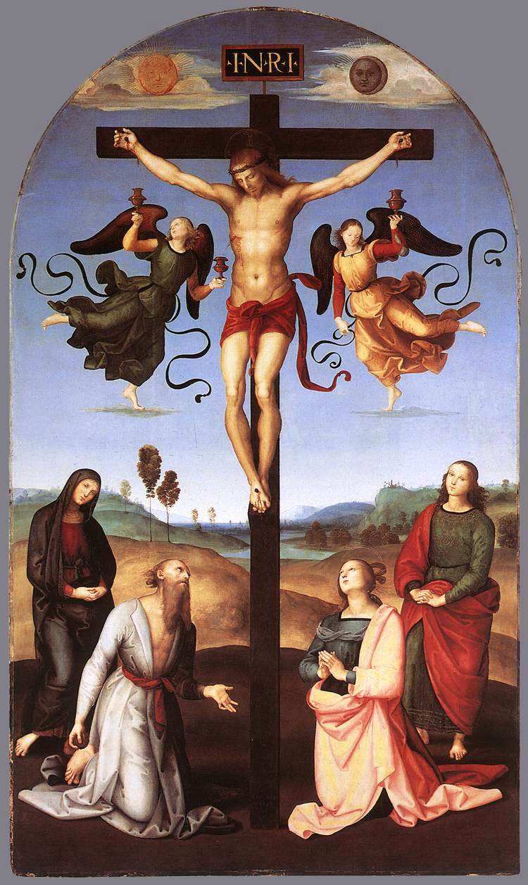
Titian is one of the greats of Western art. He lived from about 1480 to 1576, in Venice, and was active almost right to the end of his life. He began painting in the period of the High Renaissance and when he died was in the latter part of the 16th century which was characterized by individual artistic styles collectively called 'mannerism'. Titian's style, though individual to him when he established it, was highly influential and much of what characterized the baroque tradition of the 17th century was derived from his work. In some ways he can be considered one of the pioneers of the baroque style that dominated in the 17th century. This is important because the baroque is the one artistic traditions that Pope Benedict describes, in his book, the Spirit of the Liturgy, as being an authentic liturgical tradition. Some people may be surprised, as I was, to discover that the High Renaissance (the style of Leonardo, Michelangelo and Raphael from about 1490 to 1525) is not considered fully and authentically liturgical (ie right for the Catholic liturgy). This is not to say that there are not individual works of art from these great artists that might be appropriate, but that it was not yet a coherent tradition in which a theology of form had been fully worked out, as was later to happen for the baroque. Pope Benedict argues that for the most part it was too strongly influenced by the pagan art of classical Greece and Rome and reveals the self-obsessed negative aspects of classical in a way that is not fully Christian.

As a young man Titian trained during the High Renaissance and the influence of this can be seen in this early painting of his, the Enthronement of St Mark. At the feet of St Mark are Ss Cosmas and Damien on the left, and St Sebastien and St Roch on the right. This was painted in 1510 and one could be forgiven for thinking it was painted by Raphael. Notice how sharply defined all the figures and all the details are, even the floor tiles.

800px-Titian_-_St_Mark_Enthroned_with_Saints_-_WGA22765


If you compare this with the following paintings we see how his work changed as he got older. The first is Cain and Abel painted in 1543; and the second is the entombment of Christ, painted in 1558. In the latter Joseph of Arimathea, Nicodemus and the Virgin Mary take Christ in the tomb watched by Mary Magdalene and Saint John the Evangelist.

Titian_-_Cain_and_Abel

Titian - Entombment

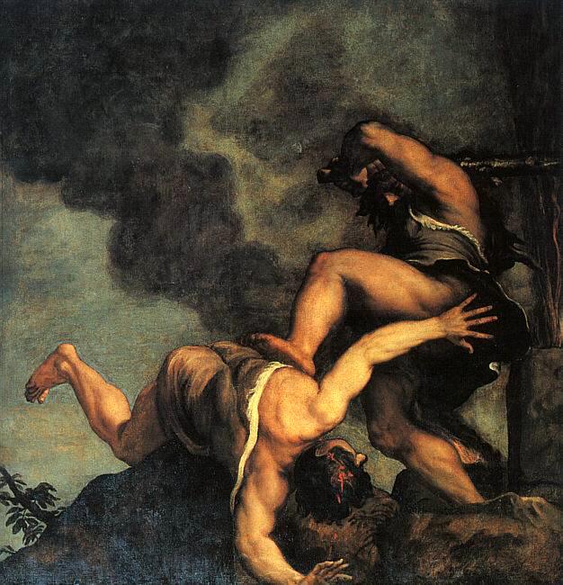
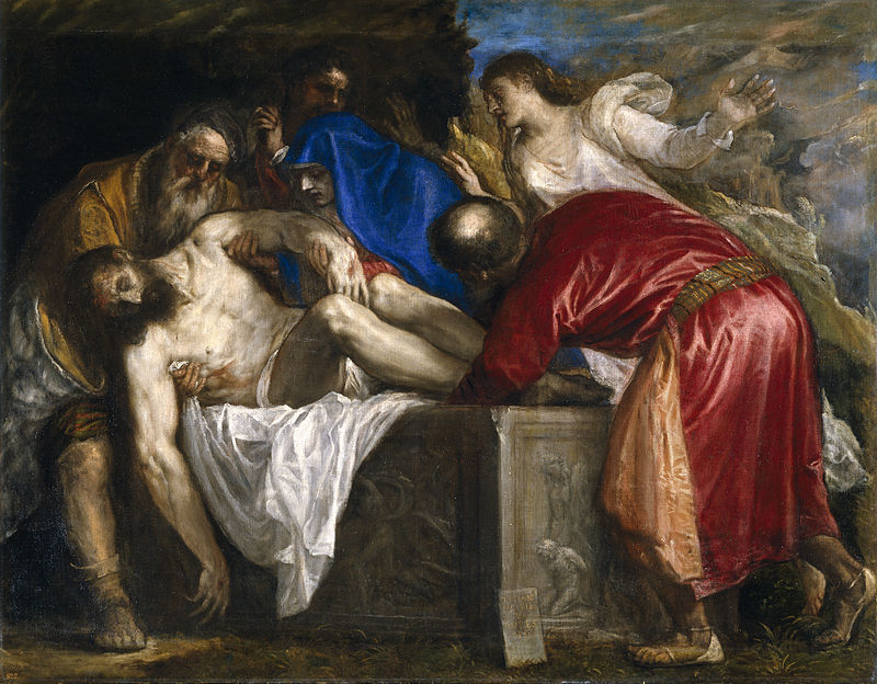
We can see how, in contrast to the first painted how diffuse and lacking in color much each painting is. The edges are blurred in many places and only certain areas have bright or naturalistic color. Those areas of primary focus are painted with sharper edges and with bright colors. This is done to draw our attention to the important part of the composition. He cannot apply bright color to the figure of Christ but notice how he uses the bright colors from the clothes of the three figures who are carrying him to frame his figure. In contrast the two figures in the background are depleted of color and detail. He wants us to be aware of them, but not in such a way that they detract from the most important figure. He uses the white cloth draped over the tomb in the same way, making sure that the sharpest contrast in tone, light to dark is between this and the shadow of the tomb. They eye is naturally drawn to those areas where dark and light meet and this is how Titian draws our gaze onto Christ.

It is suggested that this looseness of style in Titian's later works occured because as his eyesight declined, he was unable to paint as precisely as he had done as a young man. This may well have been what forced him to work differently, but if so, all I can say is, my, how he accomodated his handicap so as to create something greater as a result!

If we go forward now to early 17th century Rome, it is the artist Caravaggio who is often credited with creating the characteristic visual vocabulary of exaggerated light and dark of the baroque style. We have seen deep shadow and bright light before this time, but Caravaggio exaggerated it and embued it with spiritual meaning in a new way. The shadow represents the presence of evil, sin, and suffering in this fallen world; and it is contrasted with the light which represents the Light, Christ, who offers Christian hope that transcends such suffering.

Caravaggio_-_The_Incredulity_of_Saint_Thomas

This visual vocabulary of light and dark can be seen in the painting above. Notice how it is so pronounced that in this example we do not see any background landscape; all apart from the figures is bathed in shadow. One thing that Caragaggio does retain from the visual style of the High Renaissance is that generally his edges are sharp and well defined, even if partially obscured by shadow. Other artists looked at this and while adopting Caravaggio's language of light and dark, incorporated also the controlled blurring edges that characterized Titian. What we think of as authentic baroque art is a hybrid of the two.

Look at the following painting by the Flemish artist, Van Dyck, St Francis in meditation, painted in 1632:


We can see how much he has taken from Titian in this painting. Van Dyck trained under Rubens. As a young man in 1600, Rubens travelled to Italy where he lived for eight years. His travels took him to Venice (where he saw the work of Titian), Florence and Rome (where much of Caravaggio's work was). He was influenced strongly by both and passed on these influences to his star pupil.


Raphael's Crucifixion - a Portrayal of the Mass

This article about the 'Mond' crucifixion, which is in the National Gallery in London, is another by Dr Caroline Farey of the Maryvale Institute. She and I worked together to design the Institute's degree level diploma (6US credits): Art, Inspiration and Beauty in a Catholic Perspective. A distance learning course requiring one residential weekend. This can be taken either by application to the Institute in Birmingham, England, or in the US through their centre based at the Diocese of Kansas City, Kansas, (email ecat2@archkck.org for details). In addition to these courses by the Institute, Thomas More College of Liberal Arts in New Hampshire has a summer programme run by myself. This programme includes an icon painting class and weekend retreats for artists, details here.

Caroline writes: Time and eternity, death and life, heaven and earth are represented here as contrasts or paradoxes and yet Raphael also presents them as in harmony.

Contrasts. Look now for as many contrasting elements as you can.Perhaps the most obvious is that of the sun and the moon both appearing together

Look for life and death contrasts.Do you notice that the most animated parts of the picture are the ribbons and dresses of the flying, dancing angels.These, the most alive are positioned closest to the dead figure of Christ.It is as though whatever is touched by the blood of Christ is given abundant life.

Look for time and eternity contrasts.Can you see that the people of the earth seem caught in a seemingly eternal stillness while the eternal beings, the angels, seem to be part of that moment in real time at the actual crucifixion catching Christ’s outpouring blood for every future Mass.

Look at the background contrasts of colour and content.The dark cross rises out of the dark, bare earth, passing barren but golden hills behind, passing on and up through water, always symbolic of Baptism, past a great city and on up into the skies where there is the sun and the moon are attending the great cosmic event of the death of their Creator.

Harmony

How does the painter hold the picture together and illustrate the harmony achieved by Christ through such an ignoble death?The heavy dark cross is the strong uniting feature.This is so theologically and so it is particularly appropriately pictorially as well.Christ’s death on the cross is the great act of love which purifies the created world in order to unite heaven and earth.It is this same act of unity that takes place at every Mass. In the painting it stretches from the top to the bottom of the picture.

The colour red has particularly strong significance. Every figure has a touch of red, every figure in the picture is pictorially touched and redeemed by the blood of Christ.

Other colours also link the elements of the picture.What are the colours in the top half of the picture that are repeated in the bottom half?The blue of the sky is picked up in St Jerome’s clothes; the green of one of the angels is also in St John’s garments; the gold of the second angel is in the sun and the hills and lights up the clo ak of St Mary Magdalene who is radiating light reflected from the sun but also the Son whose love changed her life; the colour of the flesh of all the figures binds them to the body of Christ whose flesh dominates the centre of the picture.

The painting is an altarpiece.It is designed for the Mass.

In a painting, people’s looks are often messages.In this painting the direction of each person’s gaze speaks a language of engagement for the sake of the congregation at Mass inviting them to join the scene at the cross.Let us begin with Jesus.He has his eyes closed so he is not looking at anything on this earth.His concentration we know is on his Father in Heaven.Now look at some of the others.What is the angel in green looking at? The angel in green turns our attention to Jesus’ blood.

Who is the angel in gold looking at?The angel in gold is looking at St John the gospel writer who is looking straight at us.

The two kneeling figures are St Jerome and St. Mary Magdalene.Who are they looking at? St Jerome and Mary Magdalene turn our attention to Jesus’ body on the cross.

The two standing figures are Our Lady and St John.Who are they looking at? When someone looks out at you from a painting he or she is trying to draw or invite you into the scene.Our Lady and St John are painted in a way that suggests that they are quietly hoping that we too will kneel or stand, and beg forgiveness like St. Jerome or adore and give thanks like St Mary Magdalene.

Almost everything in this painting is about the Mass: we gather together at Mass around the sacrifice of Christ on the cross; Mass brings us salvation through the cross; we kneel and worship at Mass like Mary Magdalene kneeling at the foot of the cross;we pray at Mass in different ways, such as asking forgiveness like St Jerome, adoring or thanking God, like Our Lady; we receive the blood of Christ in a chalice at Mass like the cups carried by the angels and, of course, angels are present at Mass.

I would add this one additional reference to the Mass in the comspositional design of the painting. If you trace a line through the four heads of the observers below to the outer feet of each angel and then to their heads, it traces the shape of a regular octagon. This is a visual reference to the 'eighth day' of creation - in which the birth, passion, death and resurrection of Our Lord ushers in the new age. My sense is that this is not intended by Raphael as a symbol to be read, so much as a design feature that he feels is appropriate to the subject and so enhance its beauty will naturally aid the communication of its message at an intuitive level. (DC)


What Colour are the Blue-Ridged Mountains of Virginia?

Do Laurel and Hardy have something to teach us about colour perspective? The words of garden designer Gertrude Jeckyll seem to confirm the words of the American comedians. Laurel and Hardy sang about the blue-ridged mountains. But were they seeing blue mountains or green mountains in Virginia?

When learning to paint landscapes I was taught the principles of colour perspective. In a natural landscape those parts that are in the distance look bluer. Artist use this to indicate distance. A good gardner understands, along with the landscape painter and the this too. Just as with a painter, the gardener is creating a beautiful scene and will consider the combinations of colour so that the whole scene is harmonious. When considering how distant flowers will combine with those that are closer, he must take into account the fact that everything looks bluer when it is further away.

There is a another way of making use of this. If I want to enhance the sense of space I can create artificial perspective. The gothic architect made the distant objects smaller in reality, so that it doubles the natural effect of perspect and made things seem even further away than they are. Consequently, gothic cathedrals seem to soar to heaven. The gardener can use large-leaf plants closeby and small-leaf plants in the distance, so creating the illusion that things are further away than they really are. Similarly he can put bluish green leaves and blue flowers in the distance and other colours in the foreground and it will reinforce this further. It is useful if you have a small garden but want to create a sense of greater space.

Even when we know this it is not always easy to see it. When we focus on a distant point, the mind modifies the information that the eye supplies it to create an image in our mind's eye that is affected by what we know, or think we know, to be true. So looking at distant hills that are blue tinged we don't believe that they are really blue, the brain knows that they are in the distance and we very often see it as green.

Gertrude Jeckyll was a garden designer who used her artistic training in the academic method in the choice of planting. She describes here how she convinced a skeptic of the fact that things in the distance really do look blue:

'As for the matter of colour, what is to be observed is simply without end. Those who have not training in the way to see colour nearly always decieve themselves into thinking that they see it as they know it is locally, whereas the trained eye sees colour in due relation as it truly appears to be. A remember driving with a friend of more than ordinary intelligence who stoutly maintained that he saw the distant wooded hill quite a green as the hedge. He knew it was green and could not see it otherwise till I stopped at a place where part of the face, but none of the sky bounded edge of the wooded distance showed through a tiny opening among the near green branches, when to his immense surprise he saw it was blue. A good way of showing the same thing is to tear a roundish hole in any large bright-green leaf, such as a Burdock and to hold it at half arm's length so that a distant part of the landscape is seen through the hole and the eye sees the whole surface of the leaf. As long as the sight takes in both it will see the true relative colour of the distance. I constantly do this myself, first looking at the distance without the leaf frame in order to see how nearly I can guess the truth of the far colour. Even in the width of one ploughed field, especially in autumn when the air is full of vapour, in the farther part of the field, the newly turned earth is bluish-purple, whereas it is rich brown at one's feet.'

So it seems that Laurel and Hardy could have been landscape painters, or gardeners - each had an artists eye!

Images: the Appalachians in Virginia; the garden scenes are of a small walled garden on Holy Island, in the Farne Islands of the coast of Northumberland in England. This designed, to some degree, to be seen from the bench seat visible below. The wall protects the garden from high winds. I struggled to find photographs of her planting that illustrate very strongly the principles I have been describing, but though the photos of this garden would be of interest to readers anyway!; the watercolours below are by John Singer Sargent and W. Heaton Cooper the 20th century English painter respectively.


Antonio Begarelli, A Forgotten Master: by Matthew James Collins

This is the first in an occasional series written especially for The Way of Beauty blog by my former teacher (when I was learning the academic method in Florence) Matthew James Collins. He will highlight lesser known but nevertheless great artists of the baroque and High Renaissance period. Matt is an excellent artist himself and knows more about the baroque and High Renaissance methods and artists than anyone else I know. An American he has now settled in southern Italy and his writing reflects his deep knowledge of that country and its art, as well as special insights into the artistic methods of the time. If you check out his blog you will see he has just written about his painting of Jesus Carrying the Cross which is well worth reading too. The history of art is full of benchmarks of Genius.  They are signposts used to indicate periods and style.  They encompass ideology and the zenith of human achievement.  Their names conjure dreams: Giotto, Michelangelo, Caravaggio, Bernini.  However, an overemphasis on their greatness risks to isolate them from their context

Art is a continuum where generations of artists and their accumulated knowledge that create an environment where Genius can blossom.  When we look more closely at the second masters, we find a lot of terrific artists. One of these is Antonio Begarelli.

When one thinks of life-size sculpture, the materials that come to mind are marble and bronze.  But it is important to remember that the humble terra-cotta has been an important medium for sculpture on the Italian peninsula since the time of the Greeks.  There are some really nice pieces in the collection of the Getty Villa in Malibu, such as these, right: Poet as Orpheus with Two Sirens, circa 350BC.

Begarelli was born in the Italian town of Modena in 1499.  Very little is known about  his childhood and absolutely nothing about his artistic formation.  Yet his work is absolutely wonderful.  His first major work was the Madonna di Piazza completed in 1522.

The next image is of his Madonna di Piazza, terracotta, h. 190cm.

In 1520 the city of Modena was planning to commission a sculpture of the Madonna for a niche located in the main piazza.  Begarelli, only 21 at the time, offered the above piece that was already completed.  Originally is was colored to look like marble. This was a common

Terracotta is a tricky medium and creating such large pieces is extremely difficult. The first step was to create an internal armature for the sculpture to be completed that would support the weight of the wet clay during the modeling process.  (as the clay is not able to support its own weight)  The sculpture was completed and allowed to dry until it was leather hard.  Afterwards it was sectioned off and removed from the armature and each piece hollowed out carefully to allow an even drying.  Once completely dry, all the pieces were strategically placed within a free flame kiln and cooked.  The pieces were then reassembled, joints stuccoed and imperfections corrected.

There are a lot of potential hazards along that path.  The industrialization of ceramic production has eliminated many of those risks.  Pre-19th century artists and craftsmen required a long apprenticeship to learn all the aspects of their particular trade.  Materials were not bought in an art supply shop, they were produced.  To make the clay different types were extracted from the ground, dried, and cleaned of impurities. Once reconstituted they were then kneaded together to differing proportions depending upon the required color and handling properties.

Kilns today are of either the gas or electric variety.  They are temperature controlled and whole process is programed and guided by a computer.  Before this innovation they were basically rooms heated up with fire.  The cooking process could last over 24 hours.  All this taken into account, it is quite amazing that Begarelli was able to produce such an accomplished work at such a young age.

His career took off from that point and he worked quite steadily until his death in 1565.  Since he did not travel much, to see his work properly one must travel to Modena.  Below are several images representative of his oeuvre.

Here are some more works by him:

San Giovanni Battista, terracotta, h. 38cm

Madonna col Bambino, terra-cotta, life-size


 Deposition of Christ from the Cross, terra-cotta, life size, Church of San Francesco, Modena

To learn a little more about Begarelli there is a Wikipedia entry,  here.


There is also a nice video on youtube that has some nice details of his work.  It can be found here:

http://www.youtube.com/watch?v=eTsN7pt3BIE