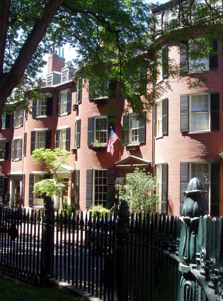
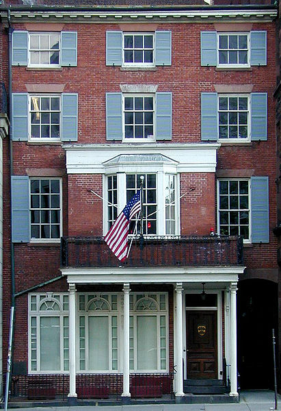
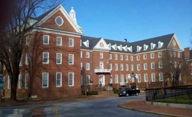
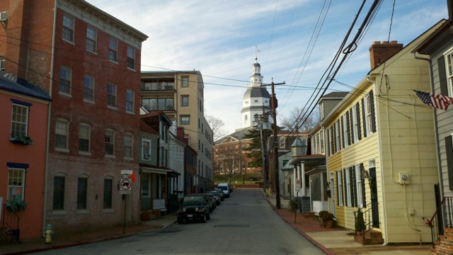
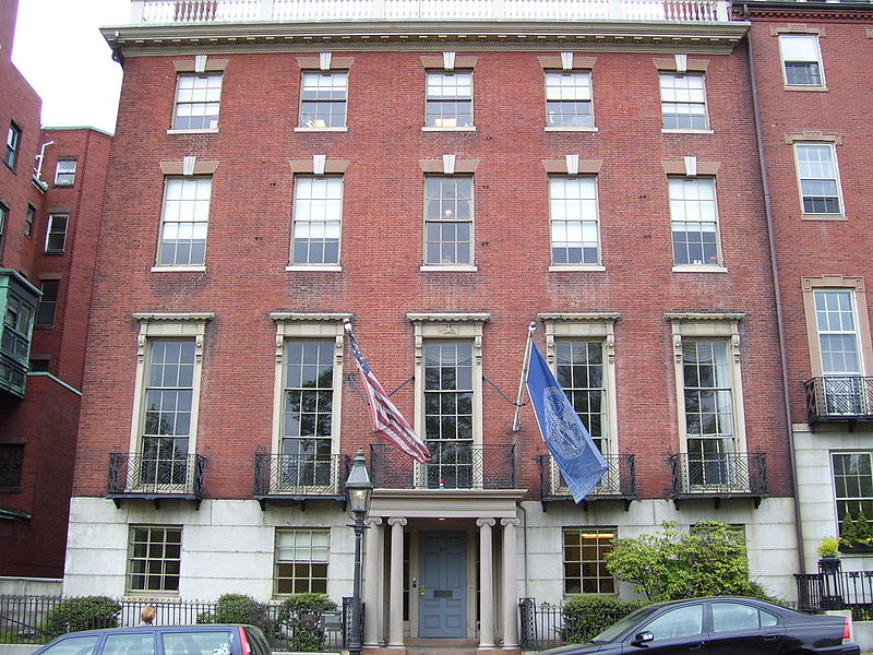
We can make a Beacon Hill anywhere This past weekend I drove down to Boston from southern New Hampshire to meet a friend who was visiting for the weekend. As we walked around town we wandered into the Beacon Hill area. This is the old heart of the town and full of elegant 18th-century terraced homes. They are built in a variation of the style that in England we would call Georgian. I’m not sure what it is called here, perhaps ‘colonial’ style? These are right at the top end of the price range for property in Boston.
Why are they so sought after? Well location will have a lot to do with it certainly. You would probably pay a fortune for the ugliest shoebox here if it could take a bed. But I would say also that their beauty is a big factor too. Beauty adds value because it stimulates greater demand and pushes the price tag up. And why are they beautiuful? Two hundred years of New England weather softening the edges on the red-brick or cobblestone forms probably adds something. But it is more than this. The main reason, I suggest, is their harmonious proportions.
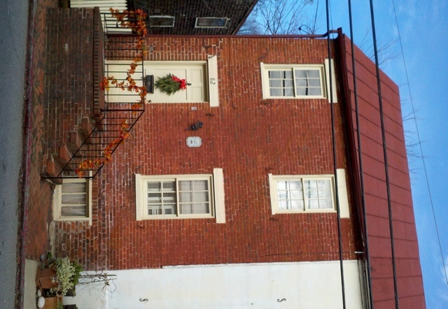
 What struck me about these houses is how simple and reproducible their design is. They have a simple symmetrical arrangement of windows, one above the other, and a pointy roof. There is some decorative work around the doors and the windows, but it could never be called flamboyant. If I knew about building materials then I reckon I could design one myself. Yet despite their simplicity they look good and it is as a result of the traditional proportionality.
Given this simplicity and the value that beauty adds to buildings, I am surprised that it hasn't occurred to more developers and architects to study traditional proportion and use it, if only for economic reasons.
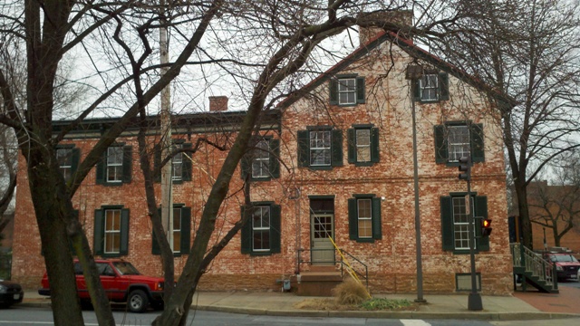
Look at the photos in this article. Notice how in every case the window size varies, storey to storey, so that the first is to the second as the second is the third and so on. When this rhythmical progression corresponds to the traditional pattern then the result is elegance. Sometimes the order changed around slightly so that it is not always the largest at the bottom. The dimensions of the first and second might be changed so the biggest storey is always the main living area. These architects didn't play tricks - they put things where you expected them to be, so that the outward signs give an indication of the internal purpose. Similarly, the main door is always more prominent than the servants' entrance. (You can't count on this now. I was at an art gallery recently, which was a modern building made completely of reflective glass and the doorway was indistinguishable from any other panel. There was no indication through the external design where the door was. In fact it was placed offset to one side in a counter-intuitive position, presumably deliberately. I had to wait until I saw someone coming out before I knew where I could get in!)
 Coming back to Beacon Hill, I am convinced that these houses looked just about as good the day they were built and if anyone chose to conform to these basic patterns today, then it would look good and sell at a high price. This has to be the simplest way for an architect to add greatest value for minimal investment of time and money. There is no need for pastiche – we are not bound slavishly to follow the decorative style of the period in every way, but provided the principles are adhered to, then here is way for modern architect to stand out from the crowd. The mathematics is relatively simple but largely unknown.
 So come on architects and town developers. Here’s your chance to make a killing. So let’s see a new Beacon Hill in the US!
Incidentally, the Prince of Wales built an experimental new town on the outskirts of Dorchester in England that conformed to traditional proportions, called Poundbury (right, click to enlarge). The experience there was that although they were slightly more expensive to build, their beauty made demand so high that their price on the open market made the modest extra investment more than worthwhile. You can see more of Poundbury here.