
One of the greatest masterpieces ever painted, the Ghent Altarpiece (also known as the “Adoration of the Mystic Lamb”) was created in the 15th century by Flemish brothers Hubert and Jan Van Eyck. While broad appeal is not the only necessary indicator of merit, it is, in my opinion, one of them. This being so, the Adoration of the Lamb passes the test with flying colors - it is the second most visited and viewed work of art in history (after the Mona Lisa).
My consideration of it was prompted by the publication of a book about the altarpiece. Called the Adoration of the Mystic Lamb it is published by Ignatius Press and Magnificat (the one that produces a portable Liturgy of the Hours, sent out monthly). The book is excellent resource with large (12in x 12in) reproductions of details, which are as sumptuous as I have ever seen. The commentary, written by French art historian Frabrice Hadjadj is excellent in its description of the historical background, provenance; and in the details of the content, viewing it as a pedagogical tool. Every figure is identified and every Latin inscription is translated.

In this article I want to consider additional elements that come into consideration of the altarpiece as a piece of liturgical art, focusing especially on how its design, use of medium and gothic style are in harmony with its purpose of promoting the right worship of God. These are the things that an artist, or patron need to be aware of if creating news works of liturgical art suited to their purpose.

I was invited by Chris Carstens, the new editor of Adoremus Bulletin to write a review of the book, and what I present here is an adaptation of what I wrote for him. I would recommend, by the way that this is read in conjunction with Chris's excellent accompanying piece contained in the bulletin, called Mystagogy of the Lamb in which he explains in detail the meaning of symbol of the lamb for Christians.
Looking now at the famous reredos: when the panels are closed we see, painted largely in monochrome, white and graded tones of sepia through to black, a depiction of the Annunciation watched by a congregation of figures, including two Sybils, the prophets Zachariah and Micah, John the Baptist and John the Evangelist. Also making an anachronistic appearance in the scene are the Van Eycks’ patrons, Joos and Isabelle Vijd. To include one’s patrons in a work of art is a typical device for honoring those whose generosity helped make the work of art possible. The figures of the two Johns are of statues in stone, lifeless as well as colorless.

When the doors are opened the scene is, in contrast, in glorious and bright color. It is dominated by the two largest central panels. The lower of the two is the image which gives the whole piece its name, the Adoration of the Mystic Lamb in which the heavenly hosts adore the Lamb of God – Christ – standing ‘as if slain’ (as it is cryptically described by the Book of Revelation (Rev 5:6)). Above this is the figure of God enthroned who looks down blessing us with his right hand.

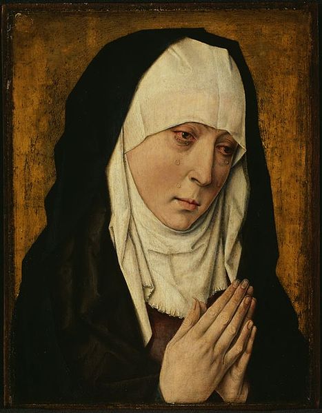
There is some ambiguity as to whether this figure is intended to be the Son or the Father (I will discuss this later). He is flanked on the left by Our Lady, as Queen of Heaven and, in contrast to the monochrome rendering of her in the Annunciation scene, in this depiction she is painted in gorgeous blue.

On the right of the enthroned figure of God is John the Baptist, now painted in living color and clothed in apple-green robes.

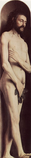
On each upper extreme, the stand the figures of Adam on the left and Eve on the right, looking inwards at the event in history that began the redemption of the Fall which they caused. Our first parents are depicted by the Van Eycks after the Fall, hiding their full nudity with hands and fig leaves, and in deep shadow. In accordance with tradition, the redeemed saints in the scene (not Adam and Eve), are the source of their own saintly light which means that there is minimal cast shadow around them.
The Van Eycks’ manipulation of contrasting shadow, light and color conforms to the tradition in which shadow represents the presence of evil and suffering in a fallen world, and Light represents ‘overcoming the darkness’.
Also, the lack of vegetation and life in the image when the panels are closed points us to a time prior to the historical event of the life, death and resurrection of Christ; this is contrasted with the lush garden of Paradise restored in the interior image (when the panels are opened) with plants in full bloom.
The commentary in the book tells us of the prophesies of the prophets and of the Sybils (who are present incidentally, because their prophesies in classical Roman literature were seen by the Church Fathers as anticipating the coming of the Messiah).
The themes are strongly Eucharistic (most obviously evoking the phrase of John the Baptist, ‘Behold the Lamb of God’ and connecting this phrase to the Eucharist). Nevertheless, even greater emphasis could have been placed on some more broadly liturgical aspects of the work as a whole.
Liturgical art is not intended primarily as decoration or even to teach us about the underlying theology, although it does fulfill these functions. Rather, as architectural historian Denis McNamara pointed out in his recorded presentation on this site, the liturgical art is a part of the liturgy itself, and reveals those aspects of the ritual that we cannot immediately perceive. For example, when the panels of this work are opened we are seeing the heavenly hosts who join us here on earth, in reality, through the sacred liturgy in their perpetual worship of God. At that moment ours is a temporal participation in this eternal reality.
Despite the title, the Ghent altarpiece is not only about the adoration of the Lamb, but also about the worship of the Father, through the Son – the Lamb of God - in the Spirit. When we worship God in the liturgy we are drawn into the mystery of the Trinity. The altarpiece reinforces this point.
This focus on God the Father explains also, perhaps, the ambiguity in regard to the identity of the central figure of God. As Hadjadj explains, in some respects the figure of God has the characteristics of the Son – his youth for one thing - and in other respects, for example his attire and his crown, the figure has attributes generally associated with the symbolism of God the Father.
Upon further consideration, this ambiguity seems intentional. It appears to be a depiction of the Father seen through our understanding the Son. Perhaps we are meant to take the figure as both Father and Son at once. Other things in the painting seem to point to the Trinitarian mystery. For instance,the sun is rising in the East above the horizon, which is the symbol of the risen Christ, Christ in glory. But the viewer only sees half of the sun. Its upper half is replaced by an image which is, perhaps, the Son enthroned but which we are meant to see as the ‘visible image of the invisible God’. Through Christ, the Ghent piece seems to want to make clear, we see the Father.

But further details of that semi-sun also reward study. Within the image of the risen semi-sun there is a dove, which represents the Holy Spirit. So, not only do we see the Father, through the Son, but we see him in the Spirit. To emphasize this point, we see rays of light, lines of gold leaf emanating from the Spirit that touch all of those who are gathered. We, who participate in the earthly liturgy are part of the mystical Body of Christ too, and so, like the adoring saints and angels in the painting, are in reality touched by the uncreated light of divinity.

In the Eastern Church the dominating image in a liturgical setting is that of the glorified Christ. (The suffering Christ on the cross will be there too, but less prominent). However, when the faithful address the Father in prayer, they will pray to the image of the Son, because those who ‘see the Son see the Father’. Years ago I was struck by how the family of my icon painting teacher, who is Orthodox, sang the Our Father: the entire family would turn and face an image of the risen Son as they prayed.

We do not know the exact intention of the artist here in regard to this visual personification of God, but if I was painting it, I don’t think I would allow for such ambiguity. I feel somewhat uneasy with the visual conflation of two divine persons into one. Rather, as Eastern Catholics and the Orthodox do I would have an unambiguous image of the Son through whom I could address the Father. The alternative, as the Western tradition allows, is to have two contrasting yet complementary images: one of the Christ in Glory and the other a traditional symbolic image of the Father (such as the grey-bearded Ancient of Days in the Sistine Chapel painted by Michelangelo).
How would congregations at the time of Van Eyck have engaged with this painting in the liturgy itself? The Ghent altarpiece is a reredos,a painting or program of images installed behind the altar. According to some liturgical historians, the reredos developed in the Roman Rite in the Middle Ages because of the growing liturgical emphasis on the visible elevation of the host and chalice by the priest. As a backdrop to this event, the reredos is intended to draw our attention to the elevation and to increase our understanding of what is happening.
Therefore, an artist who paints a reredos should be aware of two things in particular: first at this critical point in the Mass, the images behind the visible elevated host should illuminate the fact that Christ is really present with us. Second, the portion of the reredos which serves as backdrop for the elevated host ought to allow us to see the small white circular wafer in clear relief against the reredos. Which part of the Ghent image is designed to serve as a backdrop for the host, I wonder? Is it designed, for example, to be contrasted with the green of the foliage or with the red on the face of the altar. I like to think that the Van Eycks designed their altar so that at the elevated host appears directly in front of the rising sun, straddling the conjunction of the two panels the one featuring the sacrifical Lamb and the other, the glorified Christ/the Father. It is exciting to think that at the point of elevation the congregation would see the golden rays of the semi-sun as if they were emanating from the host itself.

Because the reredos is no longer in it’s original location but in a side chapel and no longer services the liturgy, we do not know exactly what worshipers would have seen. We also have no information about when the reredos panels would have been opened or closed in the course of ordinary use. It was common in the middle ages for monochrome images to be be used during the penitential seasons of Advent and Lent; and then brightly colored for Easter and the rest of the year. If this was the case for the Adoration of the Lamb in Ghent, then during these periods prior to Christmas and Easter, the panels would have been closed so that congregations saw the Annunciation scene. This scene would be doubly appropriate because Advent and Lent are also periods of anticipation of the coming of Christ, and this anticipation would have been enhanced by portraying the biblical scene which inaugurated the incarnation. Nevertheless, without precise information in regard to this particular painting it is difficult for us to say exactly how the painting helped those attending Mass relate to the actual celebration of the liturgy.
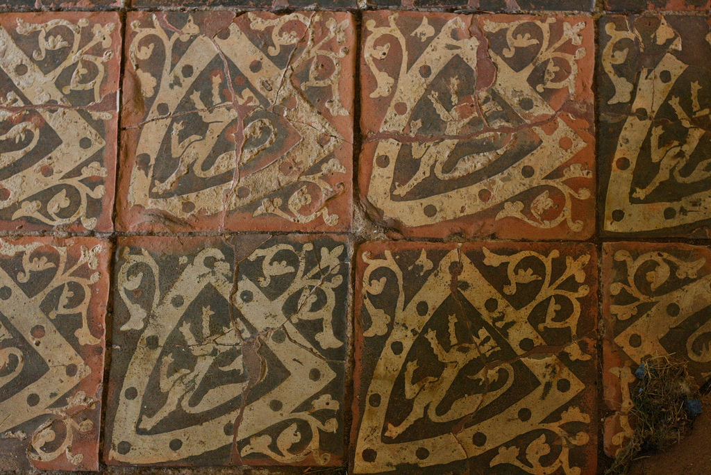
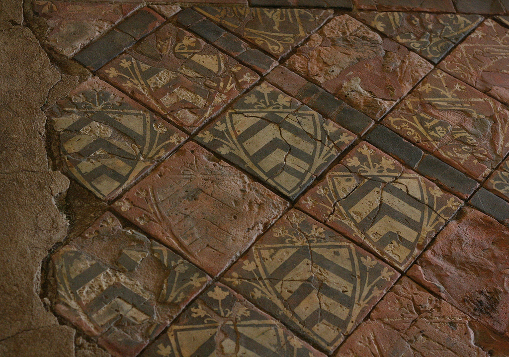
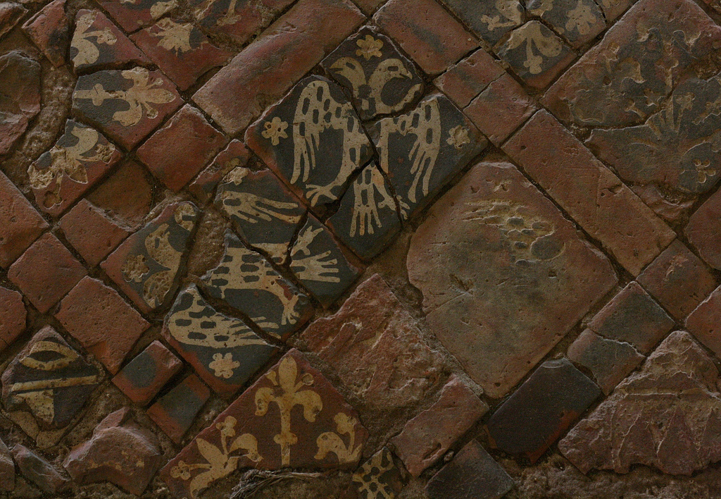
It is interesting to note that the Ghent altar’s scheme contains no image of the crucifixion. But since this reredos was very likely not the only image in the church, it was probably painted to be seen in relation to all other images that were present – including that of a crucifixion elsewhere in the church. During the middle ages, altar rails were customarily expanded upwards into a chancel screen or ‘rood’ screen – which consisted of transparent tracery and was perhaps carved in wood. This screen would often be surmounted by a sculptural representation of the crucifixion (the word ‘rood’ is an old English word for cross). If there was something similar in Ghent cathedral, then the congregation would have been able to see all three: the Lamb, the enthroned figure of God and the crucifixion simultaneously. After the Council of Trent, the call for greater visibility of the celebration of the Mass resulted in many chancel screens being removed (although in fact they weren’t condemned explicitly). I believe Ghent underwent this same sort of revision.
As for the methods of the artists: the Van Eyck painted in glazes and never used painted whites. The white we see is the polished white gesso ground (a powdered chalk, or something similar, set in an animal glue) showing through. This technique is unusual for oil painters – but is similar to the way that a contemporary watercolor artist might integrate the white of the paper into the painting.
The Van Eycks built up multiple glazes of color, giving the finished product a deep, jewel-like luster with deep pearlescent colors. In order to understand how this works it is worth considering first just what paint is.

No matter which medium an artist uses, the color in all paintings is always derived from the same inert pigment. For instance in yellow ochre, the yellow comes from iron oxide dug up from the ground. In order to get the pigment to stick to the surface, the artist must apply it after suspending it in some sort of medium which can be brushed on as a liquid, is viscous enough to adhere to the surface and capable of solidifying so that the paint has permanence. If the paint is egg tempera, the medium is egg yolk; if it is oil paint, then the medium is linseed oil or some other commonly available vegetable oil; in watercolour the medium is gum arabic. It should be noted that the oil paint used by the Van Eycks was not the tube oil paint found in art shops today. In the 19th century artists mixed the oil medium with wax to give it bulk and the physical properties that would allow manufacturers to mass produce the paint in factories by putting it in tubes that might sit on shop shelves for long periods of time without degenerating.
This change in the quality of the paint – which before this would have been mixed by the artist in his studio - affected how artists painted. It is much easier for artists such as Monet or Van Gogh to use thickly brushed opaque layers of waxy oil paint in a style called impasto. In contrast, the oil paint that the Van Eycks used would have had a much more fluid quality to it than more recent sorts of oil paint; it would have been a genuinely ‘oil like’ paint. Therefore the paint used in the Ghent altarpiece had been worked into very thin, smooth and transparent layers called glazes. The deep colors that we see in this work would have been created not by a single application but by having perhaps as many as 15 or 20 layers each just a few microns thick.

Artists favored this method because it achieved a certain special optical effect. As the light hits the surface of the painting, some of the light is reflected and takes on the color of the paint and some is transmitted through the first layer of paint until it hits the interface between the second and third layers, where the process is repeated. If a strong light, such as flickering candlelight, shines onto the painting, it creates an especially jewel-like richness on the smooth surface, as if the painting itself were the light’s source, the light rays emerging from deep within its surface. The artist who knows what he is doing manipulates this effect by subtly changing the relative tone and the precise colour of each layer. It is no accident that this effect is called ‘pearlescent’. In pearls the same optical effect is created by many layers of the transluscent deposit, put down by the oyster around a irritating piece of grit.
If you read the art history books, Van Eyck’s painting style is described as part of the ‘Northern Renaissance’. Whatever we call his style, it is to my mind more a culmination of the gothic that preceeded it than it is an anticipation of the High Renaissance that followed it. Certainly it is highly naturalistic and it has this in common with the Renaissance style. But this increased interest in natural appearances and curiosity about the natural world did not begin with the Renaissance nor with Van Eyck, but began over two hundred years before (due to the influence of the newly rediscovered philosophy of Aristotle among other things).
What links Van Eyck to the Gothic stylistically is the sense of emotional distance between the figure and the observer. The whole gothic movement has this same sense of emotional distance in common with the iconographic styles that preceded them. Although sometimes we do observe some emotion in the figures, these emotions do not engage us directly; we are still in some way detached, observing from a distance.
This placement of the figures at a distance - in the middle ground rather than in the foreground - affects the dynamic of the observer’s interaction with the image. The beauty of the painting draws us in and we want to engage, but we cannot because that distance is inherent within the composition and style. It is there even if we have our noses pressed against the panel. Our desire to be part of what we see then takes our attention beyond the painting itself to the reality that it portrays, which is heaven. So the painting first pulls us in and then it sends us up to heaven. This dynamic of prayer is built into the style of the painting and is part of what makes it a skillful execution of the artist’s skills; and stylistically appropriate for the liturgy.

A Christian artist must paint man so that he is recognizably human – in short, the image must look like a person. At the same time the artist must indicate those invisible truths by deviating from a strict adherence to physical appearances. It is through a controlled partial abstraction that the artist reveals a fuller truth about the human person. It is in the way that an artist executes this abstraction,we recognize characteristic styles.
Such styles can be done well or badly. The three authentic liturgical traditions – iconographic, gothic and baroque - are described by Pope Benedict XVI as communicating this balance of naturalism and abstraction well. Good Christian art is always a controlled balance between the representation of the physical appearances of the person, and partial abstraction by which, symbolically, the soul is revealed. (Any artists or lovers of art who are interested in knowing more about this process and how Christian artists have done accomplished it in the past should read my book, the Way of Beauty.)
The process of balancing naturalism and abstraction is done badly by swinging too far in one direction or another. Either the artist renders an excessive naturalism on the one hand, or he neglects appearances, leading to a grave distortion on the other hand. While there is always room for new and fresh art, to be Christian art it must reflect this balance. Pius XII said as much in Mediator Dei (195): “Modern art should be given free scope in the due and reverent service of the church and the sacred rites, provided that they preserve a correct balance between styles tending neither to extreme realism nor to excessive "symbolism," and that the needs of the Christian community are taken into consideration rather than the particular taste or talent of the individual artist.”
The 20th century artists named painted in styles that reflected a worldview that is governed by a dualism in which the spiritual aspects of man are exaggerated at the expense of the physical. These modern artists were not reflecting a Christian anthropology, and furthermore they knew it – the explicit aim of abstract expressionists exhibited by Newman and Rothko was to represent man as pure disembodied spirit. The corollary to this is the style known as photorealism in which there is total neglect of the spiritual and only the material aspects of man are considered and represented.
As far as our understanding of the Ghent altarpiece is concerned, Van Eyck work was both naturalistic and also incorporated a symbolic element. While the surface of each object he paints is represented in exquisite and minute detail, the overall form of what he paints, the substrate to which all that detail is fused, is distorted according to gothic sensibilities so as to give a sense of the sacred.
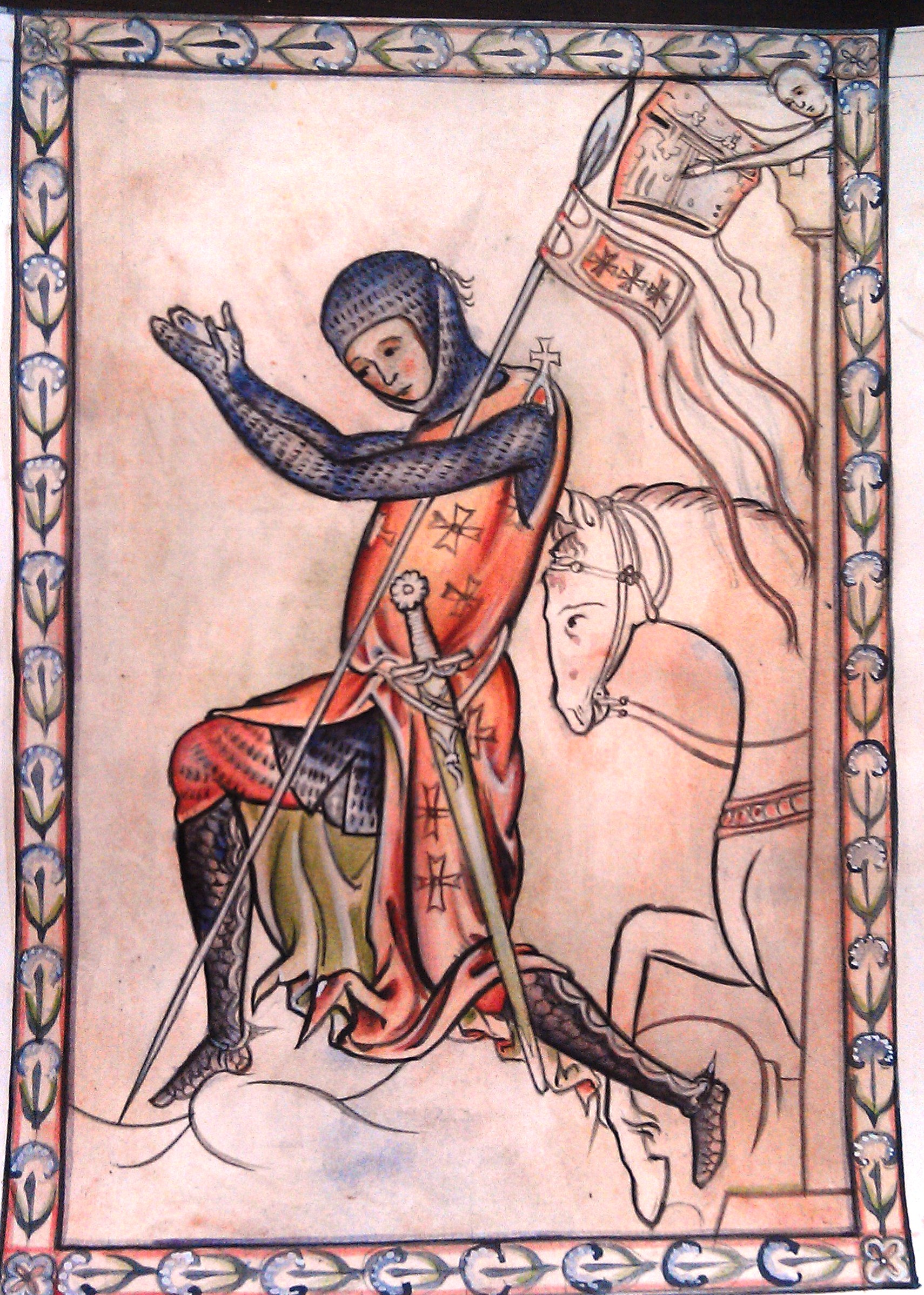
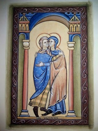
One of these gothic aspects is compositional - that portrayal of the figures in the middle distance, (already described above) which creates a particular dynamic of interaction with the observer, especially in the context of prayer. Another gothic aspect is found in the form of the figures. In many ways the gothic is a naturalized form of the iconographic tradition that began in the early Church. You can see this gradual increase in the naturalism of surface appearances of figures if you follow a path historically from the late Romanesque/early gothic art of the 13th century (as in this illumination from the Westminster Psalter (link to example here) through later gothic art, such as the work of Duccio (link to examples here) and culminating in Flemish artists such as the Van Eycks and Van Der Weyden (below is Last Judgement altarpiece, from about 1440)

and a detail of the central section...

Gothic naturalism is very different from the naturalism of the High Renaissance which followed Van Eyck. In the High Renaissance, the figures were painted in the foreground and engage with the observer much more directly than in gothic depictions. The High Renaissance’s underlying form (to which this naturalistic surface detail is fused) is a copy of Greek and Roman (i.e. classical) art. From the High Renaissance onwards and through to the 19th century, artists such as Leonardo, Michelangelo and Raphael copied Greek and Roman statues as part of their training, which in turn affected their style profoundly. So when the baroque artist Rubens painted Theresa of Avila in prayer in the 17th century, the stylistic difference we see in his work emerged from his training for thousands of hours by copying Greek and Roman statues.
The Van Eycks’ did not train by copying classical statues, and so stylistically were influenced much more by the art forms that they saw around them, which were earlier gothic and Romanesque. Despite the fact this this painting is over 500 years old, the glory of what is true and good is radiating out the Van Eyck’s work, even today. When we perceive this quality in art, or anything else for that matter, we call it beautiful. And that beauty is irresistible. This is the message of John Paul II’s Letter or Artists and the numerous writing about the via pulchritudinis - the Way of Beauty - by Benedict XVI.
Thus, the lesson that artists today can learn from Van Eyck is that if people are not climbing over each other in their eagerness to see our work, the reason is simple. It is not beautiful enough. For proof of this truth, I suggest we need look no further than the Adoration of the Lamb. Hundreds of years after it was painted, this altarpiece is still the second most viewed painting in history. Modern man has voted with his feet – or to be more precise, with adoration.


 It was pure coincidence that this is the image that we were studying when I heard of Strat's death and then happened to read the above passage in his book.


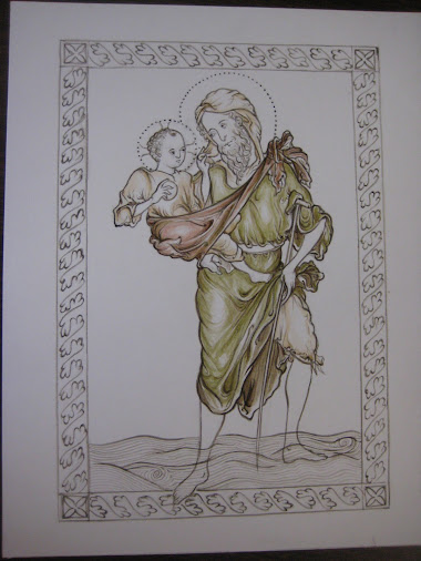
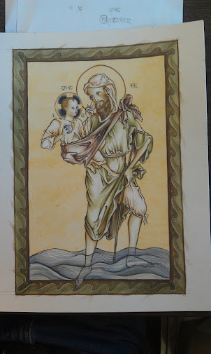
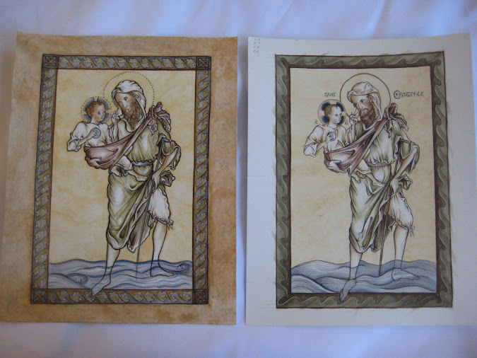
 This summer we held a painting course in Kansas City, Kansas at the Savior Pastoral Center Kansas. I taught it and it was sponsored by the Diocese of Kansas City, Kansas which runs the center. I thought I would show some of the work done by students. This is unusual in that we focussed on 13th century gothic illuminated manuscripts from the School of St Albans. This one is a St Christopher painted by a master of the school called Matthew Paris.
The students, Paul Jentz and his mother Christi (who kindly took and sent me the photographs) worked from the image shown top left. They constructed a grid as a help but drew the design by hand. While giving them guidance, I gave each freedom to vary the border and the colour schemes. I think you'll agree that they did a good job.
This summer we held a painting course in Kansas City, Kansas at the Savior Pastoral Center Kansas. I taught it and it was sponsored by the Diocese of Kansas City, Kansas which runs the center. I thought I would show some of the work done by students. This is unusual in that we focussed on 13th century gothic illuminated manuscripts from the School of St Albans. This one is a St Christopher painted by a master of the school called Matthew Paris.
The students, Paul Jentz and his mother Christi (who kindly took and sent me the photographs) worked from the image shown top left. They constructed a grid as a help but drew the design by hand. While giving them guidance, I gave each freedom to vary the border and the colour schemes. I think you'll agree that they did a good job.
 .
.


