 Russian icon style contrasted with Greek My icon painting class recently made a trip to the Russian Icon museum in Clinton, Massachussetts (perhaps 1 hour west of downtown Boston). Certainly, this is the best collection that I have ever seen (I have not been to Russia or Greece). It is only recently established (2006) and displays the private collection of Massachusetts industrialist, Gordon Lankton. The collection includes more than 400 Russian icons and is one of the largest private collections outside Russia.
What is particularly exciting for me whenever I go to the museum is the chance to see a number of very large icons from one of the glorious periods of Russian icon painting in the 16th century. I shall talk about some examples from the museum in describing the Russian style.I shall talk about some examples from the museum in describing the Russian style.
Russian icon style contrasted with Greek My icon painting class recently made a trip to the Russian Icon museum in Clinton, Massachussetts (perhaps 1 hour west of downtown Boston). Certainly, this is the best collection that I have ever seen (I have not been to Russia or Greece). It is only recently established (2006) and displays the private collection of Massachusetts industrialist, Gordon Lankton. The collection includes more than 400 Russian icons and is one of the largest private collections outside Russia.
What is particularly exciting for me whenever I go to the museum is the chance to see a number of very large icons from one of the glorious periods of Russian icon painting in the 16th century. I shall talk about some examples from the museum in describing the Russian style.I shall talk about some examples from the museum in describing the Russian style.
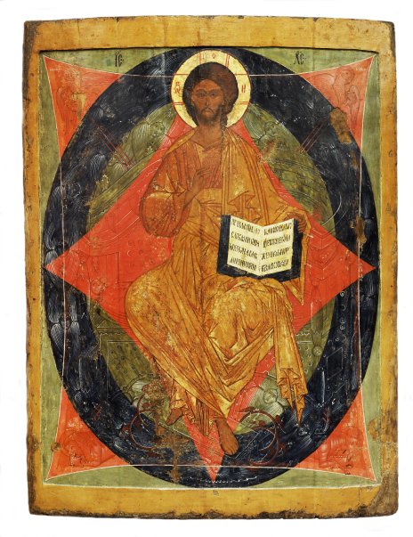 The one that that I love is the Christ in Majesty which dates from 1580 and is about 5ft high (if you click the image on the right, it will enlarge).This is one of the Christ- 'Pantocrator' images, which means all powerful or omnipotent. Sitting on a carved throne he blesses with this right hand. He is surrounded by the oval mandorla and two curved squares forming an octagonal star. The Mandorla represents heaven and so with it Christ is placed outside the earthly realm of existence. The octagon represents the 'eighth day' of Creation, by which Christ instituted the new order. In the corners of one square are the four Evangelists taking the gospel to the four corners of the world. The cherubim around the throne, contained by the mandorla, and which represents the world's angels . These are rendered in monochrome (indigo, vermillion or green) by elegant tonal work in black and white over the base colour.
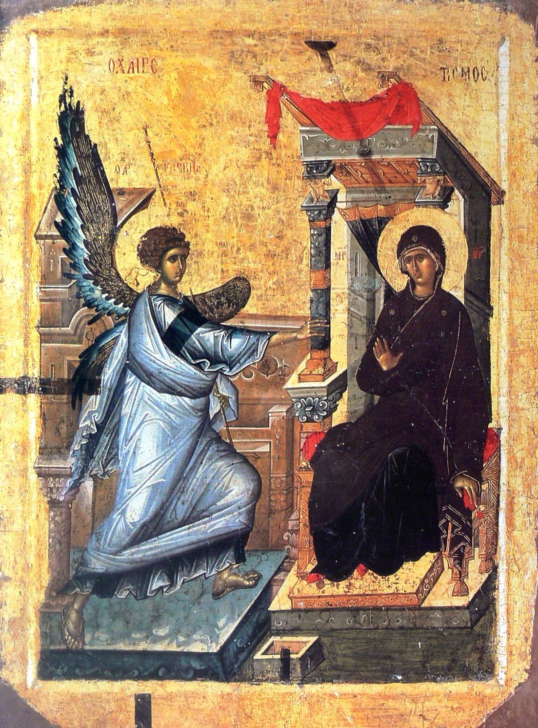 In some icons, the Russian style can appear simple at first glance. The figures are less modeled than, for example, the Greek or Byzantine style (the 14th century Annunciation shown left is in the Greek style). The Russian icons describe rely far more on line to describe form. The 'colouring in', is done by using multiple washes of transparent paint, rather like watercolor washes. The variations of color and tone that result are subtle. This is apparent in, for example, the icon of St Nicholas shown, below right, which dates from 1525.
The medium for each painting is egg tempera (where the pigment is bound in egg yolk) and once it is dry it is impermeable to water. It means that, in contrast to watercolour, for example, you can have almost any number of layers of paint. It is not unusual to have 15 washes. When painting transluscent layers of paint, one has the choice of painting a glaze (a dark transparent layer over lighter tone) or a scumbles (a light tone over dark). When used skillfully, the combinations of glazes and scumbles produce a brilliant jewel-like quality that glistens when light is shone directly onto the surface. As light is incident upon the surface, some is transmitted further into the icon and some reflected back at the viewer. This happens at the interface of each layer, so the light that strikes the eye of the observer is an aggregate of rays that have penetrated and been reflected off, say, 15 different layers. This effect of the light emerging from different depths within the surface is to give the sense of luminescence, ie that it is a primary light source. This  rarely comes out in photographs and is strongest under flickering candle light. The control of these effects is quite a skill. Furthermore, if the artist is going to rely so heavily on the placement of line for the description of form, it means that while there is, relatively, quite a large margin for error in your washes of paint, the lines have to be very accurately placed. They must be applied with the control of a calligrapher, narrowing and widening rhythmically in accordance with the curvature of the plane that it describes. It is the subtle control of the flow and ebb of the line that gives the painting its grace and beauty. I have often thought that a good training for an iconographer might include some Chinese calligraphy. It was this thought that lead me to experiment with Chinese brushes when I paint icons, which I now use because I like their ability to produce a fine point and hold a large amount of paint without compromising control. (They also come a lot cheaper than the usual recommendation of Kolinsky sable watercolor brushes!)
Something else that I find fascinating in the museum are the modern, hand-painted reproductions (right down to the effects of age) of famous icons by Rublev and Dionysius, two legendary names amongst icon painters. They tell me that they are the only copies in existence, and they are certainly convincing. It is fascinating, for example, to see life-size (say 4ft, I forget precisely) Rublev’s Trinity. I wouldn’t normally rave about copies, but I think these are worth seeing if you can't get to Russian. I was able to see closehand (as in nose against the icon) one of the effects that Rublev uses so skillfully. This is his counter-intuitive use of tone to describe form. If one looks for example at the angel on the right in the Hospitality of Abraham, otherwise known as the Trinity, we can see green cloth draped over each knee. The highest point of the knee is sparkling with white highlights. The usual approach in iconography is to describe form by gradually darkening as you move away from the highpoints into the ‘valleys’ until you reach the deepest recesses, which are also the darkest in tone. So one might expect white running into pale yellow, which in turn blends into light green which blends finally into dark green or even blue. However, Rublev reverses the order in the mid-tones. The tone directly under the white is green, and the next tone, which should be darker still is pale yellow. Yet we still are able to read the form. The cloth still looks as though it is draped over the knee. It creates the effect of a light, translucent cloth almost floating over the form of the angel.See more information about the Russian Icon Museum at www.museumofrussianicons.org
Images below: the modern replica of Rublev's Trinity; a Greek Annunciation, 14th century (this one is not in the musuem it is shown for comparison).


Baptism of Christ, dated 1780


