Blog

Using Boethian Proportion for Better Web Design

The Via Pulchritudinis or Way of Beauty has application in anything that can be designed and one expert website designer, Adam Solove,  has started to incorporate these traditional ideas into what he does. He has written about the project here. He says that the results are better and simpler to implement than the design methods he was shown as a student: something called a Swiss grid; or the Golden Mean, which is the ratio observed in nature so often. Adam has replaced this with one of the Boethian series referred to in my article on Harmony and Proportion, called the Fourth of Four. As he points out, this is the same as the famous Fibonacci series, named after the Italian mathematician Fibonacci, who is credited with introducing the series into Western mathematics in 1202...but Boethius's De Arithmetica,  in which it appears also, dates from the 6th century AD and so predates Fibonacci by several hundred years. And Boethius tells us that he got the series from works by the ancient Greeks before him.

I am very excited by what Adam is doing and encourage readers to go to his blog, here, to read more about what he is doing. I can't show you a photo of his first example as it is for a website that won't be launched for some time yet. In what I saw he devised his page so that it was 8 units across and then divided used relative lengths of 5 and 3 up and down the page. This is the broad layout. Then he subdivided these blocks into 3, 2, 1 relative lengths for smaller inserts, subsections and so on.

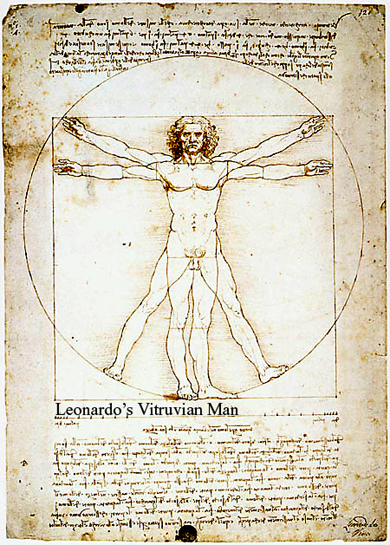
The Fourth of Four, like the Fibonacci series, tends towards the Golden Mean proportion as the number of terms increases. It is interesting that the modern interest is on the end of the series, that is, the Golden Mean. The ancients were uninterested in this aspect it seems, but chose instead to focus on the beginning of the series. The Church Fathers such as St Augustine identified the proportions given at the beginning of the series (3:5:8) with the perfect proportions for the ideal man, who is Christ and who embodies the harmony of the cosmos.

It is a personal view, but I question whether the Golden Mean is in fact worthy of the appellation 'Golden'. It was only in the Renaissance that it was called 'Golden' and my research suggests that the level of its use before the the 20th century has been exaggerated. It was only ever used consciously used by artists occasionally and in the Renaissance when the term Golden was coined. (This is despite all those diagrams in art books with grids placed over photographs of the of Parthenon or the pyramids in Egypt). But that's a discussion for another day.

Why is there this different focus one wonders? I would account for it by considering the difference between traditional Christian and the modern secular worldview of nature and man's place in it. Modern man looks at what nature is and considers it perfect (as long as man hasn't messed around with it). The Church Fathers on the other hand observed nature but sought to perfect it by considering what it ought to be. They considered the world in which we live to be  beautiful, yes, but nevertheless imperfect due to the Fall. Therefore, they sought to emulate perfect nature rather than fallen, imperfect nature. Employing the Golden Mean, which is the modern obession, is to emulate fallen nature. (I have written about this here.)

So for the ancients the Ideal proportions at the beginning of the Fourth of Four are not employed as an approximation to the Golden Mean. It is the other way round. What we now call the Golden Mean  (the ancients never called it this) if it represents anything it is the Fall and is better understood as a degraded version of the ideal proportion.

Adam has kindly offered to help me create our accompanying website, which I hope to get going in the next few weeks. This will be an ordered presentation of the whole Way of Beauty vision; and an archive of the written material both from the blog and of additional longer articles that I wish to post, which I will start referring to in the blog. We will work together on this project and make it open to fellow traveller on the via pulchritudinis.

The Music of George Sarah

Drum, bass 'n violins I would like to bring to your attention the music of composer George Sarah. George is a Catholic who lives in Los Angeles and since 1985 has regularly been commissioned by film and TV companies to compose scores for their programming. I won’t go through the names, but his portfolio is impressive. He works for household name shows, as his MySpace page reveals. I came across him when I first visited Los Angeles about 4 years ago. A Catholic friend had organized for me to teach an icon painting class at St Monica’s Church in West Hollywood. George just happened to hear about this and keen to help, arranged promotional interviews for community  radio and TV. You can see the TV show through the panel, right. The music for the opening sequence is one of George’s pieces. This was filmed before I was recruited by Thomas More College and moved to New Hampshire. He writes music for his separately released CDs (or whatever the latest mode of recording via computer is!) and performs his work in concert. His style has been described as electronic chamber music. He performs with a traditional string trio, but accompanies them on electronic keyboards and drum machines. It has a haunting quality and a modern feel but, and I think it is more than simply the choice of instruments, it has a sense of traditional form about it as well.

If we are to evangelise the culture, then it must be rooted in the Mass. For the Mass, it is important that we employ traditional forms that are united to the liturgy. However, once we go out of the church building it is legitimate, I think to develop them into other profane (ie non-sacred) forms that grab people and then direct them towards the Mass. We are required to develop a culture of beauty that both speaks to modern man and opens up the hearts of men to God’s grace. George is consciously seeking to do this by working within the world of popular music.

If asked he will talk freely and enthusiastically about his conversion, which he attributes to Mary; and his desire to draw people into the Church. However, within the context of his music it is through form rather than words that he seeks to do it. He aims for beauty that elevates the souls of men to God. He is self taught and composes by developing melodies on the keyboard and then building the harmony and counterpoint around it instinctively. To my mind George is doing something very important here. While I firmly believe that the most beautiful music is that which is united to the Mass, plainchant and polyphony, not all are attracted to it immediately. It is an adage in all evangelization that you have to meet people where they are and take them to somewhere better. George’s music heard by many who would never hear Palestrina and is quite different structurally, but I do feel that it is nudging their souls in the Palestrina’s direction.

Some argue that pop and good music are a contradiction in terms. Certainly, I would say, much pop music is detrimental to the soul (and intentionally so). But it is not true of all it. What opened me up to classical music (and who knows, the beauty of God and my eventual conversion some years later) was the music of a band in the 1970s who were writing rock music but consciously employing classical, rather than blues based forms. The early music of Genesis (we are talking pre1976 here, for example the track, The Firth of Fifth) was cutting edge and trendy at the time so as a teenage schoolboy I could contemplate listening to it. I would never, ever, have chosen to listen to ‘Christian rock’, which just made me cringe with embarrassment…and it still does.  Genesis did not write their music as an evangelical tool at all (none are Christians to my knowledge) but its use of traditional form, with intelligently applied rhythms pulled me in and sent me off in the right direction. I have spoken to a number of people since who have said the same. I doubt that 1970s rock will pull in many today, but the idea is still good, and this is what George is doing in a current idiom. It is interesting that he does not see his music as something that is used the context of the Mass. Firmly orthodox, he loves the Latin Mass and would always want to see the traditional forms of plainchant and polyphony.

George was recently commissioned to write an original score for performance at the Los Angeles Film Festival. He could choose whatever film he wished. He picked the 1920s silent film, The Passion of Joan of Arc. This is accepted in all circles as classic and so there was no hesitation in accepting his choice, even though it has Catholic themes. George just had to write the music and he could let the silent film do the talking! You can see and hear the show on August 7th this summer in LA, details here.

Matt Alderman, Illustrator!

Matt Alderman describes himself first as an architect (he trained at Notre Dame). He is a Catholic and a writes about sacred architecture for the New Liturgical Movement website. He also has his own blog about all matters Catholic and which is worth a visit, here. It is called the Shrine of the Holy Whapping (don’t ask me what the title means!). He talks about his art as though its just a hobby  on the side, but I find it interesting. He has, in my opinion, a natural sense of composition and his lines flow gracefully and rhythmically. He fills up the space without it being too cluttered. In this regard it reminds me of the English artist from the turn of the last century, Aubrey Beardsley. There is also something of another English artist, Arthur Rackham, about his work.

Although I can say with certainty I like his work, I find it difficult to pigeonhole. Clearly, the subject matter reflects his faith, featuring lots of saints (and he has Catholic figures such as Dante there too). But the style is not one that which I would normally associate with sacred art (very different from Beardsley, for example who evokes a turn of the century decadence). I couldn’t see Matts's work in a church as liturgical art, for instance, or even an icon corner in the home as a focus for quiet prayer. It doesn’t make we want to pray. But it does draw me in and make me curious about the personality of the person depicted. These seem to me to be just the qualities that are needed in illustrations, which accompany text. I wonder, Matt, do you get any requests in this regard?

I should explain that I am not downgrading his work by describing it thus. Much of the quality artwork of the last century has come from illustrators.  This point was made to me years ago when I was working as a lowly freelance sub-editor at the The Sunday Times in London. The art critic, Frank Whitford (who was a charming gentleman) always used to include reviews of illustrators’ art exhibitions in his weekly round-up. I can remember him reviewing a show of the work of E.H. Shepherd, for example, the creator of the images of the characters in the Winnie the Pooh books. I asked him why he included so many illustrator's shows. He said it was because illustrators were, in contrast to most artists nowadays, trained in the skills of drawing and painting and were directing their skills i conformity to an external purpose (rather than self-promotion). Consequently they very often produced the most interesting and original work around.

Above, from top: Dante; St Augustine.

Below, from top: St Catherine disputing with 50 pagans in Alexandria; St Peter Martyr; St John Kemble; Archangel Raphael.

Just What Do Catholics Believe About Icons?

Are icons really superior to other forms of sacred art?

The growth of interest of icons, identified with the Eastern Church, has helped to ignite a greater movement towards the re-establishment of authentic Christian art in our churches. This is good. Very good.

However, the same process that has lead to a greater appreciation of the importance of icons has created as well, it seems, a misplaced mystique about icons to the detriment of a genuine appreciation of our own traditions. Whenever I write about icons I get responses from people who are very often Roman Rite Catholics who tell me that Catholics can’t paint icons, only Russians or Greeks can do it (even though the fact is that it is as much part of the Western tradition as the Eastern). Some tell me that only religious can paint them despite the fact that I know accepted and thriving icon painters who are not monks or nuns. I am told that I should not say that an artist ‘paints’ icons, rather that he ‘writes’ them; even though my teacher, who is as Orthodox as they come and a respected authority in the Orthodox world, refers to this pedantic insistence on the word 'write' as ‘a bit precious’. (I am told that this happens because the word for write and paint is the same in Greek.) And, perhaps most importantly, people speak of icons as though the saint depicted is really present in the icon. So what does the Church really believe about icons? I have done my best to find out.

As I understand it, the orthodox view was articulated in the 7th Ecumenical Council and with a later clarification by the Synod of Constantinople, which finally closed the iconoclastic period in AD843. This is celebrated today in the Eastern Church as the Feast of the Triumph of Orthodoxy. The Church Father who expresses this is St Theodore the Studite. Theodore was abbot of the Studios Monastery in Constantinople and he is revered in the Eastern Church as well as Western. (He is probably more known in the Eastern Church.) What is ironic is that the error of attributing to the icon a presence of the saint by iconophiles (those who were in favour of them) is one of the things that the iconoclasts objected to so strongly that it provoked them into seeking to eliminate the use of sacred images altogether. Theodore, like the iconoclasts, opposed this view; but he provided an alternative theology that justified the use of sacred images.

 According to Theodore:

1. The essence of the saint is not present in the icon. It is just wood, gold, paint etc. The connection to the saint is made in our minds, especially through the imagination, when we see the characteristic likeness portrayed. So if the icon is covered up, for example, by metal cladding, it has no sacramental value (unless the cladding has been panelbeaten into a likeness, in which case it is the cladding that evokes the saint for us). Theodore illustrates with the point that once the icon becomes damaged so that the likeness is destroyed, it is just thrown away.

2. Icons, when worthy of veneration, are  like sacramentals.  Their value is that they predispose us to grace, they are not themselves channels of grace. This distinguishes them from sacraments.

3. Theodore’s theology applies as much to any form of art in which the characteristic likeness appears. Therefore the view that what we now consider to be the iconographic style is a higher form than the other traditions of the Western church, such as the gothic and the baroque, cannot be justified. Theodore spoke of 'icons', but only in the broad sense of the meaning of the  in Greek, meaning ‘image’. He did not refer to specific styles or traditions beyond that. Accordingly, his theology, applies as much to gothic and baroque art (the other two traditions cited by Pope Benedict XVI as authentically liturgical in his book the Spirit of the Liturgy) as it does to the iconographic style; it can also be applied to statues as it does two-dimensional images.

Furthermore, it should be pointed out that there is no canonical or dogmatic statement or account by any Church Father, Eastern or Western that I know of that that says that the iconographic style, as we now refer to it, is inherently superior to any other. Like the discussion of Theodore, the debate in the early Church was about the validity of images in general.

It may be a surprise for some to discover the theology of the iconographic style is it is generally articulated today (and which does distinguish the iconographic style from other forms of sacred art) is a modern development and did not exist until the 20th century. This doesn't make it wrong, but it does make it new. We should be aware however, that it was developed by very anti-Catholic Russian Orthodox thinkers based in Paris (such as Ouspensky and Lossky). So while they did some great work in their assessment of their own tradition, they spoke in ignorance of other traditions. While their dismissal of other liturgical traditions may be fair from an Orthodox point of view (that is for the Orthodox to say) but has no basis in the teaching of the Catholic Church.

Eastern Rite Catholics might legitimately and reasonably say that the only form of sacred art that is appropriate for the Eastern Rite is the icon, and this might affect their choice of image for an icon corner in their homes. But it is just as legitimate for Roman Catholics look to their authentic liturgical traditions (which includes the iconographic) and consider them appropriate for the Roman Rite, and for use their own home.

To read an account of the theology of icons of Theodore the Studite, his works are still available. For an excellent summary of the whole debate regarding sacred art which includes an account of the theology of images develope by both Theodore and St John of Damascus, I recommend God's Human Face by Cardinal Cristophe Schoenborn, published by Ignatius Press.

The icon at the top is the Triumph of Orthodoxy.

The Russian Icon Museum, Clinton, Massachusetts

Russian icon style contrasted with Greek My icon painting class recently made a trip to the Russian Icon museum in Clinton, Massachussetts (perhaps 1 hour west of downtown Boston).  Certainly, this is the best collection that I have ever seen (I have not been to Russia or Greece). It is only recently established (2006) and displays the private collection of Massachusetts industrialist, Gordon Lankton. The collection includes more than 400 Russian icons and is one of the largest private collections outside Russia. What is particularly exciting for me whenever I go to the museum is the chance to see a number of very large icons from one of the glorious periods of Russian icon painting in the 16th century. I shall talk about some examples from the museum in describing the Russian style.I shall talk about some examples from the museum in describing the Russian style.

The one that that I love is the Christ in Majesty which dates from 1580 and is about 5ft high (if you click the image on the right, it will enlarge).This is one of the Christ- 'Pantocrator' images, which means all powerful or omnipotent. Sitting on a carved throne he blesses with this right hand. He is surrounded by the oval mandorla and two curved squares forming an octagonal star. The Mandorla represents heaven and so with it Christ is placed outside the earthly realm of existence. The octagon represents the 'eighth day' of Creation, by which Christ instituted the new order. In the corners of one square are the four Evangelists taking the gospel to the four corners of the world. The cherubim around the throne, contained by the mandorla, and which represents the world's angels . These are rendered in monochrome (indigo, vermillion or green) by elegant tonal work in black and white over the base colour.

In some icons, the Russian style can appear simple at first glance. The figures are less modeled than, for example, the Greek or Byzantine style (the 14th century Annunciation shown left is in the Greek style). The Russian icons describe rely far more on line to describe form. The 'colouring in', is done by using multiple washes of transparent paint, rather like watercolor washes. The variations of color and tone that result are subtle. This is apparent in, for example, the icon of St Nicholas shown, below right, which dates from 1525.


The medium for each painting is egg tempera (where the pigment is bound in egg yolk) and once it is dry it is impermeable to water. It means that, in contrast to watercolour, for example, you can have almost any number of layers of paint. It is not unusual to have 15 washes. When painting transluscent layers of paint, one has the choice of painting a glaze (a dark transparent layer over lighter tone) or a scumbles (a light tone over dark). When used skillfully, the combinations of glazes and scumbles produce a brilliant jewel-like quality that glistens when light is shone directly onto the surface. As light is incident upon the surface, some is transmitted further into the icon and some reflected back at the viewer. This happens at the interface of each layer, so the light that strikes the eye of the observer is an aggregate of rays that have penetrated and been reflected off, say, 15 different layers. This effect of the light emerging from different depths within the surface is to give the sense of luminescence, ie that it is a primary light source. This rarely comes out in photographs and is strongest under flickering candle light. The control of these effects is quite a skill. Furthermore, if the artist is going to rely so heavily on the placement of line for the description of form, it means that while there is, relatively, quite a large margin for error in your washes of paint, the lines have to be very accurately placed. They must be applied with the control of a calligrapher, narrowing and widening rhythmically in accordance with the curvature of the plane that it describes. It is the subtle control of the flow and ebb of the line that gives the painting its grace and beauty. I have often thought that a good training for an iconographer might include some Chinese calligraphy. It was this thought that lead me to experiment with Chinese brushes when I paint icons, which I now use because I like their ability to produce a fine point and hold a large amount of paint without compromising control. (They also come a lot cheaper than the usual recommendation of Kolinsky sable watercolor brushes!)

Something else that I find fascinating in the museum are the modern, hand-painted reproductions (right down to the effects of age) of famous icons by Rublev and Dionysius, two legendary names amongst icon painters. They tell me that they are the only copies in existence, and they are certainly convincing. It is fascinating, for example, to see life-size (say 4ft, I forget precisely) Rublev’s Trinity. I wouldn’t normally rave about copies, but I think these are worth seeing if you can't get to Russian. I was able to see closehand (as in nose against the icon) one of the effects that Rublev uses so skillfully. This is his counter-intuitive use of tone to describe form. If one looks for example at the angel on the right in the Hospitality of Abraham, otherwise known as the Trinity, we can see green cloth draped over each knee. The highest point of the knee is sparkling with white highlights. The usual approach in iconography is to describe form by gradually darkening as you move away from the highpoints into the ‘valleys’ until you reach the deepest recesses, which are also the darkest in tone. So one might expect white running into pale yellow, which in turn blends into light green which blends finally into dark green or even blue. However, Rublev reverses the order in the mid-tones. The tone directly under the white is green, and the next tone, which should be darker still is pale yellow. Yet we still are able to read the form. The cloth still looks as though it is draped over the knee. It creates the effect of a light, translucent cloth almost floating over the form of the angel.See more information about the Russian Icon Museum at www.museumofrussianicons.org

Images below: the modern replica of Rublev's Trinity; a Greek Annunciation, 14th century (this one is not in the musuem it is shown for comparison).

Baptism of Christ, dated 1780

The Icons of Sr Petra Clare

When Pope Benedict XVI spoke recently to assembled artists (in the broadest sense of the term) in Rome, he was echoing John Paul II and Paul VI in calling for a new culture of beauty. Benedict emphasised strongly, perhaps even more strongly than his predecessors, the importance of the evangelization of the whole culture and how beauty is a principle that can inform all human activity – work and leisure as well as worship. When we work beautifully, we work gracefully ie with God’s grace, and we are travelling on the ‘via pulchritudinis’ - the Way of Beauty - which leads us ultimately to God and attracts others to Him.

If this broader evangelization of the culture is to happen, it must begin with orthodox, dignified and beautiful liturgy. It must, in my opinion be closely followed by the art, architecture and music that is united to it. This will set the form that becomes the model upon which all aspects of the culture are based, just as it did in the past.

At the moment, the re-establishment of iconography is slightly further ahead than that of naturalistic Western art (as a sacred art form) and our Eastern brethren are setting the pace in this respect. Like Western art, iconography (even in the East), had degenerated under the influence of the Enlightenment.  (For further discussion on this see the article about icons, here). Its resurgence began first in the Eastern Church in the mid 20th century, with figures such as the Greek artist Photius Kontoglou and the Russian émigré based in France, Gregory Kroug. Under their influence, the next generations of iconographers have come through. The Western Church has lagged behind slightly in this respect, perhaps 50 years (maybe hampered by the difficulties in its liturgy). However, just as we see light at the end of the liturgical tunnel now in the West with what I have heard people refer to as the ‘Benedictine Restoration’ (as in Pope Benedictine XVI), we do now see Catholic iconographers are beginning to emerge. One is Sr Petra Clare, who is a Benedictine nun based in a skete in the Scottish Highlands. It is a bus ride northwest of Inverness in a village called Cannich and it is a truly beautiful spot to visit if you get a chance. Here are some examples of her work. You also can see her website here. I first became aware of her work through visits to Pluscarden Abbey near Elgin in northern Scotland. She was commissioned by the abbey to paint two large icons, a John the Baptist (or John the Forerunner) and a St Andrew (seen here). They are facing the monks in the choir and visitors sitting in the transcepts have to strain their necks slightly to see them, but it’s worth the effort.

Sr Petra's style is probably closest to that of the Russian school. When I have written about her work in the past, some have questioned the validity of having an Eastern style in the Western liturgy. Shouldn't we, they say, use some of our own iconographic traditions? After all we have Carolingian, Ottonian, Celtic and Romanesque styles that all conform to the iconographic. My thoughts are that we have to start somewhere good, which Sr Petra does, and there has always been cross fertilisation in iconographic styles. Also, the Romanesque itself, was a style formed by contact with the East and when it began resembled greatly the Greek Eastern styles. Gradually, a distinct voice developed naturally. Also, I would say that Sr Petra is an experienced icon painter and without ever seeking to force it we can see her own style coming through. Who's to say that isn't Western?

Below: St Luke, left; and right, St Andrew. More of Sr Petra's work can be seen at www.sanctiangeli.org

Dispelling the 12-tone blues

Introducing the the music of Frederick Stocken. Frederick is a Catholic British composer whose credits include his Mass, the Missa Pacis, commissioned by the London Oratory, the best-selling Lament for Bosnia and a symphony commissioned for the Royal Philharmonic Orchestra and premiered at the Royal Albert Hall in London. His serious but accessible musical style has deep roots in the tradition of European classical music. Other commissioned works include ballet, choral and piano music. I first met him several years ago when I went to the monthly meeting in London of the Catholic Cultural Group, run by Catholic writer, Joanna Bogle. She introduced us to Frederick, that evening’s speaker who, she said, believed that good music is beautiful music and the purpose of composing is to bring glory to God. This sounded fine, but in itself didn’t necessarily mean much. I had come across a number of composers who said the same things, but it was difficult to hear how their ideas were reflected in their music. However, it was quickly clear that as usual, Joanna was right and Frederick was not one of these moderns in a traditionalist’s frock coat. Rather he was radical traditionalist, who was genuinely departing from the tired modernist dogma. First of all he played a selection of recordings -- from his Mass, the Missa Pacis -- and I could hear the difference. It was appropriate to its setting and surprise, surprise, beautiful - you can hear for yourself if you go to his website www.frederickstocken.com. And his talk was to prove a turning point for me, because I realised that many of his ideas about music could be applied to art. He described how there is structure and form to music, which is the basis for its beauty, and how the development of this can be related to the Faith, just as its abandonment can be related to rejection of the Faith and the development of Modernism. He also emphasised how when we follow the traditional musical principles it does not stifle composition, but liberates it. The variety of music produced is far greater than that which has been produce since they were abandoned. This was the important point for me that applied in art too: traditional principles liberate the creative spirit.

To quote from his article in the journal of faith and culture, Second Spring: ‘I think I can even demonstrate the dependence of music on faith historically.  It always amazed me how such disparate musical styles as baroque, classical and romantic music (in fact the whole range of music from Josquin des Pres to Bruckner) has far more that unites it than separates it.  In this period of five hundred years, a period in which music retained faith in its musical laws, the supremacy of the so-called musical triad (otherwise known as the common chord) remained inviolate.  The key system was expanded though never changed, and the chordal relationships within keys remained constant.  In terms of basic musical structures, form and chordal procedure, a Josquin motet works in a surprisingly similar way to a Bruckner symphony.  This is astonishing.  But what happened to music as it entered the last century?  Those laws, based essentially on faith rather than proven by science, were rejected.  Is it mere coincidence that in the very year, 1907, that Schoenberg began ripping the intestines out of music in his first atonal compositions, Pope St Pius X was issuing his encyclical Pascendi Gregis against Modernism?  To the casual historical observer the activities of an atonal composer and a Pope shoring up the theological purity of the Catholic faith would seem entirely separate.  But with hindsight we can discern a relationship between the decline in Catholic, and indeed in all Christian, belief in the West and the collapse of music.  Many of those who rejected religious faith at that time still believed that the common-sense moral assumptions of their culture would remain in place, and they were proved wrong during the twentieth century.  In a similar way, the commonly accepted musical laws of Western culture could not survive the loss of the faith which provided a context in which they made sense.’

It was after hearing his talk that I wrote my first published article, also in Second Spring called The Way of Beauty in which I first set out my ideas of how we can look to tradition to guide us in the future. This is the article that contained the first presentation of the principles that became the basis of what later became the programme at Thomas More College and after which this site is named.