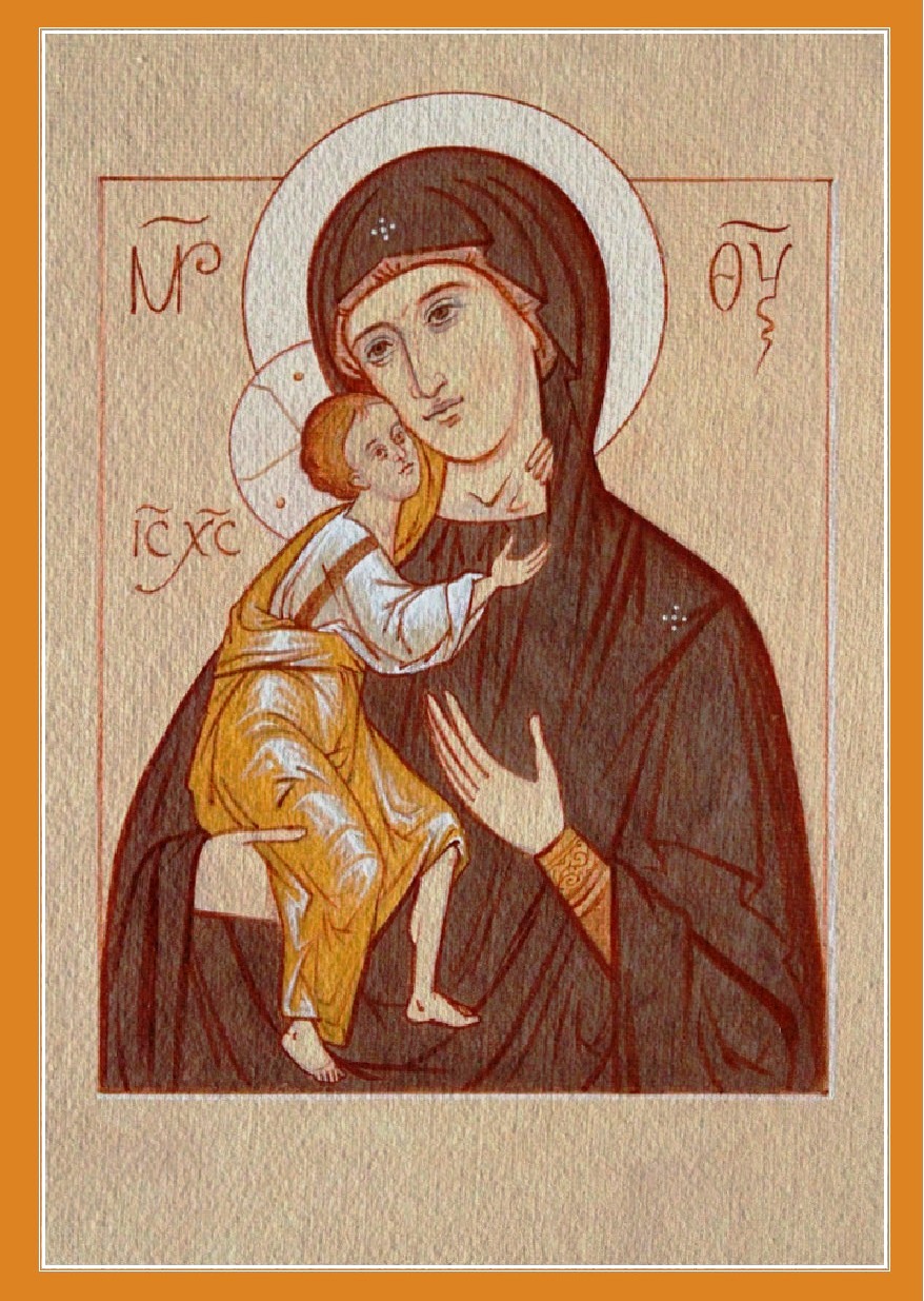
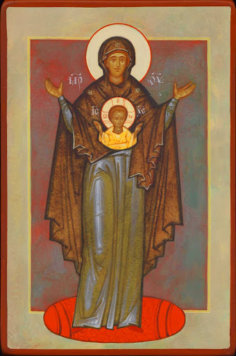
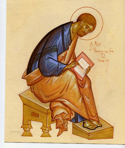
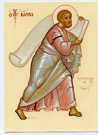
I received this Christmas card from Philippe Lefebvre, whom I met first when I was living in Oxford several years ago. He was interested in learning how to paint icons and went to train with the Russian teacher based in Belgium, Irina Gorbunova-Lomax. He has now completed his training and we can see in this simple card how well Irina (whom I do not know personally at all) has taught him, and how well Philippe has learnt from her. I suggest to you on the evidence of this that first, Philippe should be considered for commissions in your church or home; and second, Irina is very good teacher whom anyone seeking to learn iconography should consider as a possible teacher.
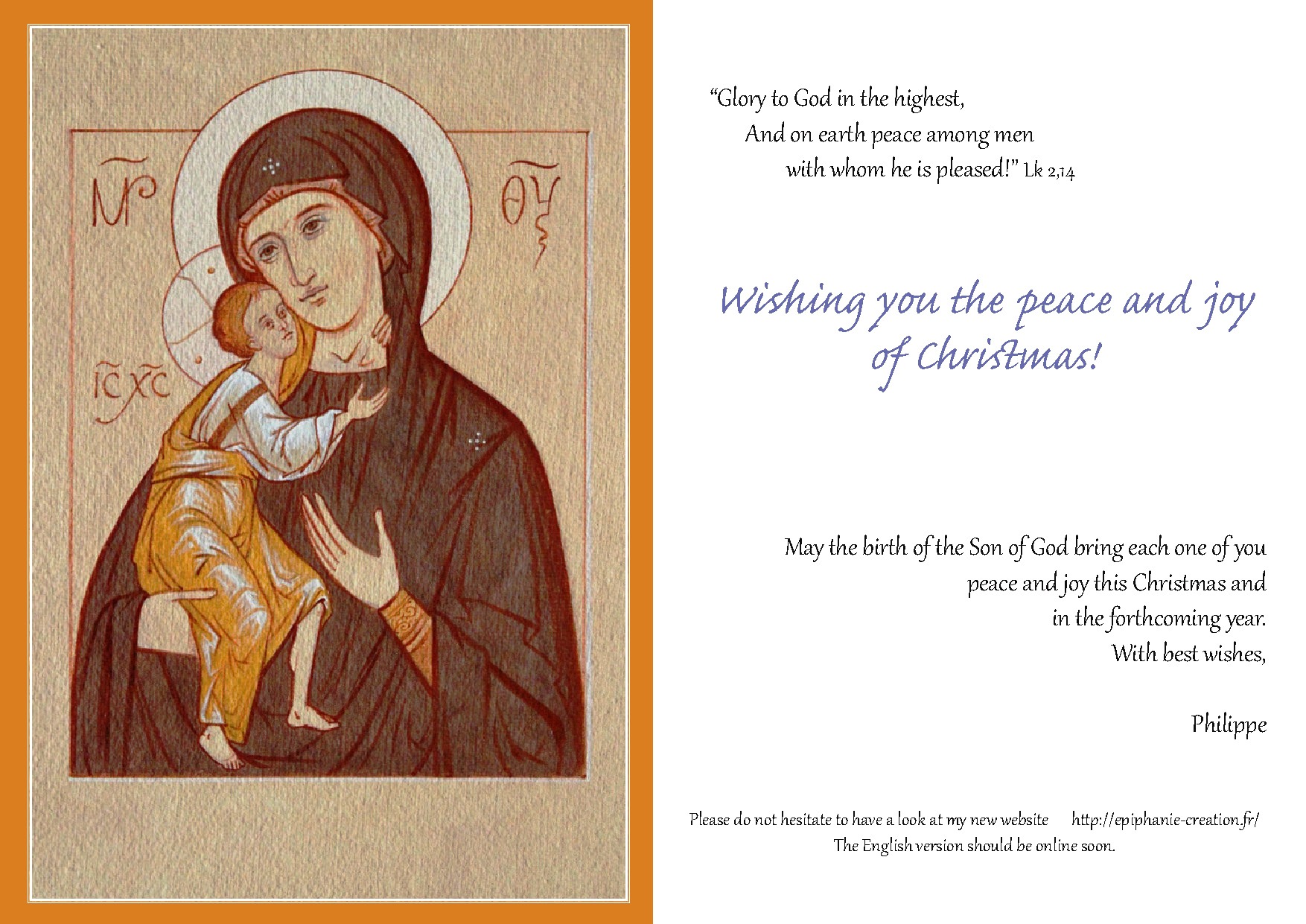
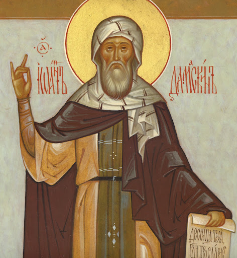
First of all, his style as it is now is similar to his teacher's (you can see her work if you go through the link above). This is as it should be at this stage, just emerging from the school. We train by following the path of past master in our chosen style, copying with understanding under the direction of the teacher. In time, while this will always be at the heart of what he does, I have no doubt that Philippe will start to develop gradually and organically, his own voice in such a way that it magnifies, rather than undermines, the holiness of the images he produces.
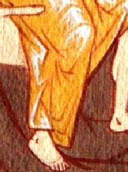
Notice how much in this one image we see how the skill of representing of form in line is crucial to icon painting. There is a grace and flow that gives it beauty. The variation in thickness of each line is used adeptly so that each fold of cloth is clearly readable. Many poor icon painters try to hide a lack of drawing ability behind overly exaggerated stylistic flourishes (a bit like the way that many landscape painters might try to hide a lack of skill behind pseudo-impressionistic flourishes in an oil painting). In fact, every good icon painter is a good draughtsman as well. Eech image must read visually so that the cloth looks as though it is draping naturally around a human form. This means that we need to have an acute observation of nature, which is represented in the image and then transformed into the iconographic style without comprising on naturalistic accuracy.
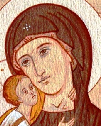
This is a simple image for a Christmas greeting and so Philippe has painted it on card. It is an characteristic stylistic feature of this school to use a coloured base and then let then speak through the painting. The image is simple in form. It relies on a very well drawn line image, that is then skillfully painted so that each line is given a width and slope that is in accord with what is represented. The majority of lines in this painting portray the tonally darkest areas of the form.
Once you have this, then he uses simple, flat and transparent washes to colour in chosen areas. It looks from the photograph that perhaps in the coloration for the Our Lady's robe has a couple of different colours (there is a darker bluish earth colour shining through, I think - certainly it is what I would do if I were painting this). This use of slightly differing tones and colours as transparent glazes, subtly creates a greater luminescence and visual interest than two washes of identical colours, which looks even but dull and sterile.
For the image of Our Lord he adds the third element of white highlights, which are simple but skillfully applied with both line and graded tonal work.
The graded tonal work is minimal altogether, other than the highlights I see only the subtlest application of a reddish or purplish tone in the shadows of flesh areas.
The combined effect is one of restraint and sophistication (using the word in a positive sense). Philippe has pared the elements of tonal and colour variation down to the basic constituents - the darks (which are his lines), the mid-tones (which are his flat washes) and the highlights (which are a combination of lights and graded tone in white). All icon images, even those that have far more complex colour schemes and modelling, break down to these three essential elements. Unless you understand how to simplify in this way, I suggest, you won't be able to do the more complicated well.
For those who might struggle to read the detail in his card, Philippe's website is epiphanie-creation.fr


