Blog

Christmas Trees: a Symbol for the Common Good?

A Christmas tree farmer working for the common good The Fall is a beautiful season in New England, as every tourist brochure will tell you, and so I am out and about  a lot at the moment. I was delighted on a recent walk near Henniker in New Hampshire to come across Forster's Christmas Tree Farm. The farm is situated on a hilltop and his shop has a deck where you can sit and enjoy a beautiful panoramic view of the surrounding area.  Steve Forster the charming proprietor was in and so I immediately starting quizzing him about local walks on developed farmland. Regular readers will know why (otherwise the curious can go here , here and here for past articles outlining my thoughts on the subject). Steve immediately told me that he has opened up trails on his land and makes them available to local people. It's not the conventional farming landscape of cereal crops or pastureland, but nevertheless, here is the land being put to productive use and an landowner who is happy to make it available as a resource for those who will use the privilege responsibly.


Gardening in England and Spain

My parents are both keen gardeners and their love of beautiful gardens has rubbed off on me. (Although, sadly, the knowledge of how to do it hasn’t. I feel I ought to know far more than I do.) Gardening is a great British enthusiasm. Britain is an island so there is plenty of rain brought over by the Atlantic winds; and it has a temperate climate, which means that is rarely either very hot or very cold. The absence of prolonged extremes means that a surprisingly large number of varieties of plants will flourish, including plants that one wouldn’t perhaps initially associate with Britain. For example, you see palm trees in Western Scotland, where the gulfstream hits the coast.  Once, when I visiting my brother who lives in California, I was surprised to discover that the ceanothus, a beautiful blue shrub that I remember from our garden at home in Cheshire, was growing wild in the hills above the Bay Area. It is indigenous to the region. I was told once several years ago that there are upwards of 100 common varieties of ceanothus available to gardeners and approximately 70% of them have been cultivated in the British Isles.

Mum and Dad are now retired and they spend the winter and much of the spring in Spain (along with several million other expats). Several years ago, once the four children had left home, there was no longer any need for the large house that I grew up in. This was sold and they bought a smaller one nearby in England, and taking advantage of the much lower property prices another small place in southern Spain (in common with many British retirees). This left them with the task of developing two small gardens.

The English garden is planted out with shrubs and herbaceous borders and although only about three years since they moved there, it is beginning to look established now. It is the planting of the little Spanish garden though that I find particularly interesting.

Many of the British people who have moved to Spain in the last 15 years, have tried to establish gardens there too. Their approach is to try to recreate a bit of English garden. But an English garden is always thirsty. So when I visit I see neighbours of my parents out every evening holding hosepipes that trail back to a tap on the house as they water annuals such as petunias copiously. If they did not do this, everything would die. My parents approach was slightly different. It was designed like at English garden, which is what they knew, but planted with indigenous plants, so that they would flourish without watering. My Dad explained to me that usually they have to water when they put the plants in, but once each plant is established, it just takes care of itself. This means also that there are no worries about the plants dying when Mum and Dad are back in England and can't care for them.

As a result, people in Spain have started to ask my Dad for advice. And its not just the expats – its the Spaniards as well. They are not used to seeing a garden like this, which is the English cottage garden style, so they are curious.

Pictures below are first, of the garden in England (graced by Mum, sometimes taken by surprise!) and the second set are in their garden in Spain.

and now Spain...

The view from the garden, over the olive groves to the mountains in the distance...

And just in case you didn't believe me... here are some palm trees on the coast of the west of Scotland, further north than James Bay in Canada

Is there a place for Celtic art today?

I have written a number of articles about ‘hard’ faceted patterned art and how it manifests sacred number, here. There is another decorative art tradition which might be termed, in contrast, 'soft'. This has the flowing and spiraling lines that we are accustomed to seeing in what generally seems to be referred to as Celtic art (although digging around, I have find Anglo-Saxon manuscripts that look similar to me). I am talking of manuscripts such as the Book of Kells or the Lindisfarne Gospels. However, it is not confined to this period, Romanesque, gothic and even the baroque periods had their own versions. It is non representational, but to me evokes the natural world in two ways. First it looks like the twisting and swirling shapes of vegetation, perhaps a creeping vine. This graceful, calligraphic flow of line gives it great beauty. Second, I am reminded of the mathematical functions that describe the natural world. I studied physics at university and the parabolas, hyperbolas and elliptical curves that are used in the mathematic description of the natural order (here in astro-physics) so often seem to jump out at me from these elaborate designs. Considering now exclusively the 'Celtic' style. It has an appeal way beyond sacred art and there are many artists today working designs directly inspired by these forms into media ranging from tattoos to jewelry. There is also a strong association with new-age-crystal ‘spirituality’. As a result, I find it difficult not to associate most modern attempts at sacred art incorporating this style with 1970s-vintage folksy Masses trying too hard to be trendy. Despite this, given the striking beauty and broad appeal today of the originals, I do think it is worth considering how we can use it for a genuine Christian purpose. Looking at reproductions of the old manuscripts, the decoration is not usually produced in isolation but as an embellishment on something else, a cross, script or figurative art. I am particularly interested in the figurative art because it is an authentic Western variant of the iconographic form. It is interesting to me that their figurative work not only has a decorative additions such as border (which other Christians have also) but their representations of the human form incorporate the swirl and flow into the lines as well. This makes them as highly stylized as any iconographic form that I know. (Interestingly, and I have no explanation for this, I cannot find images of Our Lady or Our Lord in this style.) As a result of this high level of abstraction, and correspondingly low level of naturalism, the form is even more two-dimensional than other iconographic forms.

If you have the figure in any pose other than straight on (we see St Luke from the Lichfield gospels left), staring out of the page, then it becomes very difficult to incorporate it succesfully. First, the image relies on a balanced symmetry to work. As soon as the figure is rotated, perhaps to three quarter profile, it makes it asymmetrical to a degree that erodes this balanced harmony. Second, the more that you introduce poses in the figure that are not face on, then more that you need the illusion of space in the image to describe the form. Take the simple example of a face in three-quarter profile; that is slightly rotated. Due to the rotation of the head, one eye is further away from us than the other. In order to make this read, usually the artist will make the more distant eye slightly smaller than the nearer one and in doing so introduces a slight natural perspective. Consequently a few inches of illusionary depth is introduced into the image. If trying to work in this ‘Celtic’ style, the artist then has to consider how to apply this rotation to the decorative element, which has an unavoidably flat, two-dimensional form. It is very difficult to accommodate both while retaining a sense of consistency in style. Any artist today, who is not naturally working in this style, living and breathing it as it were, will find these poses very difficult to create without them looking out of place. (The masters of the past did mange it, however, the four evangelists of the Lindisfarne gospels are not drawn front. St Luke is shown below.)

For a similar reason, this style does not lend itself to narrative imagery. In order to relate, for example, a scene from the life of the saint, each figure to turn and interact with others in the scene. The problem of style consistency in these scenes would be harder again for a the modern-day artist. I was very interested recently to see the work of Daniel Mitsui. He is unusual in that he is trying to recreate the figurative art in this style (not just the decorative swirly parts). I recently had a discussion about him because I saw examples of his work and liked them. I contacted him because I wanted to encourage him to do more. His ‘In principio’ and the St Patrick work well I think. The figurative piece is clearly based upon the traditional form (with figure fully facing us). It has also a contemporary feel, but this, in my opinion, doesn’t detract. His St Columba works less well. The face of the main figure is fine, but the narrative scenes below the main figure are struggling to grapple with the difficulties I describe above. As a rule, I am very reluctant to focus on any negative publicly. However, with his permission that I bring them to your attention, because I think it illustrates exactly the way in which artists learn, by doing it first, then analyzing (often with the help of others) and finally, one hopes, learning from these early attempts we can go on and produce even better work.

There is the question also, even assuming we can master this style today, as to where it is appropriate. I find it difficult to imagine a 6ft mosaic or fresco in a church in this style. I can see it, however, working in the setting from which we draw most of the originals, in books - say a Book of Hours or lectionary.

Above, three pieces by Daniel Mitsui.

Below, St Matthew, Book of Kells

An Old England Walk in New England

The pleasure of going round in circles I have written before, here, about my belief that farms and gardens are, or at least with God's grace can be, even more beautiful than the wilderness. I have also referred to my love of walking in the countryside. There are lots of set aside hiking trails in New Hampshire, nearly everything I have seen is set in conservation land, owned by the state and so not farmed but rather, it is left to grow wild. Typically, therefore, one is walking through a tunnel through trees, emerging occasionally at vista points to see...tree tops. I seek the pleasure of good old fashioned 'walk in the country'. This is an aesthetic pursuit which, while involving exercise, emphasises more the enjoyment of the scenery and, if done in the company of others, conversation along the way.  The modern version is a 'hike in the wilderness'. This is much more an athletic pursuit. Clearly there is enjoyment of the scenery there too but often expressed in a new-agey spiritualism:  the individual seeks to  'commune' with Nature. Just to illustrate the point, when I arrived in New England I signed up for a group that walked regularly in the White Mountains in northern New Hampshire. On the sign up form, there were sections in which they invited people to answer questions that gave a bit of background about themselves.  Sample questions were: 'What sort of goals and challenges are you going to set for yourself in this group?'; or 'What is your greatest achievement as a hiker so far?'. I couldn't quite see how 'pleasant conversation' could fit into the category of goal, challenge or achievement.

When the middle classes of Jane Austin's novels went for walk in the country, they didn't pull on their ergonomic rucksacks and aim for three peaks or 50 miles in a day.

Since I arrived in New Hampshire I have been trying to discover circular walks in farmed countryside. There is no tradition of public footpaths across private land here, so I try to connect public, unmade roads and old cart tracks (some do exist) that run through at least some farmland. I have managed a couple. Recently I thought I had completed one near the Blackwater Dam near Webster, NH. Unfortunately I couldn't complete the circle because the old cart track bridge over the river had collapsed. There was a ford for horses, but this was too deep for me to cross. Nevertheless, this leaves me with too very pleasant walks along a river, in which I will just have to go so far and then retrace my steps. Here are some pictures.

These stone walls mark the boundary of what used to be a field for pasture, now overgrown with trees.

The old bridge collapsed many years ago. The water is too deep, so its either swim across or turn around. (I chose the latter option!). Unfortunately I didn't have a pair of waders like our friend below..


Beauty and Superabundance in Business

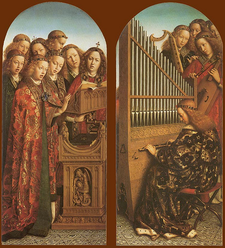
Consider two musical notes. They can be played separately, but when heard simultaneously something profound happens. Without destroying the integrity of each individual note, a new third entity has been created – a chord. What is interesting about the chord is that is created out of nothing. Crucially, the result is beautiful. What has this got to do with business? This little example is analogous to what happens in business when wealth is created. In his encyclical, Caritas in Veritate, Pope Benedict XVI describes how wealth is created out of nothing – he uses the phrase ‘superabundance’ to describe it.

It is out of nothing because nothing materially new has been created. Through a transaction two people have exchanged one thing for another which they value more highly (otherwise they wouldn’t have chosen to do it) and wealth has been generated.

The principle of superabundance is based upon the presence of God. When human relationships are founded upon love (ie mutual self-sacrifice) then God, who is Love, is present in a special way. When He is present, they are termed ‘covenantal’ relationships. Covenantal relationships are always fruitful – something new is created out of nothing. In the family, this fruitfulness of love is realised in the creation of children. Clearly not all human relationships are intended to be as profoundly loving as a marriage, but all of them, even those in business, can be ordered to love rather than selfishness and will be more productive for it. Relationships which, in the other hand, are based upon the alignment of self-interest, are termed ‘contractual’.

Pope Benedict describes covenantal relationships in the context of business as being imbued with the principle of ‘gratuitousness’. Gratuitousness exists when something is freely bestowed by one for the benefit of another. It relates as much to the how of the action as to the what. If, for example, the way we treat someone communicates that we genuinely trust and value that person then that is going beyond the simple contractual aspects of the relationship (which are in accordance with the demands justice). This he says is not just desirable, but necessary. He goes as far as to say that, ‘Without internal forms of solidarity and mutual trust, the market cannot completely fulfill its proper economic function.’ Note he says explicitly the economic function is fulfilled – he is not referring here to incidental social benefits. There is no exchange without some wo

Beauty, I would suggest, is a litmus test of love and so of the maximisation of superabundance. When it is present in our actions then it indicates that we are opening ourselves up to the source of inspiration for greatest creativity and productivity. The generation of ideas and seeing them through to fruition is the basis of entrepreneurial activity.

To the extent that what we do is beautiful, it will be in harmony with the common good also. This means that in serving the aims of the business, there can be no conflict with society or God’s creation. If this is true then we might have found the route to genuinely ‘green’ business activity: one in which the more profitable and productive it is, the better it will be for the environment. This is something much more profoundly ‘green’ that many green activists envisage. The assumption behind the secular worldview appears to be that man is necessarily in conflict with the environment and so their solution is damage limitation in one form or another. This usually boils down to reducing the amount of human activity (which in turn usually equates to reducing the number of human beings on the planet). In contrast, the idea of superabundance offers the vision of a transformed human activity that improves upon the natural world. It is better than an activity that is neutral ie does not destroy the wilderness; it actually improves and perfects it. Nature is meant to flourish under man’s influence, and with God’s grace it is possible. When what we do is in harmony with nature, then in contrast to what we described before, the more active man, is the better it is for nature; and accordingly the more people there are doing it, the better.

How can we combine consideration of what is beautiful with the other considerations of running a business? Profit has to be the driving consideration and this doesn’t change that. Provided that moral law is not contravened the motive of profit will dictate what decisions are made. But an education in beauty (as described in more detail here) will naturally stimulate ideas that are simultaneously good for business (in the sense of profitable) and in harmony with the common good.

There are occasions when I can imagine the principle of beauty being considered consciously: for example when there are number of options available that seem equally valid by other criteria. At that point one might ask which is the most beautiful option? Even then I don’t imagine it will always be an easy criterion to use, we may be trying to apply it in situations in which beauty is not normally associated. In some situations it will be obvious though: if price is set by the perception of the value of an object, and if we make objects for sale more attractive then people will pay more. This is the idea that pitches the more expensive yet visually appealing and user-friendly Apple against the cheaper PC. But we are talking of something deeper as well. Beauty is a guide (along with morality) to the right exercise of our free will. Whereas morality restricts options, beauty multiplies them.

There is another aspect to this. The more we take the principle of beauty into account, the more our actions will be covenantal. We will giving of ourselves and going beyond the limited demands of justice. This gift of self, says the Pope, ‘by its nature goes beyond merit, its rule is that of superabundance.’ Business has its place in the fulfilment of the common good and to that end must be seen as something that is good in itself and business done beautifully is going to be closer to the fulfilment of that ideal.

It is important to note that we are living in a fallen world, and so seeking to institute a covenantal model of operation does not preclude contracts. The market is regulated by law in accordance with the principles of justice (or at least it ought to be), and contracts reflect this. While contracts are necessary, they are never enough. Contracts alone cannot generate the trust and goodwill that oil the wheels of commerce. It is the covenantal behaviour that permeates this legalistic structure that does this and so must be there too. I know of one person who has successfully developed and applied a systematic method of identifying and developing naturally occurring covenantal relationships. John Carlson of System Change, Inc. looks for  those revenue generating covenantal relationships in the companies that he works with. They permeate through and sit alongside the formal management structures in any company (and extend out into the client base). Once identified, he uses these as a basis for sustainable growth in accordance with a covenantal business model.

These considerations, I believe will hasten the business on to its proper end. The end of a good business is the steady creation of wealth in harmony with the common good; but take note, the right end of a bad business (if it doesn’t change) is failure! The indications are that the employment of these principles in the past (for example by the Benedictines) and by modern entrepreneurs works well for sustainable growth when understood in these terms.

For more detail on these principles see articles Sustainable Growth and Art, Grace, Education and the Beautiful Business, both at our sister site, www.thewayofbeauty.info.

PS There are two more blogs that have recently started that discuss these and similar matters: Andreas Widmar has started a blog Faith and Prosperity Nexus which is about 'sound business and strong faith in action' and knowing Andreas as I do, it'll be about enjoying the process too!

Fr Michael Sweeney's new blog, Re-Visioning Society discusses the common good and Catholic social teaching. He is an insightful and inspiring speaker if you ever get a chance to hear him.

http://thewayofbeauty.org/2012/04/the-green-green-grass-of-texas/
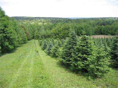
The Role of the Catholic Artist Today

Daniel Mitsui, whose blog  The Lion and Cardinal is doing a series of interviews of contemporary Catholic artists. He recently spoke to me about the practical process of creating art (which you can access here). The interview probed me, quite deeply, on how I approach painting - the attitudes I feel I must adopt, prayer, and how to draw on tradition discerningly.  He also reproduced a few of my paintings for any who are interested. The homepage of Daniel's blog, the Lion and the Cardinal, is here. And, while we're on lions and cardinals, the picture, is a detail of the 15th century painting (by Italian artist, Colantonio) of St Jerome removing the thorn from the lion's paw (a medieval tradition).  St Jerome was not a cardinal (there weren't any all until three centuries after he died) but he is one of the great Fathers of the Church and a Doctor of the Church. So we can assume that if there had been any when he was around, he would have been one of them! It is appropriate that today, September 30th, is the memoria of St Jerome.

I have given some more paintings of him below, one showing him in red cardinal's garb, anachronistically.

El Greco, 16th century

Ribera, 17th century

Caravaggio, 17th century


Japanese Landscape

The compatibility of traditional Japanese and Western Landscape I have discussed before the compatibility of Chinese and baroque landscape. The controlled variation in focus and colour  is common to Eastern and Western forms - the most important parts of the composition in sharper focus and, if it is not monochrome, most intensely coloured. Traditional Japanese landscape is worthy of study too. If anything the variation is even more marked. So much so that I would suggest that any budding landscape artist study these as part of their training, even if eventually they wish to concentrate on the Western form. One of the hardest things to do when painting from nature is to decide which parts are blurred and which in focus so that the end result is a coherent, unified impression. I feel that study of these Eastern forms would help develop this faculty.

This is not a new idea. The landscape painters of the 19th century, such as the Impressionists and others such as the great John Singer Sargent studied Japanese art (especially woodcut prints) and their compositional style was affected by it. If we look at the painting at the bottom by Alfred Sisley, (who came from and English family, but lived in France) example, the hanging boughs that frame the composition and the indication of branches and foliage in the very near foreground is a development in the 19th century that corresponds to the Eastern style of composition.

Other articles describing the principles of baroque landscape here.

News: Catholics TV series featuring David Clayton

The Way of Beauty is now the name of a new TV series produced by Catholic TV, which is based in Boston. We have been filming this over the last year at locations around the area including the campus at Thomas More College. It is a 13-part series and the first two have been aired. You can watch each show, after it has been aired at the Catholic TV website here. Alternatively you can go through the page on this blog 'Way of Beauty TV Series'. If you click the icon of the Sacred Heart of Jesus, it will take you through to the page on the TV company's website where you can watch each show.

News: a musical premiere in London by Catholic composer

Frederick Stocken, my favourite contemporary composer and one who definitely follows the via puchritundinis is giving an organ recital, which includes a premiere of sacred music composed by him. It is on  Wednesday 29 September 2010, 7.30pm, at St Mary and St Joseph’s Church, Poplar, London, E14 6EZ. The programme includes works by Bach, Sechter, Bruckner, Franck and Boellmann. It closes with the premiere of his own work, St Michael the Archangel. Here are his comments on the piece: ‘I first realised that I would write a collection of pieces for the organ based on the archangels on this very day, 29 September, the Feast of the Archangels Michael, Gabriel and Raphael (otherwise known as Michaelmas) a couple of years ago; hence the idea of unveiling St Michael on this feast. I am still writing the other movements because other projects intervened, but am due to give the set its first complete performance next October at St Michael’s, Cornhill. I hope it will suffice to say that I have tried to capture, however imperfectly, something of the power and magnificence of this ‘Prince of the Heavenly Host’, as Pope Leo XIII described him in his famous prayer to the angel. I also had one practical consideration: that each of the pieces would not be so long that they could not also be played in due course after a mass or service as a useful voluntary.’ To read more, visit his site here.

Business Culture and Creativity

Business decisions are driven by aesthetics When I was living in Oxford, I met an American called Michael Black, who is a former MD of the American Stock Exchange. He is now based at Blackfriars, the Dominican house at the University, where he specialises in the study of the theology of business. In conversation with him one day, he told me a surprising thing. When one examines what motivates people to make the business decisions they do, contrary to what most people assume (even those who make the decisions), it is neither pay nor profit that is the primary motivator.

When he examined actual behaviour and decisions made it suggested something else to him. ‘However, you structure a pay or commission scheme,’ he told me, ‘people act in accordance with the company culture rather than what the commission scheme is motivating them to do. Also you might think, at least for the management within the company, that profit would be the strong motivator; and at one level it is. Except that the way that profit is defined depends upon what is valued, and in practice that varies from company to company. Even standard accounting practices allow for a whole range of definitions of profit.’

If you go to the root of the decision making process, he says, you always find a set of arbitrary assumptions about what the company ought to be doing. Some businessmen may like to think that they act purely by reason, but in fact like everyone else in all walks of life, decisions are made by applying reason to empirically gained information in accordance with assumed principles. What really piqued my interest was Michael’s assertion the choice of starting assumption is at source and aesthetic one; consistent with an innate sense of what is in harmony with the core values of the individual. In other words, whether they are aware of it or not, people choose what they believe to be beautiful.

This means therefore, that an education in beauty is an education in business practice. When we apprehend beauty, we do so intuitively. Therefore, an education that improves our ability to apprehend beauty, as Thomas More College’s Way of Beauty does, develops also our intuition. All creativity is at source an intuitive process so this education develops creativity also.

Beauty like morality is a principle (or perhaps a set of principles) that guides our freely chosen activities, helping us to make good choices. Morality tends to work on a negative basis – it cuts out options that are bad. In contrast, beauty is a principle that operates on a positive basis – it presents new possibilities in the form of new ideas that are in harmony with the common good. Choosing what is beautiful will invoke the principle of 'superabundance'. Superabundance is the creation of wealth out of nothing that Pope Benedict XVI describes in his last encyclical, and which I describe here.

The ‘company culture’ is formed from the aggregate of the values of the people within in. By values I mean what they believe to be good. People flourish within the company when they act in harmony with its culture. And in turn, ultimately, a company will flourish as God intends when its culture is in accord with the common good.

Of course, any culture can be good, or it can be bad. However, Catholics who have a deep understanding of what culture really is  (or at least what it ought to be) are in a position therefore, to create a culture that is in harmony with the cult that sustains and perfects all that we do, that is the liturgy of the Church with the Mass at its centre. The Way of Beauty is rooted in the premise that Catholic culture, in its broadest sense, is rooted in liturgy.

The photographs are of a selection of 18th century mill buildings.

The Symbolism in the Content of Fra Angelico's Frescoes

The Sermon on the Mount Rather than talking about form, my usual interest in painting, I thought that this time I would focus on the symbolism of the content contained in an example of gothic art by focusing on a fresco of the Sermon on the Mount, once again by Fra Angelico (1395-1455). It is in cell 32 in the north wing of San Marco in Florence and was painted between 1440 and 1450. I should mention that I am indebted to a lecture given by Dr Lionel Gracey who was my colleague when I was teaching at the wonderful Maryvale Institute in Birmingham, England for much of the detailed information here. First of all there is the symbolism of the colours of Jesus’s clothes. The red under garment or tunic is red, which is a symbol of blood and a sign of his humanity; while the blue outer garment or cloak symbolizes his divinity. I was told that originally in this fresco the blue of the cloak matched precisely the heavenly blue of the sky. Fra Angelico often uses this colour symbolism for Christ and it is seen in all three liturgical traditions (although it is certainly not true to say that depiction of Christ is limited to these colours). Shown below is the Last Supper of an earlier gothic master, Duccio; a modern icon of Christ by Gregory Kroug, the 20th century Russian émigré; and The Kiss of Judas by Caravaggio from the early 17th century. All have the same colour scheme for Christ's robes. Judas is depicted in Fra Angelico’s painting as well, indicated by the black halo – an aura of darkness representing evil.

Dr Gracey pointed out how unusually shod Jesus is, in a slipper of some sort rather than sandal or barefoot. He speculates that this is an allusion to the Eucharist because during Passover the Isrealites were required to be shod.

What strikes me about the composition of this fresco is the vertical dynamic in colour, light and composition that sweeps the eye up and down the painting through the geometric centre, which is somewhere around his knees. Our eyes sweep continually from earth to heaven and back, so to speak.

The colour dynamic comes in the match (when still bearing the original colours) between the blue shawl on Christ to the blue of the sky above. This causes our eyes to sweep upwards. Also, Christ’s hand points directly upwards. At this point commentaries often say that he is telling us figuratively that his kingdom is ‘not of this world’ (John 18:36). The light takes us down in the other direction. As described last week, the upper part of Christ is dark and the lower portion is light. The eye is taken from here to the brightly lit rock plateau beneath him.

A link is often made between the Sermon on the Mount and the 10 Commandments. Christ resumed these Commandments in the double precept of charity -- love of God and of the neighbour; He proclaimed them as binding in the Sermon on the Mount (Matthew 5). The mount upon which Jesus is preaching echoes Mt Sinai on which Moses was given the commandments. This parallel is emphasised by the bright illumination of the rock. Also Peter, whom Christ appears to be addressing, to his right, is ‘the rock’ upon whom He would build His Church.

Given Fra Angelico’s masterful manipulation of light (as I described last week, here) Dr Gracey suggested to me that this was the perfect painting for contemplation of the third Mystery of the Light in the Rosary, the Proclamation of the Gospel.

This is the third short article about Fra Angelico and the gothic that have been written for the New Liturgical Movement. The second was last week, already referred to and the first is archived here.


Fra Angelico's Theology of Light

I thought I would do a short series (I intend three at this stage) of articles focussing on paintings by the gothic artists, looking at two of my favourites Fra Angelico and Duccio. Fra Angelico, the 15th century Florentine artist is normally considered late gothic in style. Duccio, from Siena, worked earlier, in the late 13th and early 14th centuries. Duccio's work represents the more iconographic based style and Fra Angelic the more naturalistic. Looking at these two exemplars of early and late gothic art gives us a good sense of what characterises this tradition. This is not just for the purpose of an art history discussion. I think that there is much to benefit from artists today who are trying to spark the ‘new epiphany of beauty’ by looking at the gothic tradition. First, it is one of the three authentic Catholic liturgical traditions cited by Pope Benedict XVI in The Spirit of the Liturgy. Also, I often find in conversation that his work appeals to people who have a similar understanding of the Faith, the liturgy and Catholic culture as I do. It seems that for many, Fra Angelico in particular has the balance of naturalism and idealism that nourishes the prayer of modern man. John Paul II gave him a special mention in his Letter to Artists. I think therefore that perhaps this could be a good starting point for artists to study and from which a distinctive art of Vatican II could develop in the future (just as the baroque, which developed from the base of the stylistic developments of the High Renaissance, might be considered the art of the counter-Reformation and of the Council of Trent). Only time will tell if I am right in this regard, of course.

The gothic style arose from a different understanding of man's perception of the natural world through his senses. The ideas that drove it developed from about 1000AD onwards with the rediscovery of the philosophy of Aritotle and the subsequent incorporation of his ideas into Christian thinking by figures such as St Thomas. The love of nature of Franciscan spirituality was also influential in popularizing the ideas. I have written more about this here.

As I wrote in a commentary on his Annunciation, Fra Angelico working late in the period is very interesting to study for his selective use of the features of the well observed naturalism such as perspective, shadow and figures in profile; and his retention at other times of those features of iconographic art.

If we look his Resurrection a fresco from one of the cells in the monastery of San Marco in Florence, we see Christ rising in an almond shaped mandorla, the traditional symbol of His glory, carrying the red and white Resurrection penant. The background is shadowy and dark and we see the tomb drawn with naturalistic perspective. The angel is in profile, which would never be seen in an iconographic painting, though shining with uncreated light which one would expect in iconographic art.

There is one stylistic feature that Fra Angelico uses that interests me greatly. This is his habit of putting the face of Christ in shadow. On first sight this is strange, since he shows the rest of the person of Christ shining with light and the face of the angel, a great, but nevertheless lesser being is totally in light. When I first noticed this I wondered why? A Dominican friar in England told me his interpretation of this: Fra Angelico is showing a light that is brighter still. In fact it is so bright that it blinds us - it is too much for us, fallen human beings who are observing Him, to bear. I find this explanation convincing, especially because we see in in other paintings by Fra Angelico, for example the Transfiguration and the Sermon on the Mount have the same feature.

Serving the Common Good in Rural New Hampshire

Thomas More College students clear an 18th century cart track Following on from last week’s article, here is an example in New Hampshire of a landowner who is putting his land in the service of the common good. He is Fr Roger Boucher, a chaplain at Thomas More College of Liberal Arts. Fr Boucher lives on his hermitage which is situated on a farm, several miles north of Concord, New Hampshire. Students from the summer program of the Catholic Leadership Institute helped expose an 18th century cart track, still marked by the stone walls along its sides although overgrown with trees and scrub. The eventual aim is to make the route open to members of the public in an arrangement based upon trust.

You can read more about this very successful and inspiring program here.

The TMC summer program, which took place predominantly on the campus in Merrimack, NH, taught the important idea of leadership through service, underpinned by the principles of Catholic social teaching. Daily lectures from Thomas More College faculty and visiting speakers gave participants a firm understanding of key ideas such as just war theory, common good, the human person, solidarity, authentic teachings on the family, and other Catholic insights on basic economic and political issues that will confront them throughout their lives.

As well as the lectures, there was a strong hand-on element included in the three-week programme: “Each week included opportunities for participants to enact the corporal works of mercy,” said Dr. William Fahey, the college President told me.  “’To serve, rather than be served’ has long encapsulated the essence of Christian leadership.  By volunteering at homeless shelters, food pantries, and other charities, students were encouraged to consider these acts as an essential part of Catholic living.” Students volunteered at several organizations, including the Nashua Soup Kitchen and Shelter, Friends of the Unborn Crisis Pregnancy Center, a refugee center in Manchester, NH, and other charities.

Fr Boucher's farm is situated a few miles north of Concord, in New Hampshire. He addressed the students at the college first, talking on the principles of leadership in the armed services, drawing on his many years as a Navy chaplain (he had the rank of Commander). Then, having inspired them to serve, a few days later he welcomed the students to his home…and put them to work! They all enthusiastically rolled up their sleeves and spent a sweaty and hardworking but satisfying day on the farm in the cause of the common good. The result of their sterling service was a clear pathway of several hundred yards running through the trees.

Here are some photographs. The first below is of Fr Boucher, addressing the 'troops' some days before. The next ones are of the farm: students with the track, before and after. Finally, yours truly surveying the work!

Prayer Cards and Prints from St Joseph's Flamigny

I would like to bring to your attention work from the Abbey of St Joseph de Clairval in Flamigny in deepest Dijon, France. Their workshop produces prints of prayer cards and devotional art of modern works in the style of French early gothic 13th-century illuminated manuscripts. When I first decided I wanted to paint for the Church it was to the gothic that I was first attracted. I was not aware at that stage of anyone producing modern works in the gothic style so went first to the iconographic. Perhaps if I had known about these, I might have found myself in France rather than New Hampshire. You see these and others at their website, here.

The Assumption is shown left.The Annunciation

The Visitation

The Crowning of Mary

20 Mysteries of the Rosary

Seven Sorrows of St Joseph

The Glorious Mysteries of the Rosary

The Luminous Mysteries of the Rosary

Mary, Mother of Mercy!

How Golden is the Golden Section?

Whenever I talk about proportion and harmony in art and architecture, many assume that I am referring to the proportion known as the Golden Section (often indicated by the Greek letter Φ). When I started to investigate these things, I assumed that the Golden Section was important too. However, to my surprise, my investigations lead me to believe that although it was known to past societies and cultures, it was not as important as we assume today. In fact, the idea that it was used by the ancient Greeks, the medievals or masters of the High Renaissance is, as far as I can work out, largely a myth. I have described in detail in my course, the Way of Beauty at www.Pontifex.University and in my book of the same name, how important symbolic number, proportion and harmony (expressed numerically or geometrically) was for artists and architects in the Christian tradition and how they were seen as a manifestation of the cosmic liturgy. But, surprisingly, it seems that the Golden Section, Φ, isn’t part of that tradition. It is proportion based upon the mathematics of music that was much more important. Most of the books that I read justify their argument with a diagram, like the one shown left. In this diagram a grid is placed over a copy of Leonardo's self portrait drawing. The grid, to my knowledge, is not taken from information given by Leonardo himself in regard to this drawing, but is a modern superimposition. To me it looks like an array different rectangles, no doubt all relating to to Φ is some way, but otherwise arbitrarily chosen until their combination coincides with the main features of the drawing...and not very well at that. The eyes, the mouth, the tip of the nose, the chin (which is hidden) do not coincide with the lines drawn. This  misfit is typical. When you look at it, given the margin of error that required to make it fit, you could justify just about any proportion you chose to apply.

My feeling is that today's overemphasis of the historical importance of Φ results from a modern, neo-pagan worldview in which the natural world is seen as the ideal of beauty. This is in contrast with the tradition Christian view that the world, although good and beautiful, is fallen and points us to something greater. The Christian interest has always focused more on what the created world ought to be, rather than what it is; and to what it points us to, that is the ultimate standard of Beauty, God.

I have found no historical evidence where contemporary sources say that Φ was used in the design of any building before the 20th century. It was known to the ancient Greeks, but I don't see anywhere that they considered a proportion of great beauty. I have seen plenty of analyses of old buildings by modern commentators which claim that their analysis of the dimensions of the building support the hypothesis, but the margins of error are so great that these claims are not credible to me. Moreover, there are other traditional proportions, for example those referred to by Boethius, Plato, and Augustine which would fit more closely and we do have evidence that they were used in the design of buildings from the pre-Christian era up to the early 20th century.

If we assume that I am right and that the use of Φ in the past has been exaggerated in modern accounts of art history. Does this mean that it shouldn’t be used today? In my opinion, not at all! However, if we do decide to use it, it should be done so with discernment. We need to consider what precisely we feel that it symbolizes and how it relates to the rest of the Christian tradition of harmonious proportion. If we consider it, for example, as a symbol of a fallen, imperfect world, then it should not be used in isolation, but should always be used in conjunction with other proportions that allow it, to use a musical terminology, to resolve to a more perfect harmony. The ultimate test of its value, however, is not the theory that justifies it, it is the beauty of the buildings that employ it.

I have described the reasons why I am so skeptical about the use of the Golden Section much greater detail in the chapter Golden or Fallen? in my book, the Way of Beauty.

My mind is not closed on the matter - if someone can produce an account from an architect of any historical period who describes how he used this proportion in his design, then of course I will change my mind!

who-built-the-pyramids-merl

Aidan Hart's Icons in Fresco

When I was in my early thirties (quite late to be making these decisions) I made an earnest decision to try to learn icon painting. I telephoned the only icon painter I knew, someone whom I had met once about five years earlier. Since I had met him, Br Aidan had spent a number of years on Mt Athos and on returning to England had founded a hermitage, that of SS Anthony and Cuthbert in Shropshire, England. I asked him to teach me icon painting. It was interesting that in response he was interested in my reasons for wishing to paint, rather than my natural ability. He asked me first why I was interested in icons. I had converted to Catholicism just a couple of years earlier and I explained that I wanted to learn to paint to serve the Church. Then (and I can’t remember precisely how he phrased the next question) he asked me what, if anything was possible, I would like to do with my art. I told him that I wanted to be able to paint something like the Sistine Chapel that really gave glory to God on a grand scale. He didn’t laugh (which is what I was half expecting). I remember him saying, ‘This sounds good.’ Then he paused and said: ‘I’m frescoing the chapel at the hermitage at the moment. Would you like to come and stay with me and help me?’ This was extraordinarily generous of him. So off I went to stay with him for a week and this was my introduction to frescoing. I was shown how to mix the plaster, how to apply it, and then how to paint onto the partially hardened plaster. He had built a wooden container about 2ft square and 2” deep to contain an area of plaster. As an exercise, I painted on this a copy of a Minoan fresco from Crete. After this introduction to the medium, I assisted him with the chapel itself, mostly lifting and grunt work. The most valuable lesion was watching Aidan doing the painting. Aidan was much better at painting than me, but also, as a result of being a hard-working hermit and farmer, he was also in much better shape than me. My recollection is that I was not particularly helpful and did most of the grunting, while he did most of the lifting. Nevertheless, by the end of the week he did allow me to assist in some minor detailing on the chapel wall and painted some faux drapery. He had a tiny chapel, perhaps 15ft square, which he frescoed from floor to ceiling. The iconostasis separated a sanctuary about 4ft wide from the body of the chapel. Once it was finished, to see a church painted from floor to ceiling took the breath away. Fresco is a medium that is not seen very often today. A summary of the method can be seen on Aidan’s website here, along with more of his work. There are some considerations that ought to be considered. First, the pigment is painted onto wet plaster which can be worked on for about a day after application. This means that there is always visible join between one day’s work and the next. The easiest way to stop this being too much of a distraction is to consider how much you can do in a day and allow the plaster line to coincide with a line in the final composition. It also means that in order to cover large areas (even those areas in this chapel would be very large paintings if put onto panel or canvas) the artist needs to be able to work expertly and fast. Aidan is both expert and fast, but even it is noticeable that he rations the time-consuming modeled areas to those that really need it, the faces. In the areas of drapery, for example, he relies far more on flat colour and line to describe form than he would in for example, his panel icons. This is fine for icon painting, which relies on line strongly to describe form. In more naturalistic styles, the ability to summarise form into simple shapes of tone with minimal blending is necessary to cover at speed those areas that are not the primary focus of interest. This is immensely difficult. This is why one can never cease marvel at the skill of, for example, Michelangelo or Raphael in their work in the Vatican. Also, deep shadow is difficult to portray in fresco. In this respect it is rather like egg tempera. Dark colours are possible, as we can see in Aidan's work, but they tend to look flat, rather like soot sitting on the surface, rather than creating an illusion of deep space in the way that a transparent glaze of dark oil paint does. This is not a problem for the iconographic form which deliberately seeks to destroy the illusion of space. It also makes it very good for decorative or patterned work which relies on flat areas of colour and tone that contrast with each other. In those forms that rely on deep shadow, the problem is more difficult. The naturalistic painters particularly those working in the styles of the High Renaissance and the baroque had to adapt by learning to work in a higher register of colour as effectively a half of the spectrum of tone is denied to them. This involves great skill. I wrote a couple of weeks ago about the work of Tiepolo, which has a distinctive light, airy feel. The high register colours he uses in his oil paintings look to me like oil versions of those that you see in fresco. Tiepolo was an expert in both media. I cannot prove this, but it has occurred to me that perhaps the restrictions placed by fresco open up the route to the developments he made in his oils. All the frescoes shown are by Aidan Hart at www.aidanharticons.com

Fra Angelico and the Gothic

When I first decided that I’d like to try to paint in the service of the Church I decided I wanted to paint like Fra Angelic (or perhaps Duccio). I suppose you might as well aim high! Fra Angelico, who worked in the 15th century, had the balance of naturalism and idealism that appealed to me. It seemed just right for prayer. It’s just an anecdotal observation, but when I meet people who have the same outlook in regard to the liturgy and orthodoxy in the Church, it seems that invariably they feel the same about him; and John Paul II described him in his Letter to Artists as one whose painting is ‘an eloquent example of aesthetic contemplation sublimated in faith’. Unfortunately, the late-gothic style of Fra Angelico is not a living tradition and I couldn’t find anyone who painted that way who could teach me. I decided that as it appeared to sit stylistically between the Romanesque (which is an iconographic form) and the baroque and these were forms that are taught today, to some degree, I would learn both and try to work out how to combine the two. I am still working on that now!

What is it that characterizes gothic figurative art? We start to see a change in figurative art around 1200AD. The departure from the iconographic prototype occurred due to a different sense of the reliability of human experience. Information received through the senses was seen much more as a possible means of the grasping of truth. Tied in with this is the belief that the world we live in, although fallen and imperfect, is nevertheless good, ordered and beautiful. So there may be evil and suffering in the world, and it may not be as good and beautiful as it ought to be, but it is nevertheless God’s creation and still good and beautiful.

This change caused both the rise of naturalism in art and the development of science fostered by the Church. I have read of two main reasons for this. One is the incorporation of the philosophy of re-discovered works of Aristotle (who trusted the senses more than his teacher, Plato) into Christian thinking, by figures such as Albert the Great and Thomas Aquinas. This provided the intellectual basis for the development. Second is the spirituality of St Francis of Assisi. He loved nature as the work of God and as Franciscan ideas spread so did an enthusiasm for, and curiosity about, nature.


Let’s look at a very famous fresco by Fra Angelico of the Annunciation on the walls of a cell at San Marco in Florence. He consciously employs some of the developments of the new naturalism: there is cast shadow, there is single-point perspective creating a sense of depth in the covered cloister; the archangel is in profile. But there are also stylistic aspects that we are accustomed to seeing in iconography: the figures are painted in the middle distance, the edges of each shape are all sharply defined and the colour is evenly applied (unlike the baroque which has selectively blurred or sharp edges and selective use of colour or monochrome, usually sepia, rendering).

If we examine the further, we can see that the light source that is casting shadow is from the left. If cast light were the only source, the face of the Archangel would be dark, yet it is bright. Fra Angelico is showing the face of the Archangel glowing with the uncreated light of holiness, which is what we are used to seeing in the Byzantine iconographic form.

I was giving a lecture once about this painting and a student asked me about the shadow. He pointed out that Our Lady is a saint, he could see that her face wasn’t in shadow and there was strong halo, representing he uncreated light coming from her. But also pointed out that there is a strong cast shadow on the wall behind her. Wouldn’t you expect her radiance to obliterate that, he asked? I agreed with him, you would. But I couldn’t say why Fra Anglelico had painted it like this. I speculated that perhaps it was due to the fact that there were two light sources from the left – the natural light and the uncreated light from the angel and that the combined intensity of light would cause the shadow against the wall. I had to admit even as I said it that my answer sounded contrived. Nevertheless, it did seem deliberate. Another Annunciation, shown below, has the same shadows.

He suggested an answer: Fra Angelico was a Dominican, and not a Franciscan. At this time the question of her Immaculate Conception had not been decided and the Dominicans did not accept the Immaculate Conception and were in dispute with the Franciscans over the issue. Perhaps Fra Angelico was making a theological point to the Franciscans, he suggested by dimming her light ever-so slightly. This was an ingenious suggestion, and I couldn’t say that it wasn’t what Fra Angelico had in mind. I certainly preferred it to my answer!

Later, someone in another class, a priest, gave the most convincing reason so far. Luke 1 tells us that the words of the angel Gabriel were:, “The Holy Spirit will come upon you, and the power of the Most High will overshadow you.”


What makes Oxford University Great?

Beauty, Grace and Superabundance in Education When I was studying in painting and drawing in Florence I started to wonder why we haven’t yet seen a modern Master. We all knew that we weren’t up to the standards of the past great Masters, such as Velazquez or Reni. Judge for yourself, I have attached photos of my own work. I must admit I am quite pleased with them and it is an amazing improvement in only one year of training and as such a tribute to the quality of the teaching in the school. But I know I’m no Velazquez.

My story aside, why don’t we see better artists coming through? Many in Florence felt that some of the training methods had been lost. Others suggested that we didn’t train for long enough and didn't start early enough in life. There might be some truth in this but I don’t think these are the main reasons. When I thought about it, something intrigued me: Velazquez surpassed the skills of his teacher (a man called Francesco Pacheco). I had always thought of education as a process of a teacher passing on knowledge and advice to a pupil on the basis of experience and their own education. If this was so, I realized, education would necessarily mean a diminution of knowledge from one generation to the next. No one can pass on everything they know so they are always necessarily passing on directly less than they were given. One would expect Pacheco to be better than Velazquez. Why was the reverse true?

The answer, it seems to me, is grace. Some might say not grace, genius. But then the question as to what genius is arises and I think that points to the same answer. A genius has a special gift from God and the ability to direct it well under the guidance of inspiration. Every education, whatever is being taught, therefore, should be designed so as to maximize inspiration from God during the process.  Velazquez’s training took place in a Christian society that understood how an artistic training could engender openness to inspiration and the humility to cooperate with it when it comes. First, specific to art, the baroque tradition was understood to be Christian (although not called ‘baroque’ yet), so the artists understood how to use the visual vocabulary they were being taught. I was taught the stylistic elements justified by an appeal to the tradition and good taste, not to theology. So we knew what the masters did, but not why. Second, the environment is made as beautiful as possible in accordance with tradition harmony and proportion, which is a physical manifestation of the rhythms of the prayer of the Church, the liturgy. And third, they prayed for inspiration in accordance with these rhythms.

I found out later that all education during this period and prior to the Enlightenment followed certain patterns. Exactly the same principles of beauty and prayer were the basis of the education in Oxford and Cambridge. The educational community of each college prayed the daily rhythms of the liturgy of the hours throughout the day. Furthermore, at Oxford and Cambridge this continued even after the Reformation and, perhaps surprisingly, continues to this day. The Anglican office of Evensong is sung regularly at the colleges of the university and the grace that this bring into the establishment for the benefit of the students should not be underestimated. It has often struck me as strange that these two universities should still be rated so highly in the world when they are relatively small by modern standards, and in a country that is no longer as influential as it once was. They punch well above their weight. Part of the answer is the sheer beauty of the buildings of the university. People want to go and live there, and so they attract better teachers and better students. But it is also, I would say that they maintain the form of a liturgical rhythm in their academic year, built around Christmas and Easter; and in the daily structures by having the liturgy of the hours in Anglican form. What we are seeing is the ordering of time and space according to heavenly principles for the benefit of the students (though I doubt more than a handful at Oxford are aware of this). They stand out today because these structures were abolished in continental Europe with the Napoleonic occupation and modern American universities, on the whole followed the continental model of university when they were established.

It should be said that of course God can inspire whomsoever he pleases and is not limited by the sacraments. There is no accounting for who might be able to cooperate with grace in this regard, even if they seem to resist it in all areas of life. For this reason, there is always the possibility of a wonderful artist, for example, popping up out of nowhere, even today. But as a principle of education that will give us more than the occasional genius it makes sense to create an institution that makes it easier for the student, rather than more difficult, to cooperate with grace.

The principle that is being invoked is one of superabundance – the creation of something good out of nothing. It was described by Pope Benedict in his latest encyclical, Caritas in Veritate. Just as it is possible to harness it to make a better education in a university, it can be used in any institution. In his encyclical, the Pope was talking about business and the creation of wealth. He was giving us a clue to a life of great abundance, yet few from what I could tell seemed to see it as I did. I refer to this in more detail in the same article referenced above.

We have done our best to invoke these principles at Thomas More College. Not just in our art classes for the undergraduates and the summer program, but also in the life of the students. We communicate the value of the full liturgical experience to every aspect of their lives. Lauds and Vespers take place daily during the term and students are encouraged to participate. It is important that there is no sense of obligation in this regard, outside what is necessary to the teaching of it. It must be something that is freely participated in, in order to have value. Our experience is that a core few come as often as they can, some others come regularly but not daily and of course some never come. However, I am sure that the fact that it is happening is helping the whole community, even those who don’t participate. This is fine. I unknowingly benefited from this at Oxford where I was a student for four years, never once even entering the chapel the whole time I was there. But perhaps this is in part what drew me to a later conversion. Certainly on leaving Oxford where I felt part of a community in a way I never felt before, I felt a sense of desolation that increased and only left me once I converted. Then it was replaced by the full source of joy, something even greater, rooted in the Church.

The photographs, incidentally, are of Oxford. At the top we have the grand Magdalen College, and the two at the bottom are of the smaller but charming front quad of my college, St Edmund Hall.

Giovanni Battista Tiepolo and the Immaculate Conception

The baroque style exemplified

It might be said of Venetian painter Giovanni Battista Tiepolo (1696-1770) that he is one of the last great painters of sacred art who painted in the baroque tradition (when he died, in Spain, he was swimming against the neo-classical current). Tiepolo is a master who added his own developments to the form of the baroque as it developed in the 17th century, but without compromising on the principles of the tradition. This makes him worthy of attention today.

The mark of a living tradition is that it able to reapply its principles without compromising on those aspects that define it; when it does this it always speaks to and of its time. This is different from pastiche, which is a rigid copying of style. (Although frankly I think pastiche is underrated – I’d take decent pastiche of the 17th century baroque over modernism every time.)

This style of the Immaculate Conception was developed in Spain. Francisco Pacheco (1564-1644) who was the teacher of Spanish baroque masters Alonso Cano and Velazquez (he was also Velazquez’s father-in-law), described the iconography of the Immaculate Conception in his influential book, The Art of Painting (Arte de la Pintura) published posthumously in 1649. (By the way, I have only ever seen small excerpts of this book in English and have not been able to get hold of a translation of the full document. Can anyone help here at all?)

With reference to the Immaculate Conception, Pacheco wrote: "The version that I follow is the one that is closest to the holy revelation of the Evangelist [John writing in Revelation] and approved by the Catholic Church on the authority of the sacred and holy interpreters...In this loveliest of mysteries Our Lady should be painted as a beautiful young girl, 12 or 13 years old, in the flower of her youth...And thus she is praised by the husband: tota pulchra es amica mea, a text that is always written in this painting. She should be painted wearing a white tunic and a blue mantle...She is surrounded by the sun, an oval sun of white and ochre, which sweetly blends into the sky. Rays of light emanate from her head, around which is a ring of twelve stars. An imperial crown adorns her head, without, however, hiding the stars. Under her feet is the moon."

He also specified that her hands are to be folded on her bosom or joined in prayer. The sun is to be expressed by a flood of light around her. The moon under her feet is to have the horns pointing downwards, because illuminated from above. Round her are to hover cherubim bearing roses, palms, and lilies; the head of the bruised and vanquished dragon is to be under her feet. She ought to have the cord of St. Francis as a girdle, ‘because in this guise she appeared to Beatriz de Silva’, a noble Franciscan nun, who was favored by a celestial vision of the Madonna in her beatitude.

All these accessories are not absolutely and rigidly required and the 17th century Spanish artist, Murillo, who is perhaps the painter most known for the Conception, strayed from Pacheco without being considered the less orthodox for it. An example is shown right. His moon, for example, is sometimes full, or when a crescent, the horns point upwards instead of downwards. I prefer Tiepolo's Immaculate Conception to this or any of Murillo's that I have seen.

The rose symbolizes Our Lady, and the white colour, as with that of the lily, symbolizes the purity of the Virgin. Palms, deriving from Palm Sunday, symbolize spiritual victory and triumph over death (often used with martyrs). In this case it is emphasizing Mary’s crucial role in the victory achieved by her Son. The dove, of course, symbolizes the Holy Ghost.

In this example, Tiepolo varies the focus and where he mutes the colour he uses tonal variation to describe form, in characteristic baroque mode. Look, for example, at the mantle. This is intended to be seen in our mind’s eye as uniformly blue in accordance with Pacheco’s specifications. However, only part of it in his painting of it is actually blue. Much is rendered tonally in brown ochre and sepia.

Tiepolo is noted for giving his paintings a lightness and airiness that did not exist in those works by artists who worked in the previous century. He has achieved this by using colours in a higher register than many of his 17th-century counterparts would have done – more pale blue, bright yellow and orange for example. Also he deftly varied the colour that he used for the purely tonal description. As mentioned in connection with the mantle, he uses sepia and brown ochre. Elsewhere he uses yellow ochre. Contrast this with, for example, Rembrandt’s St Bartholomew: all his tonal description is in a dark sepia, which creates a sense of heavy shadow wherever it is used. Tiepolo used quite a range of colours as well. For example in his John the Baptist Preaching, we see him modelling tonal areas in blue-greys and green-greys. all this helps to lend a mood in a Tiepolo that is more joyful and less somber than a Rembrandt.

Rembrandt - St Bartholomew

Tiepolo - John the Baptist Preaching

The Work (and Blog) of Matthew Collins

Matt Collins is an American, originally from Chicago, who was my teacher when I studied portrait painting in Florence. Aside from the daily critiques of my work, he was always very happy to answer questions about the baroque style and direct me to further reading. He has been therefore, very influential in giving me what understanding that I have of this great Christian tradition. I had lost contact with him after I left Florence, until I was asked to be on the advisory board of the Foundation for Sacred Arts. When I looked at the works the Foundation had presented at a recently staged exhibition, there was one submission that caught my eye as being consistent with the baroque tradition. It was painted by Matt and it is the one shown here.

He no longer lives in Florence, still lives and works in Italy. He paints, sculpts and does traditional etching with great skill. In addition to this I do not know anyone who knows more about the teaching methods and techniques of the High Renaissance and baroque periods than Matt, so I would enthusiastic direct all readers to it his recently created blog, here.

Some regular visitors to my blog may recognize his name. He has contributed detailed comments about technique and teaching methods to several of my articles, all of which add greatly to what I have written. His first blog posting is particularly interesting. It is about printmaking and he includes several examples he has produced himself which I have reproduced here.