Blog

Thomas More Students Learn Academic Drawing at Internationally Known Atelier

Thomas More College Adds Academic Drawing to its Way of Beauty Program I am delighted to announce new developments in the Way of Beauty program for undergraduates at The Thomas More College of Liberal Arts’ in New Hampshire. It is partnering with the internationally renowned Ingbretson Studio to expand the Way of Beauty Program to include a series of weekly classes in the academic method of naturalistic drawing, which has its roots in the baroque and the High Renaissance, including the known methods of Leonardo da Vinci. This is a significant addition to its college courses and summer programs in sacred art.

This new initiative directly challenges modern art theories and seeks to renew in aspiring artists an appreciation for Catholic principles in sacred and secular art.

Students participating in the program will spend one day each week at Ingbretson Studio in Manchester, NH—a fifteen minute drive from Thomas More College’s campus. In addition to the practical method, they will study the philosophy behind academic drawing and painting.

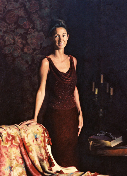
Paul Ingbretson is himself a modern master of the Boston School Tradition, which seeks to combine the truth of impressionist color with good draughtsmanship, sound composition, and skillful paint handling.  His studio is known internationally and has trained some of the best known artists painting today, including Catholic portrait painter Henry Wingate, who teaches at the Way of Beauty Atelier summer program.

Ingbretson was taught in Boston in the 1970s by R. Ives Gammell, who is the teacher, writer, and painter who almost single-handedly kept alive the traditional atelier method of painting instruction.

Through Gammel, Ingbretson can trace a line through the Boston School, to the Parisateliers of the 19th century, and to the 17th century baroque. His students tread a path taken by such masters as the great American artist John Singer Sargent and the Spanish 17th Master, Velazquez.

This partnership with Ingbretson Studio helps the College achieve one of the primary objectives of the Way of Beauty Program—to form a new generation of professional artists that produce art that lifts the soul to God.

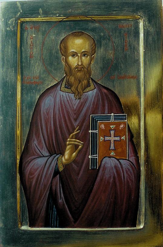
It is imperative that aspiring Catholic artists obtain, as well as the skills, a firm understanding of the Western tradition, which Thomas More College provides through its curriculum.  It is further imperative that aspiring Catholic artists receive firm spiritual formation from which they can derive inspiration, which again, is available at the college.

During their four years at TMC students will attend a series of courses in Catholic art and architecture; experience art first-hand during our semester in Rome; produce an icon of their own through our St. Luke Sacred Art Guild, assist me in producing sacred art for our chapel; and further hone their skills through opportunities like the one now available through Ingbretson Studios.

The Thomas More College of Liberal Arts provides a four-year undergraduate education which develops young people intellectually, ethically, and spiritually in the Catholic tradition and in faithfulness to the Magisterium of the Roman Catholic Church.  Thomas More College introduces its students to the central questions of Western Civilization—and to the Church’s response.  It teaches students how to reason, engage in academic discourse, and to write. Students from Thomas More College are shaped into becoming faithful leaders who will be able to pursue the individual vocations which God has given each of them.

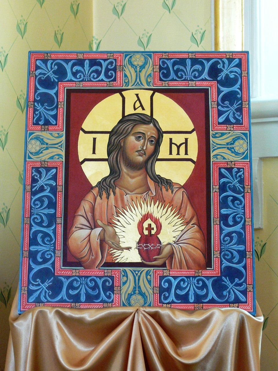
All the artwork shown is the product an academic training. The charcoal drawing above is my own work; the painting of the two children is by John Singer Sargent; the portrait below is by Henry Wingate. The paintings below that are by the 19th century master of the Boston school, Joseph DeCamp

Russian Icon of the Mother of God of Fatima

Here is an interesting icon. Painted by a Russian Orthodox icon painter in collaboration with a Catholic priest. It is a beautiful image. The image is, in part, inspired by one of the Immaculate Heart of Mary. In order to accomodate the sensibilities of the Orthodox painter, the image doesn't show a picture of a heart, but show's Mary pointing the the word Sense (Heart) where her heart would be.  


You can read more about the development of the image here.


Summary of the Kenrick Seminary talks on art

By Mark Scott Abeln on his Rome of the West blog For any who are wondering whether or not it's worth the effort to watch them, here is a summary of the four talks at the Kenrick-Glennon seminary by Mark Scott Abeln. His blog is worth a look. He is a skilled photographer and he has insights how the principles I have been articulating in art and architecture apply in the art of photographer. The 'Rome of the West' for those of you, like me, who didn't know is his home town of St Louis. Photograph: the Cathedral Basilica of  St Louis, in St Louis, Missouri.

Glazes and Scumbles - Creating or Destroying Depth in a Painting

In good sacred art, even the appearance of the negative space around the figure is controlled by the artist The iconographic tradition portrays the heavenly realm, which is outside time and crucially (in this context) space. In order to convey a sense of the heavenly order in an earthly image, all sense of depth beyond the plane of the painting is deliberately eliminated. There is no superfluous background in an icon and the negative space around a figure is meant to appear flat. The naturalistic tradition, in contrast, seeks to do precisely the opposite. It is portraying Historical man, that is man after the Fall but not yet redeemed. This is the world of time and space that we live in. When painting in this tradition, the artist deliberately sets out, therefore, to create the illusion of space. There are a number of ways that an artist can do this. One way is to draw a scene with conventional perspective (and the icon painter can do the converse by using inverse perspective). However, in order to use either form of perspective, there must be a background scene painted in the area around the main figures onto which the artist would apply it. If there is not background scene the artists must use other means to control our sense of how the negative space appears: as either a three-dimensional space or a flat surround in the plane of the painting.

One is the choice of medium or media used in the painting. One option is to gild, which always looks flat. (You can see this 12th century Greek icon Moses at the burning bush, above.) If the background is painted rather than gilded, then egg tempera, fresco and mosaic always tend to look flat too, whereas oil paint, especially when used for painting shadow, always creates a strong sense of space beyond the plane of the painting.

Just to illustrate, compare the two paintings first and second below: and icon of Our Lady and Our Lord painted by Gregory Kroug in the 20th century; and Bellini’s Sacred Conversation painted in 1490. Neither has scenery painted around the figure, yet first has a white background that is designed to eliminate, as far as possible any sense of space beyond the plane of the painting. Bellini on the other hand, has painted a dark background that plunges into the depths, and gives a sense of almost infinite space – there is a gaping chasm beyond the figures.

The next painting (below, left) painted just 4 years before Bellini's by Carlo Crivelli in 1486 demonstrates why the standard choice of medium became oil rather than egg tempera. In this painting of the Annunciation, Crivelli uses single point perspective in order to create a sense that the pathway on the left is receding into the deep distance. The draughtsmanship is fine, but for me the painting just doesn't work. I have seen the original many times in the National Gallery in London and every time I see it what strikes me is that although the size those tiny figures in the background and all the perspective lines pointing to them tell me that they are in the distance, they just don't look distant. They look small. The reason, I feel, is the medium that Crivelli is using is egg tempera.

Even beyond the choice of medium, there are ways of manipulating the paint also that it can enhance or reduce the natural look of the paint in this respect. These are ‘glazes’ and ‘scumbles’. I do not know for certain, but as far as one can tell from the reproductions, my guess is that this is what Kroug and Bellini were using. Certainly, if I was trying to create the same effect, this is what I would do.

Glazes and scumbles are created when a translucent layer of paint is painted over another. When the tone of the upper layer is darker than that of the lower, it is called a glaze; when the tone of the upper layer is lighter than the lower layer it is called a scumble. If I were seeking to create the Bellini effect I would use a glaze in the background; and if seeking to create the Kroug effect, I would use a scumble.

When light hits the surface of the painting, some light and some is transmitted through to the next layer of paint deeper into the painting, and some is absorbed and re-emitted back outwards. This re-emitted light bears the character of the layer that absorbed it. It is why, for example, when you shine blue light on paint, that it appears blue. Consider now the light that was not absorbed, but which passed through the layer of paint. It is then incident upon the layer of paint underneath. At this interface the same thing happens again: some is transmitted and some absorbed and re-emitted. This goes on right until some of the light penetrates all the way through to the ground. If the ground of the painting is white and so very reflective, good part of the incident light comes back out of the painting.

When we look at a painting, what the eye sees is the aggregate of different rays of light emerging from differing points within the paint layer and bearing the mark of the layer that last absorbed and re-emitted it. When I paint with tempera, which can be diluted into thin washes of paint, the final effect is the cumulated effect of as many as 15 layers of paint of varying tones and colours. If you shine a light directly onto the painting then the optical effect is that the painting is itself a source of light. It is especially beautiful if the light is a flickering candle.

If you use a glaze with tempera, the usual medium for icons, it creates richer, jewel like surface. I you apply one in oil, the effect is even more dramatic. It causes the surface to appear to sink into the deep distance. The shadows of baroque art, such as we see in a Rembrandts, seem to sink into the infinite. This is effect, is created by a glazes and it is perfect for the numinous, mysterious feel that baroque artists sought. The painting right is Rembrandt's St Bartholomew.

A scumble, on the other hand creates the opposite effect. The upper layer appears to float on the surface. Generally, it is less often useful to an artist and so you don’t hear the term used very often by artists. However, it is extremely useful to any icon painters wishing to create this Kroug effect. You simply ensure that the final layer of paint is the lightest in tone. If the layers underneath are a combination of glazes and scumbles it still looks interesting and varied, but it thrust forward, rather than sinking back into the painting. What I find so lovely about Kroug’s works is the huge variety of washes of tone and colour that he applies underneath the upper layer, be it glaze or scumble.

So many modern attempts at icon painting that you see don’t do this. The colours are flat, dull and lifeless because they are created by the painting of a number of thick layers of the same paint. Like do-it-yourself decorator painting a wall.

(The painting below is The Virgin at Prayer by the Italian artist Sassoferrato. This baroque artist is using oil to create sinking depths in the negative space around the Virgin. What a wonderful painting! This is in the National Gallery too, and every time I visit, I make a point of going to look at it.)

Four talks on Sacred Art at Kenrick Seminary, St Louis

This autumn I was invited to address the seminarians at the Kenrick Seminary in St Louis. I gave four lectures on sacred art and liturgy. Here are four podcasts, posted on the seminary website. They are enhanced -  you hear my voice and see the slides I am describing. Harmony and Proportion - linking culture to the cult

Iconographic art

Baroque art

Gothic art

Sacred Heart Icon Promoted by Cardinal Burke at TMC

Cardinal Archbishop Raymond Burke visited New England recently as keynote speaker at the annual President's Council Dinner of Thomas More College of Liberal Arts. For those who are interested, you can read the text of his speech and see a video here. Afterwards, Cardinal Burke handed out small prayer cards to everyone who spoke with him. These were an image of the Sacred Heart of Jesus. There is a connection here. The college had been inspired to enthrone the Sacred Heart of Jesus in its chapel, in large part, under the inspiration of then Archbishop Burke's writings on the subject (the commission by the college of a Sacred Heart image that was the subject of the first article in this series).

The image that the Cardinal was handing out was of the one commissioned for the shrine in St Louis as a focus for this ancient Church devotion. The St Louis Sacred Heart image is a mosaic and strikingly similar in form to the Maryvale Institute’s Sacred Heart images (which are based upon the visions of St Gertrude in the 13thcentury). The housing of the Shrine was designed by Duncan Stroik (with some input from New Liturgical Movement’s own Matthew Alderman, see here)

Photographs below are of the Shrine in St Louis, including the mosaic; and at the bottom of the two Maryvale Sacred Heart images, a panel painting and a window, which are in the same vein.

As a postscript: the Cardinal has agreed to work with the President William Fahey of Thomas More College in New Hampshire on the production a children's catechesis for the Sacred Heart I will do the illustrations for the book. It is the third in a series of catechetical books for children, the last one God's Covenant with You, was written by Scott Hahn.

Pope points to Mary as the door to the Way of Beauty

In an address made on December 17th, Pope Benedict XVI highlighted the role of Mary, who is all beauty -  'tota pulchra' - in guiding us to the Way of Beauty, the 'via pulchritudinis'. Once again, and echoing John Paul II before him in his Letter to Artists, Benedict highlights the importance of art united to the liturgy and manifesting theology. 'I take advantage of this occasion to invite experts in theology and Mariology to follow the via pulchritudinis, and I hope that, also in our days, thanks to a greater collaboration between theologians, liturgists and artists, incisive and effective messages can be offered to the admiration and contemplation of all.'

The full text of the address is here

He also suggests that to this end we should contemplate two images. First the apse of St Mary Major (above). A virtual tour of the church is available here. Secondly he points us to the mosaics at Santa Maria in Trastevere. Two are shown below. They are 13th century (the annunciation is by Pietro Cavallini).

The Creation of a New Icon - the Merciful Jesus

When writing about Aidan Hart's work last week I noticed this icon. It represents an interesting postscript to the recent discussion of the portrayal of the Sacred Heart in the iconographic style. Aidan Hart was approached by someone who wished to commission a Sacred Heart image. As an Orthodox Christian he explained that he would be happier to paint an icon of Christ that communicated the themes of mercy and compassion but without making the heart visible. As he put it: 'My solution was to relate it to Christ's appearance to Thomas (hence the doors in the icon and Christ showing his wounded side). The wound summarizes Christ's compassion (sacred heart) for us in suffering and dying for us. The rays of light come from his whole person, although radiating from the direction of his heart.' This is interesting to me in a number of ways. First it is a beautiful image that does indeed communicate to me a sense of mercy and compassion; second, the story of its origin gives us a sense of how a new iconographic image is created; and third, if there are any Catholic artists out there looking to paint a Divine Mercy or Sacred Heart image, this is something that it could be based upon.

From a technical point of view, it is difficult to paint a robe that is all white and avoid creating something that is dull and lifeless. The interplay of different colours is one way in which the artist avoids this, and the scope for this is limited in an all white robe. Aidan has approached this by putting dark colours on the ground and then painting the white form over it. The ground colours show through faintly and give it variety, life and interest.

Christmas Cards from Daniel Mitsui

I just received Daniel's newsletter and included were these pictures which are for sale as Christmas cards. If you're interested, you can get further details from www.danielmitsui.com I like his style very much indeed. It is very refreshing to hear him freely admit that he has areas where he feels he could improve (he says his figure illustrations). I can only pass on advice that was given to me.  I was told that skill comes with work. To some it comes easily, some not so easily, but if you work for it, then you'll get there. And, I was told, if you love what you do, you will put in the work. 

This is the second feature I have written about Daniel's work (first is here). I am taken with his style and would like to encourage him to keep on getting better and better.

Learn to live the Way of Beauty at a weekend course

You’ve heard about The Way of Beauty, now learn how to walk the path This summer the Way of Beauty Atelier is running a long-weekend retreat: Traditional Paths to Inspiration and Creativity. Based upon the methods by which artists were trained to apprehend beauty and open themselves to inspiration, this has been adapted for everyone and has application in all activities. No special experience of ability is assumed. So artistic or not, creative or not, young or old alike, it doesn’t matter. Creativity and inspiration are great things whatever you do. It will be a weekend of prayer, traditional chant, talks, discussion and reflection. For more information and to sign up, go here and once there scroll down to the bottom of the page.

The painting shown, by the way, is Schedoni's Holy Family teaching Jesus to read. Schedoni lived in Italy in the late 16th and early 17th century. Here are some more images in a similar vein. From the top, Raphael; Annigoni's 20th century St Joseph teaching the boy Jesus carpentry; and de Grebber's Virgin teaching the infant Christ to read from about 1630


Where Should Catholics Go to Learn Icon Painting?

Choosing an Icon Class I would recommend that any Catholic artist, even those wishing eventually to specialize in more naturalistic styles, spend at least part of their training learning to draw and paint icons. The style of icons is so strongly and clearly governed by the theological message that it conveys that to learn this through the painting of them (as opposed to just learning about them) reinforces deeply the general point that form is important in Christian art, not just content. This is immensely helpful in trying to paint in, for example, the baroque style which is integrated also with theology but with a subtlety that can be missed if one is not alert to it. (Two short pieces on different aspects of this are here and here.) There a number of places that one can go to learn icon painting, that I know of, both in the US and Europe. first and foremost I'm going to recommend doing a summer school at Thomas More College in New Hampshire, of course. Here are some things that strike me as worth considering when choosing such a place. I use my own experience of having classes with various teachers before settling on one whom I felt was right.

I was very lucky to be taught icon painting by an English iconographer called Aidan Hart. Firstly, he is a great icon painter: his icons are, in my opinion, as beautiful as any being painted today that I have seen. Second, he is a natural teacher. His is the model I look to when I try to teach others. As he demonstrated any particular skill, he emphasized the importance of understanding why things were done as they were, and reduced things down to a few core principles, which he sees as the unbreakable guidelines that define the tradition. This is in contrast to rules; which are the applications of the principles in particular cases. Understanding principles allows for the development of a living tradition which can develop and adapt to its time and place. The principles can be re-applied, perhaps to differing result, in different cases as need demands. So the rules change but the principles don’t.

Once this was understood it was easier to see how there is a huge scope for variety in style of icons, without deviating from the central principles that make an icon and icon. It was he who pointed out to me the common elements that unite the various Eastern and Western Catholic traditions in iconography (and which I wrote about in more detail here). An understanding of principles allows for change without compromise of those principles; this is what is necessary in all traditions if they are to flourish.

He had a particular interest in this, because living in England, he was exploring ways of painting icons of the ancient saints of the British Isles in a way that was simultaneously true to both the timeless and ‘placeless’ principles of iconography; and rooted in the geographical location and times of their lives. He tended to draw on the style that was seen in Constantinople and the Greek Church about 800-1,000 years ago. This is the style this has a higher degree of naturalism than we see in, for example, Russian icons, and, as I see it, is more accessible to the modern Western eye. The painting at the top of the article is of Saint Winifred. St Winifred’s well in North Wales is a British Lourdes, a place of pilgrimage still, where there are miraculous cures. The town which contains the well is called Holywell and there is still flowing spring and a 15thcentury gothic building that houses it. I have included below some more pictures of his saints of the British Isles. I have a particular fondness for this, I grew up on the English side of the border with Wales about 10 miles from the well and she is the patron of the local Catholic church. I have not spoken to Aidan about this directly, but I am guessing that when he painted it he was thinking of an icon of St Theodosia painted in Constantinople in the 13th century.

Inspired by this, when I seek to paint in the iconographic form, I look to our Western forms that grew up in the Roman Rite. For example, rather than have a plain raised border, I paint abstract patterned borders and backgrounds, taking inspiration from the Romanesque. (I wrote about this particular variation previously in Why Frame a Picture?)

It is important that Catholics who learn to paint icons place this artistic form within the context of our own tradition. If learning from any Orthodox teachers (which is likely), it should be remembered that Orthodox churches do not view Western non-iconographic liturgical traditions as legitimate forms of sacred art. As Catholics we do not need to be worried by this. We are not bound to accept all we are told uncritically, and as long as we know the basis of our own traditions well, we can make a sound judgment regarding the validity of what we are told.

If any of who can get to Shropshire in England, then consider signing on for his workshops here. He is very generous in his advice and happy to critique work and answer questions between workshops, so it is possible to make progress in between. This is the route that I took. (He also teaches a diploma in icon painting offered by the Prince of Wales's School of Traditional Art, which you might like to investigate, but there is such a waiting list you'll have to wait until 2013!)

If you cannot get to Shropshire, then there will soon be an alternative. I am excited that he will also bring out an instruction book on painting icons, which will be published by Gracewing. I have seen previews of significant parts of it and it is excellent, better by far than anything I have seen on the market. When it comes out I am sure to feature it. (He was hoping to raise money for an instructional DVD to accompany the book, so if anyone feels like contributing, please feel free to contact him through his website or the publisher!)

Scenes below are of St Winifred's Well at Holywell in North Wales, the 15th century housing and the well itself. Apart from St Theodosia above, all icons are by Aidan Hart, including a second St Winifred.

An Englishman Meditates on Thanksgiving and Psalm 114

We had a banquet at Thomas More College in New Hampshire before people dispersed for Thanksgiving.  Before the dinner we chose to chant the first 8 verses of Psalm 114 - 'When Isreal came out of Egypt' in order to help us meditate on the meaning of this very American holiday. When the people of Israel, the subject of the psalm, left Egypt they had two goals. The first was to worship and serve God; and the second was to occupy the Promised Land. On their journey they stopped at Sinai. Here they received their instructions for worship and for a rule of life, before moving on to their final destination. That pause in their journey is significant.

‘Sinai, in the period of rest after wandering through the wilderness, is what gives meaning to the taking of the land. Sinai is not a halfway house, a kind of refreshment on the road to what really matters. No, Sinai gives Israel, so to speak, its interior land without which the exterior one would be a cheerless prospect. Israel is constituted as a people through the covenant and the divine law it contains.’(Pope Benedict XVI, The Spirit of the Liturgy, p19)

There are obvious parallels between this and the popular story of Pilgrim Fathers for which Thanksgiving has become a focus.  They, like the Isrealites, had worship in mind. They were seeking to institute a sort of religiously based community; and the land they settled in is the land of plenty we now live in. But we would do well to remember also, that it is always a ‘cheerless prospect’ without its Sinai – the interior life that is available to us in its fullest expression through the Church.

But there is something greater that both point to. All of us in this life are constant pilgrims on that journey in its highest form, the pilgrimage to heaven – that quotation was taken from Pope Benedict XVI’s book on the liturgy. He describes the pilgrimage not seen as as a straight path. Rather, he talks of a constant liturgical dynamic of exitus and reditus – leaving to return home, but each time it is a fresh new home, when we step into the supernatural made present by the Eucharist at the centre of the liturgy. Rather than an enclosed circular motion of repeated worship, it is a helix, in which each cycle takes us further upward. (I explore this idea further in another article, The Path to Heaven is a triple Helix.) Quoting Pope Benedict again, ‘in the Christian view of the world, the many small circles of the lives of individuals are inscribed within one great circle of history as it moves from exitus to reditus’. This is why the liturgy, the formal worship of the Church is described as both ‘source and summit’ of human existence. It is both our supernatural launch pad, a source of grace, and landing field, the heavenly activity is liturgical – the perfect, joyful exchange of love in perpetuity .

It is interesting that the Pilgrim Fathers’ journey began in Plymouth and ended in a new Plymouth – Plymouth Rock; and similarly ironic that the one thing that would truly have grounded it in an unmoveable rock was supernatural. The Catholic Church that they did not accept. We, because we are aware of this, are in that privileged position of being pilgrims who have that sure and certain guide to our final destination, one that has its foundations in rock, not Plymouth Rock, but the rock of Peter. Then our home, wherever it may be, can be (referring to the psalm) both Judah and Israel, sanctuary and dominion.

That is true cause for gratitude on Thanksgiving day.

(As an interesting side note: even the psalm tone that we use to sing Psalm 113 is appropriate to the theme. The ancient tonus peregrinus is always used for this psalm. This translates as  'pilgrim tone' and which was adapted from the pre-Christian Jewish liturgy. We sang it as  Anglican chant which adapts the tone to English, and uses four-part harmony.)

Paintings: top, Poussin: Moses String the rock to give water in the wilderness; and above, also Poussin, the Iraelites gathering manna in the wilderness.

Halo, halo!

Following on from last week’s article Heart to Heart, about the commissioning of the Sacred Heart paintings, there were two points that I raised for discussion. The first is the suitability of the iconographic form for a Sacred Heart painting. A number of people who spoke to objected to this (some quite forcibly!). If I have understood their points properly, then it seemed to be based upon the idea that the iconographic form is necessarily an Eastern (and one person even said an Orthodox form) so the portrayal of a Western devotion is not appropriate. The first point to make is that the Sacred Heart, although originating in the West, is no longer restricted to it. I was told by a Melkite priest that the Sacred Heart is a popular devotion in the Eastern Church too. Second, this view of icons as being an exclusively Eastern form is contrary to the Catholic view. I have written before, here and here that what characterizes the iconographic form is that it is a style that is consistent with an image of eschatological man – mankind, redeemed, in heaven, so to speak. There are variants of the iconographic form that emanate from the Eastern Church and the Western Church (for example Carolingian, Ottonian or Romanesque art). Therefore, if it is right to represent Christ in the iconographic form at all (and of course it is) then it is right, I would argue, to paint images of the Sacred Heart in that form too. (The same could be said in regard to the other liturgical forms – just as it is appropriate to paint Christ in the gothic and baroque styles, it is appropriate also to paint images of the Sacred Heart in those forms.)

Similarly, the iconographic style is not communicating a message restricted to any particular time in history. It is communicating the timeless realm of heaven. So the time in history when the devotion arose is irrelevant to the discussion. (Although, in fact, the Sacred Heart devotion might even have begun, according to my research as early as the 11th century, which would place it in the period when the standard art form in the West was Romanesque, which was iconographic anyway, also, though not specifically linked to the Sacred Heart devotion, there are a few older images of Christ's heart as a symbol of love. I found one going back to 450AD).

The other point relates to how we show the light emanating from the heart. The concern of someone, whom I respect as being very knowledgeable on the tradition, that a halo was not appropriate for the heart, although this is a representation of uncreated light, within the tradition the nimbus of light, the halo, has only been applied to the head. Therefore, rays (as one might see in a monstrance) were better. This is a strong argument and worth of further consideration. While we should never say that just because it hasn't been done before we can't now, we must be respectful of tradition and try to consider why it hasn't. On reflection, however, I feel that it is appropriate to use a halo if the artist chooses, but I am still open to persuasion and would love to see any thoughts that readers have on the matter.

Here are the points I would make in response: it is certainly the case that the halo has a strong symbolic meaning beyond simply the pictorial representation of uncreated light. It is telling us something about the person – that this is a saint or the glorified person. When we see a person their head is the place most appropriate visible part that represents the person – we naturally tend to look at the face as of a person as a ‘window to the soul’; and most would not consider for a moment, for example, putting a halo around the hand to say something about the person. However, tradition does say that the heart, perhaps even more than the head, symbolizes a person. The heart is the human centre of gravity, our very core that incorporates body and soul. It is the place that represents the whole person, the vector sum of all our actions and thoughts. This is why the heart represents love. We are made for love and so the place that represents the person is also the symbol of what the person is made for. This is even more the case for the person of Christ, who is not made for love but rather, as God He is Love.

Normally the heart is not visible, so the question as to whether or the artist should apply a halo to it does not come up. However, in this case it is, and I would argue therefore that it is not inappropriate, at least, to put the halo around the heart.

Another point that was raised is that it seems to disembody the heart. It is a matter of opinion as to whether this is a problem, I think. My response to this is that the heart has been no more disembodied by putting a halo around it than it has by placing rays around it. The Maryvale image, which is based upon the visions of St Gertrude in the 13th century, has Christ presenting his heart to us in the palm of his hand, this is quite a disembodying action, it seems to me!

The discussion so far has been concerned with general principles. It does not account for individual taste or the quality of the images portrayed. Even if consistent with the principles that constitute a particular tradition, a painting can still be poorly executed. And I have to say that most of the Sacred Heart images I see are, to my eye, sentimental and unattractive. (There are exceptions. I have included some that appeal to me, including once again the 18th century stain-glass window in the Maryvale Institute in Birmingham.)

Images inserted into text,  from top: from St Patrick's El Paso, Texas; the Maryvale stain-glass window; a modern icon of the Sacred Heart.

And images below: an 18th century engraving; a 15th century woodcut of the Five Wounds of Christ; a heart and cross from 450AD.

Heart to Heart

I have been commissioned to paint two Sacred Heart images and each time it raised some interesting questions in relation to tradition. One relates to the style in which one ought to paint the image, given that this is a relatively recent devotion – is it legitimate to use an iconographic style which predates the devotion, for example? The second is in regard to how the light emanating from the image of the heart itself should be portrayed, should it be tongues of light or a halo for example? A recent visitor to Thomas More College recently asked me about both these points. Fr Seraphim was very knowledgeable and had well thought out views on each issue, so it forced me to sit down and think again about the reasons for doing what I had done in each case, and to reflect on whether I had made the right choices, especially in the consideration of applying a halo to the heart. This week I will describe the story of each commission, so that readers can get a feel for how these dialogues run. Next week I will present the arguments as I see them surrounding these two concerns. The first was for the Maryvale Institute, in Birmingham, England, which as well as being an internationally known Catholic college is the national shrine of the Sacred Heart. They have a beautiful little side chapel, right, separate from the main chapel. The central focus of the side- chapel is a stained glass window, above, which was imported from Rome at the beginning of the 19th century, and is the oldest image of the Sacred Heart in the UK. I was asked to paint an image of the Sacred Heart based upon this window to commemorate the 25th anniversary of the founding of the college. Since its founding like any educational institution seeking to be orthodox, it has had to counter efforts to undermine what it is doing and Fr Paul Watson, the president of the college, explained to me that they felt sure that much of their success could be attributed to the protection of Christ through devotion to his Sacred Heart.

I was asked to paint an icon based upon the window. In discussion, it became apparent that any image that conformed to the iconographic prototype would not retain the distinctive qualities of the window, which is in the baroque style. What I aimed for, therefore, is more gothic than iconographic – a naturalized iconographic form. The pose is obviously taken from the window. Deviating from Western naturalism, there is no cast shadow, and it is painted in egg tempera, so has the flat look of the medium. Also, I painted a conventional halo around his head. To his heart I applied radiating, monstrance-like, tongues of light (the form of which was also taken from the window).

The abstract design around the border is taken from the window. It is not usual to incorporate such designs into Eastern icons. However in the West, in all forms of art including the iconographic, there is a strong tradition of abstract art and especially that which uses flowing graceful lines. The fleur-de-lis incorporates the lily, the symbol of purity and, by virtue of its threefold design the Trinity. The red and yellow design incorporates vine leaves, the symbol of wine the Eucharist. The blue-green design, which forms the arms of the cross give a sense of a flower coming into bud. Within the root there is a triangle and the within the bud a pentagonal design. Five symbolizes living creation (and in this context, I thought, man). I do not know the intentions of window maker, but I interpreted the combination as a symbol of the Incarnation, God is made man.

It was presented to the college at the Silver Jubilee Mass celebrated by the then Archbishop of Birmingham, now Archbishop of Westminster, Vincent Nichols, a supportive patron of the college during his time at Birmingham.

The second is at Thomas More College in New Hampshire. Like the Maryvale Institute, it was asserting its Catholic identity and fidelity to the Magisterium. Shortly after I arrived, under two years ago, I was struck one day by the words of the psalmist in None: ‘Vain is the builder’s toil, if the house is not the Lord’s building; vainly the guard keeps watch, if the city has not the Lord for its guardian.’{ Ps 126(127)}. Recalling also, my experience at the Maryvale Institute, I immediately suggested to President William Fahey that we have an image of the Sacred Heart for our chapel too. It seems he had been thinking along similar lines for he told me that in fact his intention was, starting that Fall, to dedicate the college each year to the care of the Sacred Heart of Jesus. This has been done twice now.

This time I chose to create an image in a more iconographic style. Clearly, this is not part of the iconographic tradition, so I based the pose on the Pantocrator, blessing Christ. Again, I used egg tempera painted onto a gessoed panel as the medium. As this is a Western devotion and I am a Roman Catholic, I incorporated some Romanesque (ie Western) features by having the geometric patterned border and also, putting a geometric pattern into the background around the figure. This time I painted halos around both the head and the heart of Christ.

Part II next week.

Above: the Maryvale Sacred Heart; and below, the Thomas More College of Liberal Arts Sacred Heart

Listen to Music by Frederick Stocken

Frederick Stocken is a Catholic composer who composes genuinely high quality classical music that actually sounds good. There is no hint of either dissonance or minimalism in his work (which seem to be the two streams that most modern composers occupy). I was lucky enough to hear his First Symphony performed at the Albert Hall in London under the direction of Vernon Hanley several years ago (I was reviewing it for the Catholic Herald). This was my introduction to his music and I have been following his work, which has steadily grown and developed, ever since.

I was pleased to hear recently that Frederick Stocken's premiere of his organ work, St Michael the Archangel was well recieved and he has been asked to perform it again when the Archbishop of Westminster visits Poplar in December.  Frederick seems to be working hard at the moment and there is another premiere, this time a piece for organ and choir, commissioned by the Worshipful Company of Musicians for their carol service at St Michael's in Cornhill, London in December.

Unfortunately, there is very little of his work available on CD. There are clips of some of his work at www.frederickstocken.com . If you want to hear a complete piece his charming Bagatelle for piano is played in full.

His early work, Lament for Bosnia, which made the classical charts some years ago now is out of print but still seems to be available on Amazon. I look forward to the day when more of his work is available.

A Course on Catholic art, for both Artists and Patrons

I want to direct readers to the Maryvale Institute in Birmingham England and its course Art, Beauty and Inspiration from a Catholic Perspective. The Maryvale Institute is a Catholic college known internationally both for the quality of the education it offers and its fidelity to the Magisterium. I have visited this college many times over the years and its very special approach to education gave me insights into how artists ought to be taught today. I wrote about this in an article Art, Grace and Education, which first appeared in the journal Second Spring. I should declare at this point that I worked closely with the faculty (from whom I learnt a great deal) in the creation of this course and was one of the lecturers on its residential weekends before I came to work in the US. This course is for both practising artists and for those interested in art, including its role in Christian life, liturgy and catechetics. It is a part-time, distance-learning, one-year course and so it is ideal for mature students anywhere in the world (as such it is complementary to Thomas More College of Liberal Arts, in New Hampshire, which offers this to a more conventional body of undergraduate students). It is very reasonably priced and is structured so that it can be combined with a working life. It is credit rated at undergraduate level.

It introduces the riches of the whole Christian tradition and its continued inspiration in both the East and the West up until the present day, rooted above all in the Incarnation and the Paschal Mystery.

The course does not presume, nor require, any specific abilities or skills in art. Nonetheless, it was established in direct response to John Paul II’s Letter to Artists and aims to stimulate and inspire a new wave of Catholic artists to create a new ‘epiphany of beauty' in religious art.

Included in this course is the role of art in liturgy and in catechesis, as well as how artists have drawn inspiration for their work in the light of grace, the daily life of the Church and the action of the Holy Spirit.  The course explores the ways that visual art forms can reflect timeless truths and a holistic Catholic world view that can speak to the needs that today's men and women have for beauty, goodness and truth.

There is a topical connection. John Henry Newman lived there temporarily before establishing the Birmingham Oratory in its permanent site. In 1846, Newman and his community who had recently been received into the Church were granted the former seminary as a house of retreat and study.   It was Newman and his followers who gave it the name 'Maryvale' after St Philip Neri's church in Rome.

BBC TV show on the Cosmati pavement

This was recently brought to my notice by Strat Caldecott in his Beauty in Education blog. The BBC art critic Andrew Graham-Dixon discusses the floor and its current restoration. It has some very interesting shots of the 13th century Westminster Pavement and refreshingly, he quite happy to refer to the cosmological aspect of its design (although always as though it is a historical detail, rather than still part of the Catholic understanding of the world). Watch the video here

The Beuronese School of the 19th century

The Beuronese School is an interesting cul-de-sac in the Christian tradition. It is named after the town of Beuron in Germany which is the location of the Benedictine community in which the school originated. The style is an attempt in the 19th century to revive Christian art, reacting against the dominating over sentimental naturalism of the time, which draws on Egyptian art and canon of proportion that was said to be derived from that of the ancient Greeks (although this is speculative, given that the canon of Polyclitus is lost). The artists themselves were trained in the methods of the19th century atelier and the result is a curious mixture of 19th century naturalism stiffened up, so to speak, by an injection of Egyptian art and geometry. Examples are to be found in central Europe and also at Conception Abbey in Missouri. I have read an account of the geometric proportions used in the human form in translation of the book written by their main theorist, Fr Desiderius Lenz, On the Aesthetic of Beuron. It was complex , so much so that my reaction was that it would be very difficult for any painter to use the canon succesfully in any but very formal poses (although it might be possible for sculptor to follow it). As soon as you have to twist and turn a pose, then the necessary foreshortening requires the painter to use an intuitive sense as to how the more distant parts relate to the nearer. To be able to do so would require the artist to have many years’ experience of working within that proportion, to the degree that it would be unnatural for him to do anything else. For this reason those that have more formal poses are the most successful works. Those that attempt a more naturalistic pose work less well, in my opinion, and look like illustrations from the bible I was given when I was a child.

The approach of Beuron school is idiosyncratic and as such sits outside the mainstream of Christian tradition. It does not as far as I can ascertain have its form integrated with theology in the way that the iconographic, the baroque or the gothic do. Nevertheless the end result does strike me as having something of the sacred. Perhaps their efforts to control individual expression have contributed to this. The school stressed, for example, the value of imitation of prototypes above the production of works originating in any one artist. The artists collaborated on works and did not sign it once finished, so it is not always clear who the artist is.

My approach in seeking to reestablish our Christian culture is look first at the mainstream of tradition, so this is not a school I I would look at in regard to my own painting, but that is not to say that no one else might consider them as examples worthy of study.

The main artists in Europe are Lenz (d 1928) and Gabriel Wuger (d 1892). The artists of Conception Abbey, their website tells us, were trained in Beuron but moved to Missouri once the abbey was founded.

Our Lady Seat of Wisdom, at St Gabriels, Prague

At the Abbey of St Martin, Beuron

Crucifixion by Bruger

The interior of Conception Abbey, Missouri and below, two frescoes from the church


A short course to learn how to live the WoB

You've heard about it The Way of Beauty, now learn how to walk it This summer the Way of Beauty Atelier is running a long-weekend retreat: Traditional Paths to Inspiration and Creativity. Based upon the methods by which artists were trained to apprehend beauty and open themselves to inspiration, this has been adapted for everyone and has application in all activities. No special experience of ability is assumed. So artistic or not, creative or not, young or old alike, it doesn't matter. Creativity and inspiration are great things whatever you do. It will be a weekend of prayer, chant, talks, discussion and reflection. For more information and sign up, go here and once there scroll down to the bottom of the page.